During storyboard reviews, products often get enlarged round after round: make it bigger so viewers can see it; move it toward the center so it reads as the hero. Soon the frame is packed with product, props, and copy. The subject is larger, yet scale, motion, and brand character have become harder to read. The issue is often not that the product is too small. The space around it has simply been given no job.
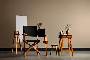
Negative space in photography is more than a white background. It can be shadow, a soft foreground, a textured wall, an uncluttered tabletop, or the air a product is about to move into. Adobe's guide to negative space photography describes empty areas through their relationship to the subject: the space helps define what it surrounds. A 2024 advertising experiment also found that participants responded more positively to highly dynamic product imagery when it had more white space, while the same difference did not appear for less dynamic imagery. That finding is useful for framing creative questions. It is not a universal performance promise.
Negative space first establishes product scale
When a product floats alone against a seamless background, viewers can read its shape without necessarily understanding its real-world size. The open area needs a relationship with a scale cue: the edge of a table, a hand, a familiar connector, or a pool of light across a surface can place the product back into a physical world.
This does not mean filling the set. A reference object should establish proportion rather than compete for attention. Our article on making weight visible in product ads explains how motion speed, support-surface deformation, and sound can communicate mass. Negative space determines whether those cues have room to be seen. When the frame is crowded, hand movement and support relationships are often the first things to be cropped away.
It also gives motion somewhere to go
A static product can feel stable in a balanced composition. A moving product needs direction. If an object slides to the right, space on the right becomes its destination. If all the room sits behind it, the shot can feel as if the action has already ended. The same principle applies to opening, rotating, unfolding, pouring, and extending: negative space is not an empty caption box. It is the place where the action will become complete.
This is why making the product as large as possible often backfires. Once the subject presses against the frame, motion loses its margin. Viewers feel confinement before they understand the feature. With a visible start, path, and result, a smaller product can still have a clearer role.
Empty areas need shape, not just cleanliness
Useful negative space has direction, tonal structure, and material character. A diagonal shadow can return attention to the product. Shallow depth of field can turn a complex environment into a quiet field of color. The weak version is uniformly empty: a background with no variation in brightness, hue, or texture that explains neither environment nor action. The product then looks pasted onto a layout.
Choose one visual anchor
The anchor might be the product's most recognizable outline, a functional movement, or a material highlight. Organize the surrounding space around that anchor instead of distributing emptiness evenly. A transparent edge needs tonal contrast. A button press needs enough room for a finger to enter, act, and leave.
Decide where the space should open
Eyes follow gaze, movement, and directional lines toward the next piece of information. If a lid opens left while all the room sits on the right, the composition creates an unhelpful pull. During storyboarding, draw the action vector on each frame and check whether its destination actually has space.
Only then decide how empty the background should feel
Negative space can still contain texture, depth, and signs of life. Low-contrast props, distant silhouettes, and restrained reflections are useful when they do not become a second focal point. Our discussion of lived-in sets for global product ads makes a related point: credibility comes from human routines and spatial infrastructure, rather than decorative shorthand. In both cases, every visible element needs a story function.
Before adding copy, identify which format owns the space
Open space on the right of a 16:9 master may disappear entirely in a 9:16 crop. When a team treats negative space only as room for post-production copy, the horizontal version can feel loose while the vertical version becomes cramped. A more reliable plan marks the subject-safe areas for 16:9, 9:16, and 1:1 before the shoot, then captures key actions in compositions designed for both horizontal and vertical delivery.
Copy does not always need to occupy the largest empty area. It can sit near the result of an action, helping viewers connect a claim to an image. It can also arrive after the action completes, allowing space to build anticipation first. Space should serve the shot before it serves the layout; then both functions can reinforce each other.
More white space does not automatically look premium
Large empty areas can reduce information efficiency when an ad needs to compare models, show installation steps, or explain several connectors. A small product without scale cues can also feel insignificant in an expansive frame. Research on white-space allocation distinguishes between interspace among products and circumspace around the group, showing that the same total amount of white space can produce different perceptions depending on how it is distributed. The result concerns specific layouts and should not be treated as a formula for every video frame.
To judge whether negative space is working, ask more than whether the image looks clean. Is product scale clearer? Does the action have a destination? Does the material gain contrast? Can the composition survive another aspect ratio? If any answer becomes weaker because of the empty area, the space is styling rather than storytelling.
Put the empty area into the storyboard
An executable negative-space frame should specify subject size, motion direction, scale references, tonal relationships, and safe areas for each format. On set, cinematography, art, and lighting can then decide which prop to remove, which shadow to preserve, and how far the product should sit from the background. The goal is not minimalism. The goal is to make every retained area do useful work.
If you are planning a product film that must balance material detail, functional action, and several platform versions, start with ONCE's video production insights and define the role of negative space before the storyboard is approved.