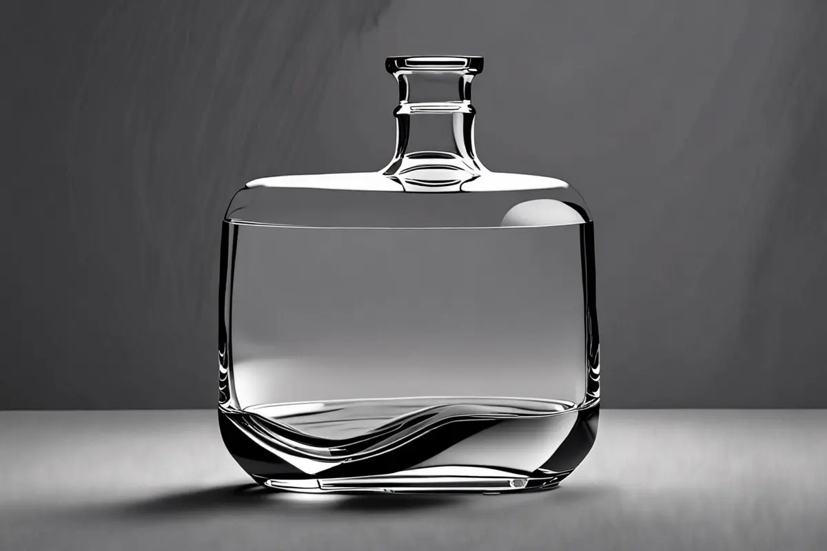
One of the most misleading moments on a product set happens when a transparent object looks beautiful to the eye but turns into a pale, shapeless patch on the monitor. Adding more frontal light may make the label clearer while erasing the curve, thickness, and edge of the container. The problem is rarely a shortage of light. Transparent objects become visible through the way they redirect the light around them.
Glass, clear plastic, acrylic, and transparent liquids transmit some light while reflecting and refracting light at material boundaries. Nikon's official explanation of anti-reflective coatings notes that when light crosses materials with different refractive indices, part of it is reflected and the rest continues through. For product advertising, that means the background, contrast, and shape of reflections must be designed. Simply illuminating the front surface is not enough.
Transparent products are defined by the background
Start by removing the product and looking at the background alone. If it moves from bright on one side to dark on the other, a curved bottle placed in front of it will refract that gradient and pick up different reflections along its edges. Much of the apparent volume comes from these rearranged tones, not from color in the bottle itself.
This is why one large, even frontal source often produces a clean but flat result. It reveals the label, dust, and scratches without creating enough contrast to describe the silhouette. A stronger starting point is to build a controlled gradient on a diffusion panel or background and add frontal fill only when needed. In broncolor's official bottle-lighting example, two sources illuminate a diffusion panel behind the subject to extend the gradation and prevent the upper bottle from developing an abruptly wider dark edge.
Bright-field and dark-field lighting communicate different moods
Bright background, dark edge
When the background is brighter than the subject's edges, the transparent object gains a darker outline. This approach supports readable liquid color, markings, and labels, and it transitions easily into ecommerce imagery. Its main risk is an edge that becomes so wide that the product looks heavy or inexpensive. More frontal fill will not solve that. Narrow the projected area of the black cards on either side and let the background change gradually from the center toward the edges.
Dark background, bright edge
Against a darker background, long diffused sources placed to the sides can create luminous edge lines. The result can feel premium, restrained, or technical, but it can also make every transparent product look like the same glowing outline. Effective edge light follows the construction of the object: the shoulder should show curvature, a thick base should feel dense, and a clear cap should separate from the body. Every edge should not be equally bright.
This connects with our earlier discussion of reflection control for black products. A black surface uses reflections to describe its orientation. A transparent object uses transmission, refraction, and reflection together to describe form. In both cases, each bright area needs a specific job.
One product often needs three independent lighting tasks
A clear bottle, a printed label, and a metal pump do not need the same light. Trying to solve them all with one source often leaves the bottle well defined but the label dull, or makes the label readable while the metal turns into a white patch. A more reliable setup separates the tasks.
- Shape light defines the container and liquid through a background gradient, backlight, or diffused side-rear sources.
- Information light is restricted to the label, scale, or essential copy so it does not flatten the entire front again.
- Material light describes pumps, caps, and chrome details with long reflections while preserving a dark band for contrast.
Turn on each group by itself and confirm what it changes. A single-light check makes it easier to identify a source that has no real purpose. In its official guide to reflective elements, broncolor likewise explains that transparent subjects are mainly captured with light travelling through them, with additional light used to show texture and surface reflection. When mirrors and glass share a set, lighting in different directions can also interfere with itself.
Build the silhouette before adding liquid, bubbles, or motion
Pouring, splashes, bubbles, and rotation make transparent-product lighting more complex. A liquid surface creates new highlights, motion blur can consume a narrow edge line, and droplets can reproduce the background as a field of distracting bright points. The complete effect should not be the first test.
Begin with the static product and confirm that the shoulder, base, and sidewall read clearly from the chosen camera position. Add liquid and motion, then observe which contours the movement disrupts. Only then adjust shutter settings, flash duration, and effect lighting. This sequence does not slow production; it makes each adjustment explainable.
What live action, CGI, and AIGC each solve well
Transparent materials respond strongly to geometry, refractive index, surface roughness, and environmental reflections. CGI works well for precise structures, large camera moves, or products that are not yet manufactured, provided the model, material parameters, and lighting environment are complete. Weak inputs often produce transparency without believable weight. AIGC can help explore background color, composition, and mood, but it should not carry final responsibility for measurement marks, packaging copy, liquid volume, or optical continuity.
Live action naturally captures small material variations: glass thickness changes slightly, liquid edges move, and pump reflections shift with the camera. For greater control, a production can combine a live-action product with CGI liquid or environment work and careful cleanup. The useful question is not whether everything should be live action or CGI. It is which visual facts must remain physically trustworthy and which spaces or movements can be designed.
During review, ask more than whether it is bright enough
Three questions make transparent-product review more actionable. Without the label, can viewers recognize the outer form and thickness? At phone size, do the shoulder, base, and cap remain separated? In the most complex frame of motion, are critical structures still visible rather than hidden by highlights or splashes? These questions produce clearer revisions than asking for the image to feel more transparent.
If your brand is planning a hero image or moving campaign for glass, clear plastic, or liquid products, review ONCE's product video and commercial production approach, then bring the physical sample, final packaging artwork, and media placements into the test plan. We can begin with camera position, background gradients, and separate material-lighting tasks to decide what belongs in live action and where CGI or AIGC can help.