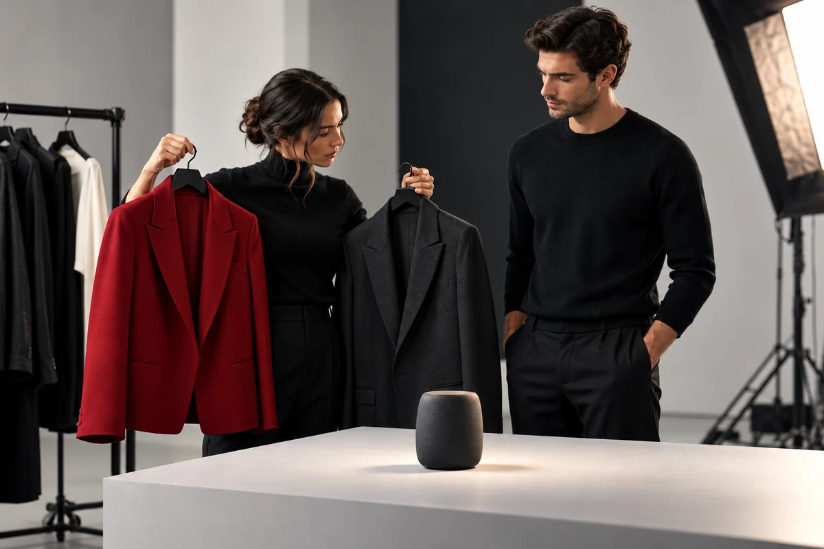
A wardrobe rack can hold several outfits that look excellent on their own, yet the frame may lose its hierarchy as soon as the performer enters the set. The lead jacket becomes brighter than the product. A supporting character disappears into the wall. Brand color appears in clothing, props and lighting at the same intensity, leaving a unified image with no clear subject.
Wardrobe color in a brand film is a system for directing attention. It must support character identity, product focus, spatial depth, skin tone, lighting and continuity at the same time. A strong plan does not put every performer in brand colors. It first decides the order in which the audience should notice the product, the person and the environment.
Wardrobe should not recite the brand message
The most literal choice is to dress the lead in the primary brand color. Sometimes that works, but it can also turn a person into moving packaging. When the product already has a saturated finish, an illuminated interface or a distinctive material, equally strong clothing can erase its outline.
Brand color works better as a relationship than as a uniform. It can appear in a small layer, a seam, a transition or only after a character completes an important action. Color then participates in the story instead of announcing the brand from the first frame.
Decide what the audience should see first
Most scenes contain four competing visual subjects: the product, the face, the clothes and the environment. Give them an order. If the product carries the first piece of information, wardrobe should protect its silhouette. If a reaction matters first, the face and eyes need separation from the collar, background and props. If the setting establishes the world, clothing can briefly step back.
Judge value before hue
Two outfits may look clearly different on a color swatch and nearly identical in grayscale. Once the shot enters shadow, shrinks to a phone screen or passes through platform compression, the characters merge again. The lead and supporting cast do not need different hues, but their shoulder lines, face areas and product-contact zones need readable value separation.
Saturation decides who behaves like information
Saturated clothing attracts attention quickly and becomes a strong block in the edit. It suits a character who carries action, change or memory, but it should not be distributed evenly. If every performer wears a different saturated color, the ensemble starts to look like a labeling system. The audience remembers categories instead of relationships.
Separate characters without turning them into a diagram
An ensemble needs differentiation, but an engineer does not have to wear blue, a designer red and a user yellow. Hierarchy can come from temperature, value, saturation and texture together. A decision maker may hold a stable silhouette. An observer can sit closer to the environment. The person who advances the action can gain stronger separation while moving.
Our earlier guide to relationships and blocking in ensemble brand films focuses on viewpoints, eyelines and depth. Wardrobe should continue that relationship map: who steps back, who enters the shared center and who carries the idea into the ending. Color helps the audience read action; it cannot replace action.
Give wardrobe one of three relationships with the product
Echo: place the character inside the product world
Clothing can borrow a muted version of the product color, a neighboring hue or a related material quality. The match does not need to be exact. A matte fabric beside a glossy product can create belonging while preserving the product finish.
Contrast: bring operation and silhouette forward
When a product is small, thin or close to skin tone, sleeves and tops can provide a clean contrast. Always test the cuff in close shots because cropping may allow wardrobe to occupy half the frame. Our article on hand models and character continuity explains why cuffs, gestures and identity must be evaluated together.
Recede: let the product become the only color point
Some products benefit from visual space. Wardrobe, set and props can stay within a related neutral range while the product becomes the only saturated or luminous element. This does not require everyone to wear black, white and gray. Skin, material and space still need depth, or restraint becomes an empty showroom.
Fabric tells the truth under production light
A fitting shows color under room light. The finished film shows color after key light, edge light, reflections, lenses and grading. Silk, nylon, leather and metallic fibers produce moving highlights with more visual weight than their area suggests. Fine stripes, checks and knits can also create moire at particular distances.
Do not approve wardrobe from phone photos alone. Use the planned camera, focal length and key-light direction for a short test. Ask the performer to turn, approach the product and enter shadow. Check whether highlights outrank the product, texture flickers, or fabric spill contaminates skin and reflective surfaces. Styling begins with a good outfit; production readiness requires control inside the frame.
Skin tone is a reference point, not a color to sacrifice
Color near the face changes how skin reads. Large areas of green, blue or red can reflect into the jaw and neck, while colored sets and practical lights add another influence. If the grade later moves the entire image to repair skin, product color and brand color may drift together.
Place performers in the real lighting position during fitting. Inspect collars, scarves, hats and shoulders, because these surfaces sit closest to the face. A neutral inner layer or a different fabric surface can solve a problem more cleanly than postponing everything to color grading.
Continuity does not mean one outfit in every scene
A brand film may move through an office, a home, an exterior and a studio. Keeping a character in the same clothes can feel artificial. Build a range instead: normal value, permitted saturation, colors near the face, excluded patterns and cuff rules for product interaction.
A character can change clothes and remain recognizable when the visual logic survives. The reverse is also true: one jacket photographed under different light can appear inconsistent. Continuity records should therefore include reference frames, light direction and exposure as well as wardrobe numbers.
Platform crops change the weight of wardrobe
In a horizontal wide shot, clothing may occupy very little area. Crop the same frame into a vertical close shot and the shoulders, collar and sleeves become large color fields. Styling that feels restrained in the hero film can overpower the face and product in a short-form cover.
Preview the main aspect ratios before production. A content system may keep one composition for the horizontal world-building shot and use a cleaner color area around the face, hands and product for vertical versions. Multi-format adaptation is an attention redesign, not a mechanical crop.
Bring the product, light and lens to the fitting
An effective fitting does not need the full set, but it does need the real product or an accurate sample, a close background color, the key-light direction and the planned focal length. Have the performer remain still with the product, pick it up or use it, then turn and move away. These actions reveal how color changes with area, angle and highlight.
Review the test in color, then in grayscale, then at phone size. Check whether the product remains the first or second visual point, characters remain distinct, skin stays stable and patterns remain quiet. Freeze a random frame and ask someone who has not read the script what they notice first. If the answer conflicts with the story goal, adjust the color relationship before adding more brand color.
Wardrobe color must serve character choice
The purpose of a color system is not to make every frame resemble a brand manual. It helps the audience understand who acts, where the product is and how relationships change. Wardrobe can establish identity, redirect attention and step back at the right moment. It should never hide the product or replace a real character decision.
If you are preparing a brand film, product commercial or cross-market character story, send ONCE your brief to align wardrobe, production design, lighting and product focus within one visual plan.