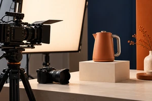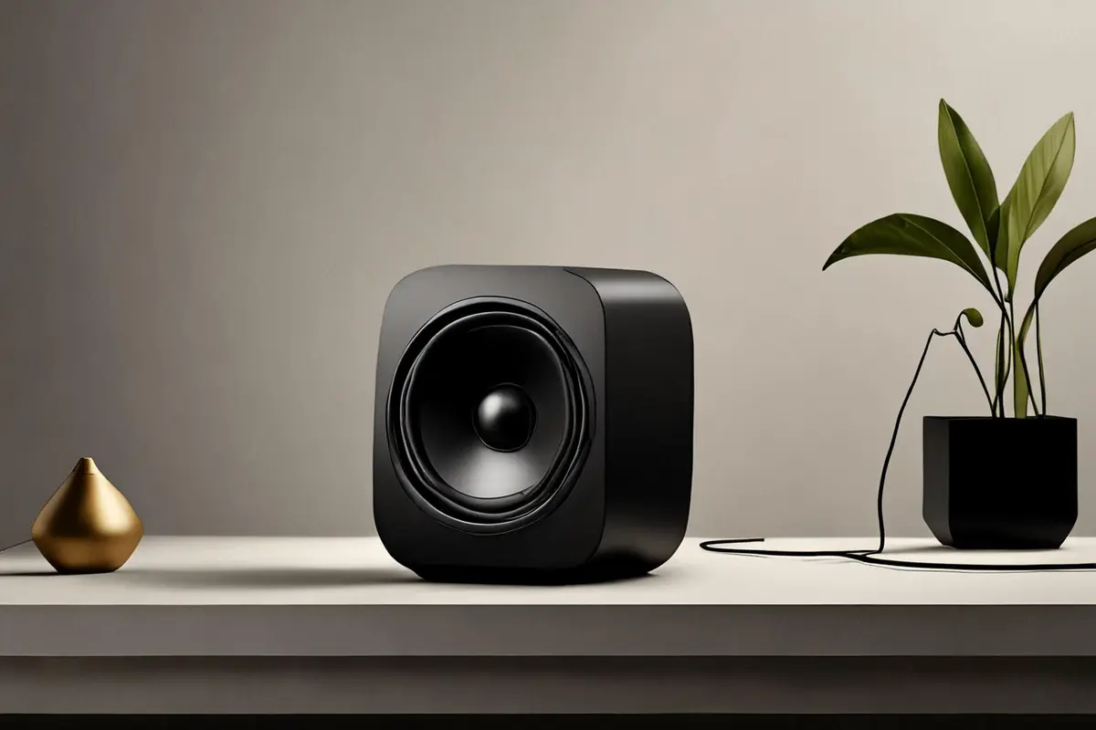
Place the product in the center, echo the light and props on both sides, and a shot can feel resolved almost immediately. It is clear, stable, and visibly designed. But if an entire film remains perfectly resolved from beginning to end, what change is left for the viewer to anticipate?
Symmetry and asymmetry are not a choice between safe and daring. A more useful principle is to use symmetry to establish product identity, then decide which departure deserves to become an event. If an off-center subject adds no information, action, or relationship, it is only displaced. If the departure changes the order in which viewers understand the frame, it begins to participate in the story.
Symmetry is first a viewing contract
Symmetry does more than make a frame tidy. It tells the viewer who owns the center, how the two sides relate, and which differences matter. The Australian Centre for the Moving Image's cinematography guide associates symmetrical framing with an orderly, organized, even choreographed world. A single subject placed on that axis is more likely to read as the center of the scene.
That order is especially useful at three moments in a product film.
First, it establishes identity. A clean center line, complete silhouette, and quieter background help the viewer register shape, proportion, and primary materials on the product's first appearance. Second, it creates a baseline for comparison. Left and right can carry closed and open states, folded and unfolded forms, or clean and used conditions. Third, it can create a sense of ceremony. A mechanical reveal, light sequence, or package opening organized around the center can make the action feel deliberate and precise.
Research helps explain why symmetry often feels fluent, but it does not turn symmetry into a universal rule. Kostyk and Huhmann's 2021 paper, Perfect Social Media Image Posts, reports an experiment with 361 participants and a field analysis of 610 Instagram posts. Vertical or horizontal symmetry was associated with greater liking and engagement, with processing fluency and aesthetic response helping to explain the relationship.
Yet a 2025 experiment by Ronald Hübner found that compositional preference changed with the evaluation method. Participants rating precomposed pictures favored positional symmetry and balance, while participants arranging movable elements also relied strongly on proximity. The PubMed record describes two experiments and explicitly concludes that the assessment method substantially affected the preferred rule.
The distinction matters in moving images. A viewer judging a finished frame and a viewer following an action as it reorganizes the frame are not doing exactly the same task. Symmetry is excellent at providing a baseline. It does not have to provide every later change.
Before breaking balance, give the departure a job
A useful asymmetry usually performs at least one of three tasks.
The departure reveals product information
Imagine a fictional desktop speaker film. The opening shot centers the speaker, keeps the two sides of the lighting consistent, and lets viewers read the grille and overall proportions. Then a hand enters from the right. The speaker shifts left, opening space for a cable to connect to a rear port. The product leaves the center because the frame now has to accommodate a real operation.
Remove the hand and cable. If the speaker remains stranded on the left for no reason, the departure has lost its job. Recenter it, or let the space carry accurate copy, an interface, or another piece of useful evidence.
The departure gives action a direction
A static object can be held by the center line. A moving product needs space in front of it. A robot traveling right, a floor cleaner changing course, or a cap rotating off a bottle all require room for the action to arrive. Breaking symmetry may simply mean acknowledging that the product is going somewhere.
That space must agree with the motion. If the product moves right but a bright prop blocks the right side, the frame is visibly asymmetrical yet directionally congested. If the right side is more open and slightly quieter, the product's orientation and path can lead attention into it. Visual weight comes not only from object size, but also from brightness, saturation, sharpness, speed, and the direction of a person's gaze.
The departure marks a narrative change
Symmetry can also define the state before something happens. Keep a package centered while it is sealed, then let its components spread to one side when opened. Treat a product as a centered display object before a hand enters, then let the frame reorganize around use. Hold an interface still in standby, then allow light, liquid, or particles to cross the axis when a function begins.
The point is not a formula in which every film starts symmetrical and ends asymmetrical. The two states need a readable cause. Viewers should be able to say what entered, what changed, and why the space had to be redistributed. Cutting from one centered beauty shot to an arbitrarily offset beauty shot changes the form, but not necessarily the meaning.
Off-center is not the same as unbalanced
Once the product moves left, the frame does not need an equally large prop on the right. That merely rebuilds mechanical symmetry with different objects. A stronger solution is to answer the product with a different kind of visual weight.
A dark product can be answered by a smaller but brighter highlight. A solid object on the left can be answered by motion, a person's gaze, or negative space on the right. A vivid display can be held by a quieter environmental texture. The two sides are unequal, yet the force relationship remains legible.
Pieters, Wedel, and Batra's 2010 study, The Stopping Power of Advertising, analyzed 249 ads tested with eye tracking. The authors separated dense perceptual features from organized design complexity. Feature complexity hurt attention to the brand and attitudes toward the ad, while design complexity helped attention to the pictorial and the ad as a whole, as well as comprehensibility and attitude.
The study does not prove that a particular product shot should be asymmetrical. It does establish a useful production boundary: adding relationships is not the same as filling the frame with detail. A composition may be irregular while still remaining organized and traceable.
This is also why occlusion in product advertising cannot be judged only by how much of the object remains visible. Occlusion, offset placement, and negative space all change the order of recognition. They work only when the viewer can still hold onto silhouette, action, and functional evidence. Visual surprise should not be paid for with product truth.
In video, balance is a relationship across time
A still frame only needs to answer whether it feels balanced now. A video must also answer how balance is disrupted and what the disruption gives back. During storyboarding, the center line can function almost like a time axis.
The opening symmetry can be brief, as long as it establishes identity. When the departure happens, choose one primary change: the product moves, a hand enters, the light shifts, or an attachment unfolds. Let the other elements support that event rather than compete with it. The final frame does not have to return to perfect symmetry, but the departure should produce a result: a port becomes visible, a function completes, or the relationship between person and product has changed.
Also inspect weight across cuts. A single left-heavy shot may be entirely intentional. Five consecutive shots that press the product against the same side can create an accidental lean in the edit. Conversely, space left open on the right of one shot can be completed by motion entering from that side in the next. Balance can continue between shots rather than ending inside each one.
Aspect-ratio adaptation changes the choice again. Meaningful side space in a horizontal master may disappear in a vertical crop. Centered identity shots are usually easier to reframe safely. Asymmetrical shots that depend on information near an edge need wider safety margins during production or separately designed vertical actions. Cropping is not a lossless transfer.
Four review tests for a deliberate departure
The review does not have to end with "I like it" or "it looks strange." Four simple tests can make the discussion more specific.
- Freeze the frame. Pause at the strongest departure. Where does the eye land first? If an irrelevant prop or highlight wins, the visual weight is misallocated.
- Draw the center line. Why has the product left it? "Centering felt ordinary" is not yet a creative reason. "The frame needs room for the hand, motion path, or evidence in the copy" is a clearer task.
- Mirror the shot. After a horizontal flip, do the action direction, gaze, and product interfaces still make sense? If nothing changes, the asymmetry may be decorative. If the flip breaks the reading order, the original placement was carrying a real relationship.
- Hide the logo temporarily. Can the viewer still identify the product through silhouette, action, material, or a distinctive structure? If the departure also pushes the only identity cue out of view, the frame has not completed its first responsibility.
These are not aesthetic scores, and they do not promise higher conversion. They help the director, cinematographer, production designer, editor, and brand team discuss the same trade-off: is the information created by the departure worth the extra effort required to understand it?
Symmetry is not conservative, and asymmetry is not the answer
Recent evidence continues to show that visual structure depends on medium, product type, and evaluation task. Yu and Xie's 2026 analysis of 30,770 luxury-brand Instagram posts found that simplicity and self-similarity were more consistently associated with engagement, while symmetry's effects varied by product type. The paper record is useful precisely because it resists a universal claim.
The most honest creative conclusion is therefore neither "symmetry performs better" nor "asymmetry is more memorable." Bind the composition to the task. Let the product become understandable first, then decide where the order deserves to loosen.
A good departure usually completes one sentence: to let the viewer see this action, relationship, or change, the product must leave the center for a moment.
If you are planning a launch film for hardware, appliances, or consumer products, bring the real sample, critical structures, operating actions, and horizontal and vertical deliverables to ONCE. Our Shenzhen product video production process can establish product identity first, then assign a clear job to every asymmetrical shot instead of treating offset composition as a visual pose.
Sources and scope
- Ronald Hübner, Preference for Symmetry, Balance, or Proximity in Picture Aesthetics Depends on the Method of Evaluation, i-Perception, published November 20, 2025.
- Alena Kostyk and Bruce A. Huhmann, Perfect Social Media Image Posts: Symmetry and Contrast Influence Consumer Response, European Journal of Marketing, 2021.
- Rik Pieters, Michel Wedel, and Rajeev Batra, The Stopping Power of Advertising: Measures and Effects of Visual Complexity, Journal of Marketing, 2010.
- Australian Centre for the Moving Image, Film It: Composition, checked October 25, 2026.
- Adobe, What Is Cinematography: Basics, Elements and Techniques, checked October 25, 2026.
- Joanne Yu and Selina Yuqing Xie, Luxury in Focus: Decoding Image Fluency and User Engagement on Social Media, Journal of Business Research, 2026.
These studies concern abstract arrangements, social media images, print advertising, or specific luxury categories. Their results should not be treated as sales guarantees for every video, brand, or market. This article translates bounded findings into production judgment; it does not report a live shoot comparison, eye-tracking study, or advertising effectiveness test. The speaker scenario is fictional and is not an ONCE client project.