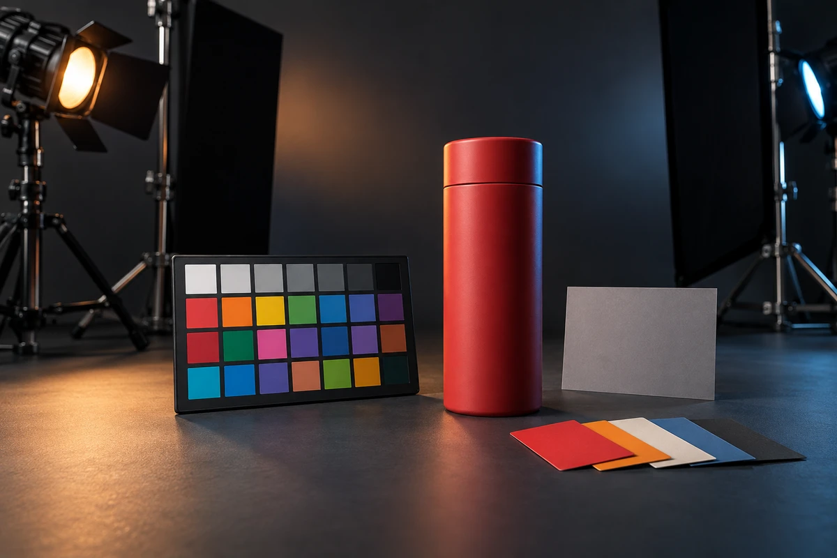
The hardest color argument on a product set is often about the color everyone already knows. The sample is on the table and the approved swatch is beside it. Then the lights come on: red leans orange, deep blue collapses toward black, and pearl white picks up a cyan sheen. Forcing the eyedropper back to a brand-manual value may not make the product look more accurate. It can flatten metal, plastic, fabric, and coating into the same digital fill.
Brand-color accuracy in product advertising is not a promise that every pixel will equal one RGB triplet. The useful goal is recognition: across plausible lighting, material response, cameras, postproduction, and playback devices, the audience should still read the same product and the same brand color.
Brand color exists in at least four states
The value in a brand guide is a reference color. A physical product also has material color: pigment, coating, texture, translucency, and gloss determine how it reflects light. Once filmed, it gains contextual color as direction, spectrum, surroundings, and exposure change the surface. Finally, it has output color, shaped by working spaces, displays, compression, and platform processing.
These states answer different questions. Reference color defines what the brand approves. Material color explains how the object reflects. Contextual color explains why this shot changes. Output color determines how the file is interpreted. Reviewing only a final screenshot can leave an upstream error for grading to repair, or mislabel a legitimate highlight or shadow as a color failure.
The same swatch can change when the light changes
Two surfaces may match under one illuminant and separate under another. Color temperature alone does not describe a lamp's spectrum, and materials do not reflect every wavelength evenly. Fluorescent inks, pearlescent finishes, metallic paint, translucent plastics, and layered coatings are especially sensitive.
The CIE's 2025 position statement on color-quality metrics notes that light sources and color science have advanced beyond the conditions that shaped older rendering metrics. A high rendering score can help qualify a light, but it cannot replace testing the actual sample, approved reference, and intended fixtures together.
A more useful set test fixes the key-light family first, then checks a neutral target, the main brand color, the brightest highlight, and the deepest shadow. Mixed fixtures deserve scrutiny wherever they produce contradictory casts on a hero surface. Highly reflective or transparent products also borrow color from the environment. This connects with our discussion of product shadows and spatial credibility, but the question here is how reflected color enters the product, not how shadow anchors it.
Make the camera understand neutral before adding a look
ARRI's Color FAQ recommends matching camera white balance to the scene illumination and checking a neutral gray target for residual casts, using an RGB waveform or vectorscope when the viewing environment makes a cast hard to see. Human vision keeps adapting; a warm monitor can begin to look normal after a long session.
White balance establishes a neutral reference, not the whole brand color. Capture should preserve three references together: gray or white for light and camera neutrality, a chart for color relationships, and the real product for material, highlight, and shadow judgment. Camera, lens filtration, ISO, white balance, fixture combination, and key exposure should travel with the footage. The ICC's paper on using profiles with digital camera images explains that standard encoded camera images are usually already color-rendered pictures rather than untouched measurements of the scene.
That is why a creative LUT should not be asked to repair an undefined capture. Establish neutral and product references, confirm exposure and input interpretation, and only then add the look. Otherwise each shot may need a different handmade correction, and the drift returns when a new version is exported.
Accuracy does not mean flattening material into a numeric patch
A stable brand color still changes across a real object. A cylinder moves from highlight to shade. Pearlescent material changes with angle. Metal reflects the set. Transparent packaging combines surface reflections with internal color. Pulling every region toward the center value of a swatch removes volume and can make the product look composited.
Separate the judgment into three layers. The color family and critical recognition zones must remain stable. Lit faces, shaded faces, and material highlights may vary. The reason for each variation must remain physically legible. When light, angle, material, or exposure explains a shift, viewers usually understand one product in space. Unexplained hue jumps between shots, mismatched white points, and CG elements that live in a different color world deserve correction first.
Live action, CG, and AIGC should share references, not methods
Live action is strongest for establishing how the actual material behaves: where highlights form, how far the brand color survives into shade, and how the finish changes during rotation. CG can control material, lighting, and camera precisely, but it still needs approved photographs, measurements, or material references. A hex value alone often produces a surface that is numerically correct and materially wrong.
AIGC is useful for exploring backgrounds, atmosphere, and palette direction, but it should not be the sole authority for a color-critical hero product. The 2025 paper Color Alignment in Diffusion proposes a dedicated method because ordinary generative synthesis can drift outside a target color pattern. Another 2025 paper, GCC: Generative Color Constancy via Diffusing a Color Checker, treats changing camera spectral sensitivities as a cross-camera color-constancy problem. The research shows progress, but also explains why prompt wording alone is not a color guarantee.
In a hybrid workflow, let filmed hero shots define material and brand color, use CG for repeatable structure and motion, and reserve AIGC for environment extensions that do not directly touch the product. Pass the same references, working-space notes, and approved variation zones at every handoff instead of sending one screenshot labeled “match this color.”
The final color decision happens in the audience's playback environment
Adobe's current After Effects color-management documentation separates input, working, and output spaces. It also distinguishes preserving RGB numbers from preserving color appearance. Those are not the same operation.
Platforms may reinterpret the file again. YouTube's recommended upload settings state that unspecified or unsupported color information may be assumed or converted to BT.709; certain wide-gamut primaries that require high bit depth but lack a supported HDR transfer function are converted as well. A wide-gamut master therefore does not guarantee correct appearance on every channel.
Start with the dominant viewing condition and derive controlled outputs from one managed project. A Rec.709 SDR master can serve mainstream video channels, while HDR or special-display versions receive separate monitoring and conversion. Review on a calibrated reference display to judge the creative baseline, then use common phones and office screens to confirm that the color family still reads correctly.
The goal is not identical pixels. It is explainable variation, documented conversion, and material that still looks like itself. If your launch video combines live action, CG, AIGC, and multiple channel versions, share the physical sample, approved references, critical materials, destinations, and existing 3D assets with ONCE. Through our brand film and product video production, we can connect lighting tests, capture references, grading, and multi-version delivery in one visual plan.
Sources
- ICC, Using ICC profiles with digital camera images, April 2005.
- CIE PS 002:2025, Colour Quality Metrics.
- ARRI Color FAQ.
- Adobe, Color management in After Effects.
- YouTube, Recommended upload encoding settings.
- Shum et al., Color Alignment in Diffusion, CVPR 2025.
- Chang et al., GCC: Generative Color Constancy via Diffusing a Color Checker, CVPR 2025.