A clear bottle can look perfectly legible to the eye and almost disappear when it is placed against a white sweep. Add a frontal light and the label becomes brighter, yet the bottle looks flatter. The problem is rarely a simple shortage of light. It is a misunderstanding of what the camera is being asked to see.
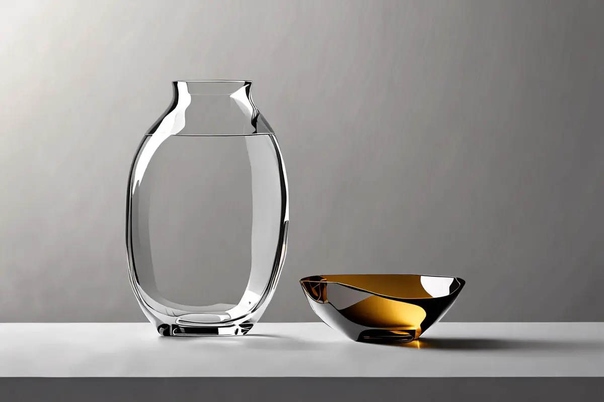
Glass, acrylic and transparent packaging do not describe themselves in the same way as a matte carton. What the camera records is the environment reflected by the surface, the background bent by refraction, and the light-dark changes created by thickness and curvature at the edges. Transparent product lighting should therefore begin with a different question: which reflections must be visible for the viewer to recognise this particular object?
Separate one transparent product into five visual jobs
A perfume bottle may contain at least five competing tasks. Its outline must separate from the background. The front surface needs enough gradation to feel rounded. The liquid colour must remain credible. The label must be readable. A metal cap or foil detail must not collapse into a blank white patch. Each task asks for a different relationship between source, surface and camera.
One large frontal source may make the label easy to read while erasing the side edges. Two elegant rim lights may define the bottle while leaving the contents and label in darkness. A more useful starting point is to set a hierarchy. Is the image primarily selling the silhouette, the liquid, the manufacturing detail or the brand label? “All of them” may be the final goal, but it is not a workable first lighting instruction.
Edmund Optics explains that each air-glass interface of an uncoated optical component reflects a portion of incident light, while the balance changes with refractive index, angle and polarisation. The production implication is simple: reflection is not merely a defect to remove from a bottle. It is one of the signals that makes the bottle's shape visible. Remove every reflection and the object may lose its volume with them.
Bright field and dark field are two outline systems
In a bright-field setup, the product faces a large luminous background. Light passes through the transparent body, while thicker or curved edges redirect more of it away from the camera, leaving relatively dark contours. This approach suits clean catalogue work, pale liquids and images that need to feel light and open.
Dark field reverses the relationship. The product sits against a dark background while long sources, cards or panels just outside the camera view create bright edges. It can reveal wall thickness and give the object a more sculptural presence. It can also bury the label and contents, so they usually need their own controlled reflection rather than a general frontal wash.
The two are not mutually exclusive looks. A grey gradient, a luminous panel interrupted by black cards, or different treatments on the left and right can combine bright and dark edges. In a Broncolor bottle-lighting demonstration, a long softbox, white reflectors and black paper create a continuous contour and a gradation that makes the bottle feel round. The useful lesson is not the brand or number of fixtures. It is that the bottle's form is controlled by the white and black surfaces it can “see,” and by the distances between them.
Build the background field before adding the product
Remove the bottle and make a background test first. Check whether the gradient is smooth, the highlights retain texture and the dark area still contains separation. Then return the product and observe what the edges do to that field. This distinguishes a background problem from a material problem.
A seam, hotspot or piece of untidy studio architecture will be compressed and bent by glass. Retouching can remove dust. It is far less convincing at inventing coherent volume from reflections that were never designed.
Large sources create shape; flags give the shape an edge
On a transparent or highly polished surface, a small source tends to become a bright point. A large source becomes a surface that can be shaped. A strip softbox can create a continuous vertical highlight; a broad diffused panel can create a gradual transition across curved acrylic. The width and character of the reflection depend on the apparent size and angle of the source from the product's position, not simply on output power.
White cards place luminous surfaces into the object. Black flags do more than reduce exposure. They define where a reflection stops, allowing the shoulder, waist or base of a bottle to become readable. Moving a black card a few centimetres can matter more than changing the lamp by a stop, because it alters the geometry of the reflection rather than its brightness alone.
This is also why dark clothing, controlled spill and a considered studio layout matter. Glass records the camera crew, monitor, white walls and ceiling with considerable honesty. Which parts of that environment remain visible should be a composition decision, not a surprise found at the end of the day.
Treat the label, liquid and cap as separate materials
Transparent packaging often puts several optical behaviours inside one silhouette. Paper labels scatter light more diffusely. Foil and metal caps behave more like mirrors. Liquids absorb, scatter and sometimes tint transmitted light. One exposure for all of them usually produces a compromise.
Complete the glass and background relationship first. Add a narrower, flagged source for the label. Shape the metal cap by adjusting the white and black cards it reflects instead of pointing a hard lamp directly at it. Judge liquid colour against a grey card, colour reference and the real sample, so “more saturated” is not mistaken for “more premium.” If bubbles, sediment or flow are shown, establish whether they are the real product state, a styling intervention or a clearly conceptual image.
Dust and fingerprints are not only still-image retouching issues. Profoto's perfume bottle guide recommends cleaning the surface and using gloves because reflective glass and metal make small marks conspicuous. In video, a speck that moves over hundreds of frames is much more expensive to remove than one in a packshot.
Polarisation can reduce glare, but it cannot make the creative decision
A polariser on the lens can reduce some reflections from non-metallic surfaces. Cross-polarisation, with linear polarisers on both the source and lens at perpendicular orientations, can suppress hotspots further. Edmund Optics demonstrates the effect with glass, water and machine-vision examples.
Polarisation is not a universal “remove reflection” switch. Its effect depends on angle, material and the polarisation state of the reflected light. Metallic reflections do not disappear in the same way as glare from glass or water. Filters also reduce light, and stressed plastics can reveal coloured birefringence. Most importantly, removing every controlled highlight can make a real bottle look like an isolated cutout.
Use polarisation to answer a specific problem: reveal the label, see the internal structure, or reduce a hotspot that blocks brand information. Keeping one reflection that explains the bottle's silhouette may be more truthful than pursuing a technically spotless but visually weightless surface.
When the camera moves, reflections must perform continuously
A highlight that works in a still frame may break during a turntable shot, dolly move or handheld pass. Camera, product and reflecting surfaces continually change angle, so the edge can move, widen or vanish. A moving shot needs more than attractive start and end frames. Its reflections must remain coherent through the entire path.
Make a quick phone or low-cost previs of one full rotation. Mark the angles where the outline disappears, the label is blocked by glare, or studio equipment enters the bottle. Then choose the lighting, turn range and cut points. Sometimes the product should rotate only through the most informative arc instead of completing a purposeless full turn for “premium” effect.
For another way to control attention inside one shot, see our article on rack focus in product advertising. Rack focus decides what becomes clear first. Reflection continuity decides whether the transparent product continues to feel like the same physical object.
CG and AI backgrounds often fail because product and environment do not know each other
A transparent object is not a silhouette that can be pasted onto any scene. Replace the background and you also change the refraction inside the bottle, the brightness of its edges, the reflection on the table and the contact shadow.
Adobe Research's LayerDecomp project treats shadows and reflections as part of the difficulty of separating a transparent foreground for editing. The 2025 TransparentGS paper likewise identifies specular reflection, refraction and secondary light paths from nearby content as central challenges in transparent-object reconstruction. These studies do not mean a general editing tool has automatically solved commercial glass. They explain why the task is harder than cutting a clean mask.
A stronger hybrid workflow retains a photographed product plate, a real matte, the contact reflection and a lighting reference. CG or generative tools can then extend the environment. If a background shifts from cool to warm but the bottle keeps exactly the same reflection, or if the camera moves while refracted texture remains locked like a decal, the audience will sense that the object is wrong even if they cannot name the optical reason.
Transparent materials are a useful stress test for hybrid production because they expose geometry, environment, illumination and temporal continuity at once. A brand does not need a mathematical simulation of every light ray, but it should ask for three basics: the outline should not jump, the label should not deform, and a changed environment should leave a corresponding response on the product.
The final question is not whether the bottle is bright enough
A convincing transparent product image does not hide every reflection or let one attractive highlight cover all the information. It gives the outline, volume, contents, label and movement distinct jobs, then chooses which of those jobs best expresses the product's value.
If you are developing visuals for glass, acrylic, transparent appliance parts or skincare packaging, prepare the physical sample, label versions, liquid state and intended movement before the lighting test. ONCE can help test bright-field, dark-field and hybrid approaches through our product video production service. A purposeful test is usually closer to the real problem than repeatedly asking post-production to “make the glass more transparent.”
Source note: On October 25, 2026, this article reviewed Edmund Optics material on polarisation and optical coatings, bottle-lighting examples from Broncolor and Profoto, and public research summaries from Adobe Research and TransparentGS. The production recommendations are editorial analysis based on those sources and established optical principles, not a client case study or performance claim.