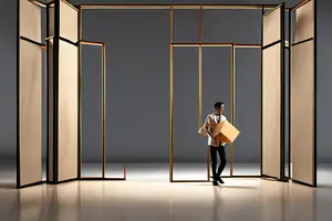
The same wireless speaker can feel like a specification-led commodity on a seamless white plinth. Place it on walnut marked by a faint water ring, leave an open book nearby, and it enters a lived-in world. Move it to lightly scratched dark metal and give the charging cable a deliberate curve, and it begins to belong to a studio or equipment bench. The product has not changed, but the audience has already formed an opinion about its price, its user, and the way it should be handled.
This is the underestimated work of product advertising art direction. A surface, a backdrop, and a prop do not merely fill empty space; they assign the product an identity before the copy arrives. Google Merchant Center treats lifestyle imagery as a distinct asset for real or staged contexts, while Shopify describes colors, props, backdrops, and sets as part of visual brand expression. The language is practical, but the implication is creative: context is information.
A surface gives the product a social position
A tabletop first communicates where a product belongs, who might use it, and how it is treated. Matte stone suggests control, cleanliness, and precision. A worn timber surface introduces time and routine. Gloss lacquer feels closer to a display case. Fine-grain metal can create an industrial, professional, or performance-led setting.
No surface is inherently more premium. What matters is whether it supports the product value. An expensive marble slab under a portable speaker may produce only generic luxury. A carefully reserved corner of a table, with a coaster, book spine, and cable establishing an action, creates a specific identity. Art direction should establish a believable relationship, not apply a style label.
Surface scale matters too. Oversized wood grain can make a small device look like a model, while very fine stone texture may collapse into visual noise at the chosen focal length. Evaluate the material through the actual lens and framing, not only from a sample board.
Write the action before choosing the props
A useful prop normally has a verb: open, connect, set down, charge, share, clean, or store. If the team cannot describe the action between a prop and the product, the prop is probably there only to decorate.
To express short-distance commuting with a pair of earbuds, the main relationship prop might be a folded transit-card holder, with keys providing scale. Add coffee, a magazine, a camera, sunglasses, and a plant, and the frame starts telling six unrelated lifestyles. The viewer reads the props before finding the product, so the product loses its role as the sentence's subject.
A practical division of labor is to let one prop explain the action, one establish scale, and, when needed, one shape the foreground or background. Surface, light, and negative space can carry the remaining information. Fewer props demand better causality.
Distance decides what becomes the protagonist
The distance between a product and its props changes their visual grammar. Too close, especially at similar scale, and they compete. Too far apart, and the prop looks like a decorative element pasted in later. A slight overlap can create depth, but it must not hide the silhouette, interface, or functional face needed to identify the product.
Negative space is part of the art direction. It supports copy and layout, but it also determines whether the product feels considered. Premium does not always mean empty. It means the information density around the product has been controlled. Pinterest recommends showing product features in context so people can picture themselves using the product; a useful context therefore needs a clear reading path, not a pile of cues.
Reduce the frame to a phone-sized thumbnail. Do you see the product first, understand the action second, and discover the brand mood third? If the order is reversed, the art direction has taken over the narrative.
Traces make a use situation believable
A perfectly untouched surface can feel like a showroom, while aggressive distressing makes a product feel neglected. Believable traces are few and causal: a pale ring left by a coaster, the natural spring of a charging cable, the edge of a page that has been turned, or small metal tools converging toward a work area.
These details work because they imply that an action has happened. They are not a lifestyle filter; they are evidence of time. They still need boundaries. A trace must support the product rather than obscure a feature, behave like the material it appears on, and stay within the brand's acceptable distance between cleanliness and use.
For a product positioned around hygiene, precision, or newness, move the trace to a peripheral prop instead of putting it on the product or its immediate contact zone. Realism does not require making everything old.
One set cannot pretend to be three worlds at once
Many product films fail not because the set is unattractive, but because it is asked to combine laboratory precision, domestic warmth, and the distance of a luxury display. Each world can work; all three in one frame cancel one another out.
Start with one decision: after this shot, should the viewer believe that the product is dependable, easy to bring into everyday life, or worth cherishing? Choose a primary answer, then let the surface, props, traces, and light prove it. Other values can appear in the next shot or asset.
This is also why character and art direction cannot be separated. The way someone holds the product, where they put it, and what remains after they leave all change the meaning of the set. Our discussion of role design in advertising makes the same point about people: a role is not a label. A tabletop is not a label either; it becomes meaningful through action.
AI background replacement often breaks contact
Generative tools can now replace backgrounds, extend canvases, and create new scenes quickly. Google Product Studio includes background generation, image creation, and product video tools. But the ability to replace a scene is not proof that the product belongs in it. The evidence lives in the contact shadow, perspective, reflections, edge color, and apparent weight.
Typical failures include a shadow that contradicts the key light, a base that does not press into the surface, a metal shell that still reflects the original studio after the background has become a living room, or a new camera height paired with the old perspective. Each error may be small; together, they create the feeling that something is wrong.
A more reliable hybrid workflow keeps the product's proportions, material response, and contact relationship in camera, then uses CG or AI to extend the environment, replace distant backgrounds, or create variants. If the tabletop must be generated, retain a real contact reference and inspect shadow, reflection, perspective, and edges one by one. AI can scale an art-direction idea; it should not invent product geometry.
Make three tabletop tests before the shoot
Directions get stuck in meetings because “premium,” “lived-in,” and “professional” mean different things to different people. Replace adjectives with three controlled tests. Keep the product, lens, camera position, and base lighting identical. Change only the surface, one relationship prop, and the distance between them.
Temporarily hide the logo and ask four questions:
- Who does this product belong to?
- What has just happened, or is about to happen?
- Does the perceived value match the positioning?
- Without copy, is the product still the first protagonist?
The more consistent the answers, the clearer the art direction. If answers scatter, do not immediately add more props. Return to action and surface.
A tabletop is never just the empty area under a product. It decides where the product lands and which life the audience places it in. ONCE can help develop that logic from use actions and art-direction tests through live-action and AI-assisted production, so every prop works for the product. Explore our product and advertising video services and bring your product materials and audience brief to the first conversation.