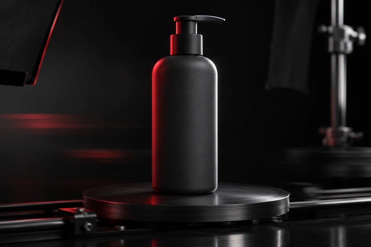
A drink bottle slides in from the right. The highlight is elegant and the rotation feels smooth, but the brand name reaches the camera just as the edit cuts away. A paused frame looks fine; at normal speed, there is no time to read it. Product advertising often treats packaging text as a static composition problem even though viewers encounter it through motion. The answer is not to keep every frame as sharp as an ecommerce still. It is to give essential information a stable, directional window in which it can be recognized.
Readability means finishing the read at the right moment
A moving product shot carries two jobs that can conflict. It should give the object energy while delivering a brand name, model, or defining message. Lock the front panel to camera for the whole shot and the result can feel like a spinning packshot. Chase only speed and flare, and the product becomes an attractive blur of color.
A more useful question is what the viewer must read and when. The entrance can establish silhouette, the middle can reveal material and volume, and the arrival at the hero position can stabilize one information panel. The complete shot carries readability; one frame does not need to carry every task.
Separate packaging information into recognition, meaning, and texture
Not every element on a package deserves equal clarity. The brand mark identifies the maker. A model, flavor, or short benefit line explains a difference. Regulatory copy, ingredients, and barcodes usually need to remain physically credible without becoming reading tasks inside a moving brand film. Without this hierarchy, the brief asks for an impossible combination: a fast orbit, a perfect front view, no reflection, and every word legible.
- Recognition: the brand, product family, and defining symbol need a stable window at normal playback speed.
- Meaning: flavor, capacity, or a short benefit line belongs in a settled shot, final hero view, or dedicated information shot.
- Texture: small copy and decorative detail should not warp, turn into nonsense, or disappear, but viewers do not need to read every word during movement.
This hierarchy also supports postproduction. If the critical panel never appears clearly in front of the camera, a compositor lacks a reliable reference for curvature, perspective, and how the print sits on the object.
Design a recognition window with an entrance, hold, and exit
A packaging shot can be divided into three phases. The entrance reveals form. The hold reduces angular speed while the main panel approaches camera. The exit restores motion. A hold does not require a frozen object. It can be a short interval in which rotation slows and the front angle changes less. The shot stays continuous while the audience completes the read.
Imagine a fictional skincare bottle. It slides across a tabletop, slows its rotation near the hero position, and presents the brand panel while a highlight travels beside the letters rather than across them. It then turns toward the pump and leaves. This is a staging example, not a client result or a claim about a real product. Typeface, coating, reflection, and safe movement still require tests with the physical sample.
Motion direction determines whether the words arrive or escape
The same speed feels different when text rotates toward the camera rather than away from it. A brand panel that arrives during the middle of the shot creates anticipation and then recognition. A front panel that begins readable and immediately turns away feels as if the information is escaping. Storyboards should mark the changing angle of the package front, rather than simply state that the product rotates once.
Lateral movement also changes the read. When camera and product travel in the same direction at similar speeds, relative movement in frame is lower and the panel can remain stable. Opposing motion increases relative speed and creates impact, but it is poorly suited to the first brand identification. A shot can use both: finish the read during matched movement, then use opposing movement as a transition.
A faster shutter reduces blur but does not solve readability for free
Sony's official explanation of shutter speed and motion blur notes that faster shutter speeds reduce blur while admitting less light. Sony's movie-recording basics also explains that normal video motion benefits from some blur, while very fast shutter speeds can make continuous playback feel choppy even when individual frames look sharp. Packaging text therefore calls for a tradeoff among action speed, frame rate, available light, and the desired motion texture.
For camera moves, control relative speed first
When the product is stationary and a slider or motion-control rig moves, reduce the panel's speed across the frame through path, distance, and focal length before relying on shutter. If the move is too fast and too close, a sharp frame still may not stay on screen long enough to read.
For product rotation, build deceleration into the motion curve
A turntable does not need one constant speed. Let the brand panel pass the camera slowly, then accelerate through less important angles. This usually feels more intentional than slowing the entire shot. If postproduction will retime the move, capture enough temporal information and keep the key panel free from vibration.
For hand interaction, motivate one repeatable pause
An actor can complete the grip, turn the package to check a flavor or mode, hold briefly, and continue using it. The pause comes from the task instead of suddenly presenting the object to the lens. A motivated action makes the readable moment feel like part of life rather than an inserted ecommerce display.
Light, focus, and print finish decide whether the text exists
Motion is not the only reason letters disappear. A strip highlight can cross the brand name, metallic foil can vanish at a particular angle, and a transparent label can merge with graphics on the far side. Before the take, run the product through its complete path and observe where the panel gains contrast and where reflection removes it. Then adjust source size, flag position, and rotation angle.
Focus must serve the information plane as well. Shallow depth can add dimension while leaving only the cap sharp and the name soft. At close range, a curved package rotating through the focal plane changes continuously. Instead of applying aggressive sharpening later, preserve usable depth for the critical panel or separate the material close-up from the brand-identification shot.
Post replacement should correct the package, not replace its physics
A packaging revision, language version, or late model update may require replacing a printed panel. A believable replacement must follow curvature, perspective, focus, motion blur, and highlight occlusion. If the new type remains perfectly sharp while the original package blurs naturally, viewers notice a label pasted on top of the footage.
Capture a front reference, a clean movement pass, tracking detail, and a neutral lighting version when alternate language packs are expected. The finished layer should still obey the camera: it blurs with the package and disappears under the same highlight. Different languages may also require different hold times because line length and occupied area change. A timing designed for short Chinese copy should not automatically be reused for a longer English or German panel.
Review the full shot at normal speed before inspecting frames
Do not begin review by hunting for the sharpest still. Watch the final aspect ratio at normal speed and ask whether the brand arrives early enough, remains long enough, and avoids captions, crops, and platform overlays. Then inspect highlight, focus, perspective, and replacement edges frame by frame. A shot that is technically clean in one frame but unreadable in continuous viewing is not a successful packaging-information shot.
If your launch film needs packaging, material, and function to remain clear inside moving shots, ONCE can mark information roles, recognition windows, motion curves, and language-replacement conditions in the storyboard before live-action or hybrid production begins. Explore our TVC and commercial production, or send the dieline, sample footage, and target aspect ratios through our project enquiry page. We will first decide what the viewer must read, then design how the product moves.
Sources: Sony USA, “How does shutter speed affect motion blur?” and “Movie-recording basics,” verified November 5, 2026. The recognition-window method, information hierarchy, and fictional skincare example are original ONCE creative methods and do not describe Sony's production process or an ONCE client result.