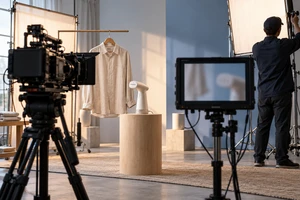
The product shot is clean and the claim is accurate. Then the copy appears, and the frame suddenly feels as if someone pasted an instruction sheet over the film. The most common response in review is predictable: make the type bigger.
Size is often not the real problem. The words have never entered the shot. They do not know what the product is doing, and they have no reason to appear at that moment. They simply wait above the image to be read. Kinetic type in product ads is not about making every word move. It is about deciding which words should join the action, which must remain quiet, and which information does not belong in the shot at all.
Separate three jobs before animating anything
One product message often contains three different jobs: naming what something is, proving that it is true, and pushing the film into its next beat. When all three use the same fly-in, bounce, or character-by-character scale-up, the frame becomes energetic but the information loses hierarchy.
Naming type must be recognizable first
Product names, model numbers, and feature names are naming type. Accuracy is their first responsibility, not performance. Letterforms, spacing, size, and reading time need to remain stable enough for immediate recognition and straightforward language replacement.
Naming type can move, but the motion should usually be simple. If a product slides in from frame left, the name might follow over a short distance and then settle. Once the name has been recognized, stability is often more valuable than adding another elastic flourish.
Evidence type should sit beside visible proof
Capacity, battery life, material, certification, and performance figures are evidence type. They should enter when the relevant fact is already visible or being demonstrated, not arrive early and announce a conclusion for the picture.
If a folding stand moves from stored to open, a line such as “open in one second” should not cover the screen before the movement occurs. Let viewers see how the structure opens, then place the line near the completion point. The words become a label for evidence instead of a curtain over it. Test conditions and limitations also need stable reading time; essential qualifiers should never be reduced to a flicker of tiny type.
Action type is the material that can truly move
Verbs, keywords, or short phrases that alter the relationship with the next shot are the real candidates for kinetic type. A word can be pushed aside by the product, written along a liquid path, turned with a dial, or released as a package opens.
Here, motion is not decoration. It is cause and effect. Viewers see the product act and the words respond, or the type proposes a direction that the product completes in the next shot. The copy becomes part of the story rather than a layer placed on top of it.
Make type inherit the product's motion
Imagine a portable blender ad in which a vortex accelerates inside the cup. If the word “smooth” simply bounces up from the bottom edge, its motion has no relationship to the product. If the letterforms gather slightly along the vortex and settle when the blades stop, the type inherits the product's visual logic.
That inheritance can come from four qualities: direction, speed, weight, and resistance.
- When the product advances, type can establish a reading order in the same direction.
- When a dial gains resistance slowly, the letters should not move like weightless stickers.
- When a soft material rebounds, the type may lag slightly, but it should not exaggerate more than the product.
- Glass, metal, or liquid optics can influence how words are revealed without turning the brand typeface into an unfamiliar alphabet.
The most common failure is type that is more excited than the product. A lid closes, but the words keep shaking, stretching, and flipping. Attention leaves the product and lands on the animation technique. Type should help viewers read the product action, not compete for the last beat.
This is why general-purpose presets so often look attached rather than integrated. Adobe's current After Effects text-animation documentation explains that selectors can animate characters, words, or lines and that motion blur can be added. It also warns that preset values created at one composition size may sit incorrectly in another. The software can make type move; it cannot decide whether that movement belongs to this product.
Give every entrance, hold, and exit a reason
Good kinetic type answers three questions: why does it appear now, when has the viewer finished reading, and why does it leave at this moment?
An entrance can be triggered by contact. A finger presses a control and the copy grows from that point. Packaging tears open and reveals a word that was previously hidden. Light travels across a material and confirms a specification beside the newly visible detail. The clearer the trigger, the less spectacle the animation needs.
The hold should not be timed only to music. Naming type needs recognition time. Evidence type needs comprehension time. Action type can be shorter, but viewers still need to understand how it affects the frame. In our article on commercial editing rhythm, we described music, action, and comprehension as separate clocks. Kinetic type has the same problem: the moment a line has been understood may not land on the drum hit.
An exit is strongest when the next action causes it. The product can occlude the words, the camera can carry them out of usable space, or the shape in the next shot can continue the direction of the last letter. A fade is not forbidden. When the information job is complete and the picture offers no better action, a quiet fade may be the most accurate choice.
Horizontal and vertical versions require different relationships
Platform interfaces occupy real space. Captions, account names, buttons, and descriptions alter the available safe zone. TikTok's reservation in-feed specifications, last updated in July 2025, say that key text and logos should stay within the safe zone. The available area changes with aspect ratio, caption length, and interactive add-ons, and TikTok recommends previewing the actual presentation before launch.
This means vertical adaptation is not simply a matter of moving words toward the center. A horizontal frame can place product and type side by side. A vertical frame often benefits from depth, upward and downward handoffs, and changing scale. Our guide to vertical ad blocking explains how people and products can use depth in 9:16; kinetic type should belong to the same spatial plan instead of being squeezed into leftover space.
A more resilient workflow defines the relationship among product, action, primary message, and secondary information before it fixes coordinates. The same motion principle may continue across versions, but paths, sizes, and resting positions should be redesigned for 16:9, 9:16, and 1:1.
Adobe's Responsive Design - Time, updated on March 27, 2026, can protect intro and outro animation regions while the overall composition changes length. That is useful production infrastructure for reusable templates. It does not decide the composition for each aspect ratio.
Silent and sound-on viewing should preserve the same cause
Kinetic type should not simply duplicate a voice-over. Sound can supply weight, speed, and transition while words name or confirm the event. Both channels can point to the same action without saying the same thing.
When a latch closes, for example, the sound can deliver the crisp sense of completion while the word “locked” appears at the contact point. In silence, the hand movement, structural stop, and type position still communicate completion. With sound, the audience gains an additional cue about material and force. If the silent version leaves only words bouncing, the product action is not carrying enough information.
Platform guidance should not be misread as a reason to add more copy. TikTok's official video advertising guide emphasizes vertical presentation, captions, sound, and keeping elements within safe areas. It does not imply that captions, narration, and animated type should repeat every point. The better test is whether the central cause-and-effect still works when one channel is removed and whether the remaining channels avoid becoming noise.
AI can extend motion material, but brand type must remain controllable
Generative video is useful for exploring flowing backgrounds, material transformations, particle paths, and possible motion directions. It is a poor place to permanently bake exact brand names, model numbers, and specifications into an uneditable image.
The research project Dynamic Typography, submitted in 2024 and later published at ICCV 2025, uses vector representations, shape-preservation methods, and perceptual-loss regularization to combine semantic motion with legibility. Meta AI's April 14, 2026 paper TransText treats consistency between transparent alpha information and RGB appearance as a central problem. These are research systems, not turnkey production standards, but they make a practical point visible: moving words while preserving outline, transparency, and temporal consistency is a specialized control problem.
For commercial production, the useful response is to separate layers. AI can generate motion references, backgrounds, and transitional textures. Brand words, legal copy, product specifications, and language versions should remain vector or independent text layers wherever possible. A changed number, a translated line, or a new platform safe zone can then be adjusted precisely instead of regenerating the entire shot and accepting unpredictable letterforms.
Kinetic type feels most accomplished when the viewer never thinks, “now the motion graphics begin.” The words emerge from a product action, complete one act of reading, and return attention to the product. They are neither outside the picture nor standing in front of it.
If you are planning a product campaign that must work across horizontal, vertical, and multilingual versions, bring the product action, required information, and delivery formats to ONCE. Through our product advertising and video production services, we can identify which words must remain stable, which keywords deserve to enter the action, and how live action, motion design, and generative tools should divide the work.