Before a product film begins shooting, the set wall is painted in the brand red, the performer is put in a red jacket, the props are changed to red, and post-production plans to add a warm red cast across the whole film. Every choice appears "on brand" in isolation. Together, they can produce the opposite result: the product loses its outline, skin tones become muddy, material differences disappear, and the brand color itself has no entrance because it is already everywhere.
Brand color in video is not mainly a question of coverage. It is a question of function. Color can help viewers locate the product, heighten attention when an important action happens, or connect different settings into one recognizable brand world. Once color has a job, it no longer needs to fill every frame.
Brand color is visual grammar, not painted area
Marketing research has long suggested that hue, value and saturation contribute to how people interpret brand personality. That does not mean a color carries one universal personality. In four studies, Lauren Labrecque and George Milne examined the relationship between color, association and brand meaning rather than offering a context-free color dictionary.
For filmmakers, a more useful idea is to treat brand color as a repeated relationship. It can play three common roles.
The first is location. In a visually busy frame, color appears only on a product edge, a control or an object in the performer's hand, telling the viewer where to look. The second is trigger. Instead of filling the opening background, the color arrives when the product responds, the interface confirms an action or the story turns. The third is connection. One hue travels through several scenes in different forms: a line on clothing, a practical light in a room, then the package and end-frame graphics.
All three can build recognition, but they are not interchangeable. Give color a role first; only then can the frame decide where it should become strong and where it should step back.
Decide who is allowed to carry the color
Brand color usually loses control when art direction, wardrobe, lighting, product design and grading all try to add more of it independently. Every department fulfils the brief, but the frame loses its hierarchy.
Color responsibility can be divided into three levels. When the product carries recognition, the environment should separate it rather than imitate it. When the performer carries emotion, skin tone and fabric texture must work first, while brand color can retreat to an accent. When the space carries the world, color should create relationships among surfaces, props and light instead of coating every object with the same value.
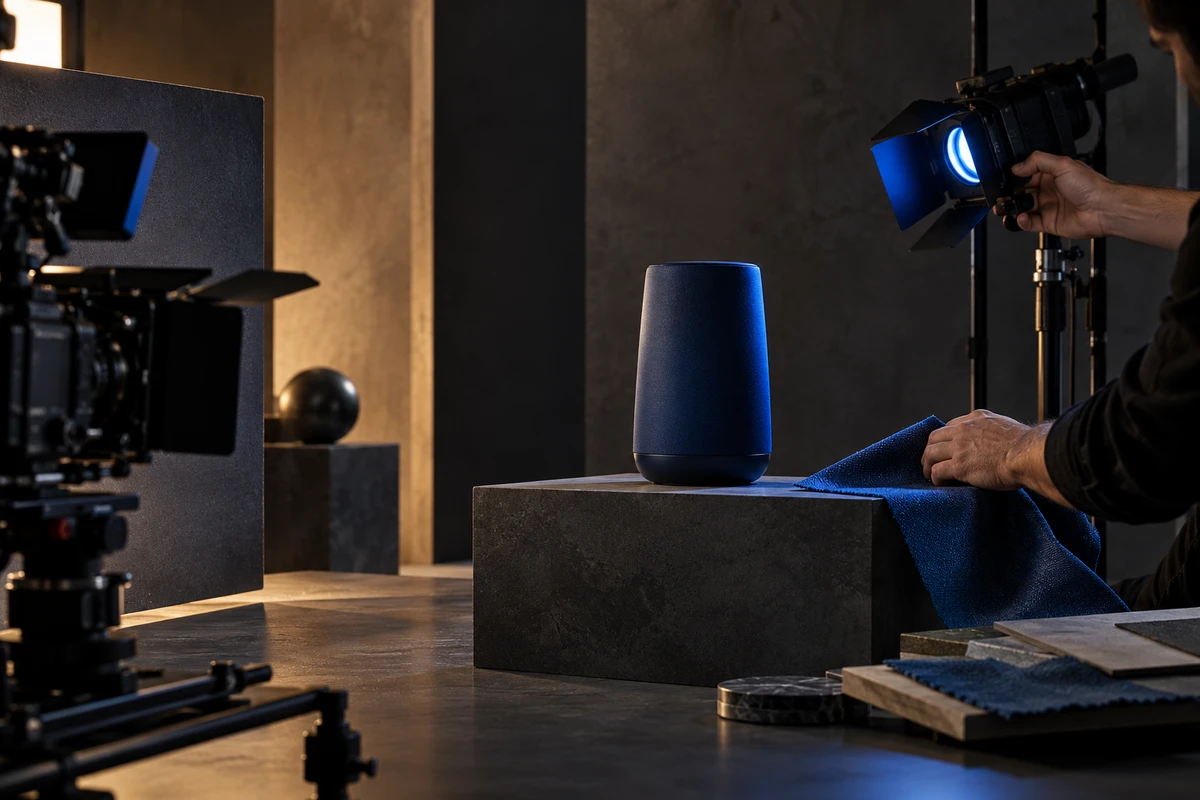
Imagine a deep-blue smart device in a nighttime home. A matching wall and costume may allow the product to disappear. A stronger arrangement could keep the wall neutral and restrained, reserve the most stable blue for the device, and let a lighter related hue appear only in a distant lampshade or glass reflection. The brand remains present, but the product owns the highest color weight.
There is no universal percentage for this. Reduce the frame, play it silently or glance at it quickly: does the color lead attention to the correct object? If viewers remember a field of blue but cannot say where the product was, more coverage has not created more recognition.
The same value becomes a different physical event on every material
HEX, RGB and Pantone references matter, but they cannot replace decisions on set and in post. The same blue behaves differently on matte paint, velvet, anodized metal, a phone display or colored light because reflectance, luminance, white balance and exposure change what the camera records.
That is why brand color should be tested together with material. A saturated wall can cast unwanted color onto skin. A colored fixture changes nearby objects, not only the intended prop. Metallic color depends on the environment it reflects and can shift as the camera moves. Screen color changes with brightness, shutter settings and the final display.
A useful pre-production test puts the key color on the real material, under the intended light and at the expected camera angle. For glass, metal and reflective products, ONCE's article on lighting transparent materials and contours makes the related point: light changes not only brightness but also the material viewers believe they are seeing.
Let color enter over time
Unlike a still image, video allows color to arrive later and retreat after it has done its work. Its intensity does not need to remain constant from the first frame to the last.
A product film can begin with a restrained environment and one weak color cue. When the performer activates the product, the core hue can emerge from the product, a display response or a practical light. As the story reaches its result, the color may spread into the space; the ending then returns to the clearest product and brand identification. Color becomes both a visual asset and a narrative action.
If the opening already fills the set, wardrobe and lighting with the brand hue, later scenes have little room to use it as a change. The color can only remain present; it can no longer happen.
Place the storyboard frames in one small row and ignore everything except color rhythm. Which scene is quietest? When does the core hue first appear? Why does it peak? After the product leaves the frame, does color continue to speak for the brand? This color timeline gives directors, cinematographers, production designers and colorists a shared decision that is more useful than "make the whole film bluer."
Live action, CG and AIGC need one color language, not one filter
Hybrid production makes color management more important. Live action starts with a camera, CG may be rendered in another working space, and generative imagery can arrive with its own color bias. If every stage judges "close enough" on a different display, saturated brand hues, skin tones and product highlights are often the first things to drift.
The official Academy Color Encoding System documentation separates input transforms, working encodings and output transforms so cameras, CG, grading and display outputs can share a clearer color-management path. ACES can reduce ambiguity, but it cannot decide how bright a brand color should be, which object should carry it or when it should appear. The technical pipeline creates common viewing conditions; creative rules give color meaning.
Generative tools are adding more controls. In an enterprise beta updated on October 13, 2026, Adobe Firefly allows custom models to use HEX brand colors and descriptive color names. Its official brand color guidance recommends distinct colors, a smaller palette of fewer than ten colors and training images that actually contain those colors. The feature shows that models benefit from explicit color constraints and examples; it does not make review optional.
For AIGC imagery, check not only the value but also where the color lands. Does it contaminate skin? Does it make the product look plastic? Does it tint shadows that should stay neutral? Does the same object keep the same color role across shots? When necessary, let generation handle environment and atmosphere, keep the product in live action or controlled CG, and connect them through compositing and selective grading.
Turn "more on brand" into a scene that can be produced
If a color brief says only "premium, young and strongly branded," the production may translate it as more saturated and more uniform. A useful creative description names the object, timing and protected elements.
For example: "The core blue belongs only to the product status light and the window reflection in scene two. Keep skin natural; do not wash faces with blue light. Before activation, retain one low-saturation blue prop. After activation, blue may expand into the background, but the product outline must remain clearer than the set. In the ending, packaging, graphics and the status light should return to the same primary color relationship."
This paragraph does not dictate every lamp or numerical setting. It tells each department who carries the color, when it appears, what must not be sacrificed and what post-production should protect. It also gives live action, CG and AIGC the same review question: not "is it blue enough?" but "did the color perform its role?"
Brand color is often most powerful not when it occupies the frame, but when viewers begin to expect its return. Stable pixels are not the goal. Stable rules for location, trigger and connection are. For more on how art direction, lighting and finishing work together, explore ONCE's video production insights.
If you are developing a brand film, product campaign or long-term content system, bring your color standards, product images and three reference frames you want to preserve. Use ONCE's brand film production page to discuss a color method that can travel into storyboards, sets, lighting and post-production.
Sources reviewed October 14, 2026. The smart-device scene is a creative hypothesis, not an ONCE client project. The color research, ACES documentation and Adobe feature notes support specific points about brand association, color management and generative controls; they do not replace testing with the actual product, materials, lighting and delivery displays.