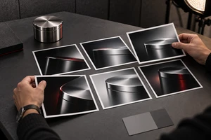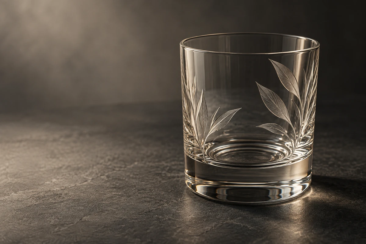
Imagine a clear drinking glass going into a diffusion tent. The image looks clean, yet the walls appear hazy. Switch to a dark background and narrower highlights, and the rim becomes distinct—but the engraving disappears. Neither result necessarily indicates incorrect exposure. The two setups may simply emphasize different features.
The useful question is what viewers should notice first: thin, transparent walls, a substantial silhouette, or the engraved surface. These qualities can coexist without receiving equal emphasis in every shot. For fragrance, drinkware and homeware brands, that choice helps determine the product's visual character.
Make clarity a visible goal
Replace the word “clear” with things you can actually inspect: can you see the background through the vessel, distinguish its rim, read the thickness of the base, and separate the liquid from the container? Those questions help identify whether the background, edge definition or frontal reflections need attention.
A bright background is a useful starting point for exploring a light, clean, everyday mood. Lock the camera and product position. Observe the glass against an evenly illuminated background, then gradually bring black cards toward the sides of the frame. Their effect depends on whether they enter the regions reflected by the glass, rather than simply how close they look on set. Move one card at a time and watch whether it changes the rim, wall or base.
Avoid increasing exposure indefinitely in pursuit of white. View the image at its intended display size. If the rim has merged into the background, more brightness adds little product information. Try card position, the size of the bright area and camera angle before adjusting overall brightness. This is a proposed testing sequence, not a universal lighting diagram.
A dark background can define shape and change perceived material
Bright edges against darkness can make a curved rim, slender stem or thick base the subject of the image. But if the space between two attractive white lines becomes a gray wash, clear glass may start to resemble a frosted finish.
In its glassware-on-black shoot account, Photigy describes broad diffused reflections making a transparent, glossy bottle appear matte. Black screens and narrower illuminated gaps gave the photographer more control over the outline. The lesson is limited but useful: a larger diffuse source does not automatically describe a material more faithfully.
Treat highlights as lines in a composition. Matching widths and brightness can emphasize symmetry; a wider highlight on one side and a thin line on the other can suggest direction. These are expressive choices, not grades of quality. Turn the glass slightly and inspect the shoulders and base before committing to a setup that works only from an easy frontal angle.
Give engraving its own light
Making the vessel readable does not guarantee that its surface treatment will be visible. Engraving, frosted areas and polished glass deserve separate consideration, particularly when craftsmanship is the product's distinguishing feature.
The official broncolor tutorial How to Photograph Engraved Glass, by Karl Taylor and Urs Recher, describes a specific contrast: overhead soft light made the scene even but left the engraving indistinct. Adding hard light with a projection attachment made it more visible. This account refers to the official page's written explanation; it is not an experiment reproduced by ONCE.
Use that observation to develop a sample of your own. Keep the background and rim you already like, introduce a tightly controlled beam, and slowly change its direction while watching the engraving. Establish whether the light reveals the workmanship before dealing with any new reflections it creates. There is no need to brighten the entire vessel at once.
For frosted glass, try a different objective: let a gradual tonal transition describe volume and a sense of touch. Do not require it to disappear into the background like a clear vessel. Within a range containing both finishes, consistent composition with individually adjusted lighting can explain the differences better than one rigid setup.
Let labels, liquid and glass have different lighting jobs
Commercial products often combine paper labels, metal caps, printing and colored liquid. Illuminating everything at once does not ensure that everything becomes legible. First identify what carries recognition and what carries material character, then test their lighting separately.
In How to Photoshoot Glasses, broncolor describes upper fill emphasizing reflections and lower fill emphasizing the transparency of the frame, with controlled illumination for specific design elements. The subject is eyewear, so its positions are not a formula for bottles. The transferable idea is to give different lights different jobs.
Imagine a fragrance bottle with a paper label. Once its edge highlights work, try moving a small white card to help the label; if that is ineffective, test a controlled local fill. After each addition, inspect the glass for new broad reflections. Label readability and material character may require a compromise—or two complementary shots.
Design how the material changes over time
Video introduces a question that a still photograph does not resolve: does the lighting work through the movement? A highlight that looks good from the front may widen, break or cross the label as the bottle rotates. That change can interfere with recognition, or become a deliberate way to reveal shape.
Try a short study of one product: establish its complete outline in a steady shot, rotate it slowly so a highlight travels across a curved surface, then stop where the engraving reads. This is a storyboard proposal; testing the actual sample should determine the movement. If rotation repeatedly obscures the label, keep the product still and try a small camera or lighting move instead. Change one variable at a time.
The image does not need to stay equally bright throughout. Establishing shape, revealing workmanship, then returning to a recognizable product view is one possible viewing sequence. Judge it by whether each moment adds useful information, not by the spectacle of the highlights.
Use one sample to answer one creative question
Begin a lighting study with a specific question: is the most interesting quality lightness, weight or handmade texture? Keep two interpretations for comparison and describe what each sacrifices. A dark background may emphasize contour while weakening the impression of liquid color; stronger engraving may come with more visible surface reflections.
There is no need to label a result “premium” in advance. Discussing actual images gives the brand and production team a clearer way to find the right character for this product. For developing those studies into finished content, explore ONCE's video production articles.
Planning visuals for glassware, fragrance or homeware? Bring a product photograph and a visual reference that captures the intended mood to ONCE to discuss a material and lighting direction.
Sources checked on October 13, 2026. The testing and storyboard suggestions are editorial analysis, not completed client projects. Lighting positions must be adapted to the sample's shape, surface finish and camera angle.