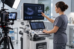
Imagine a corporate film introducing an intelligent warehouse. Live-action footage can show shelves, robotic arms, barcode scanners, and a control screen. It cannot directly show how an order enters the system, how tasks are assigned, or how an exception returns to a human decision. The images become polished, the voice-over becomes abstract, and the viewer still does not understand what the system actually changes.
Motion graphics should not be added simply to make this sequence feel more technological. Their real job is to make relationships visible when a camera cannot record them directly: where data starts, which layer handles it, what state changes, and how that change reaches a real person or machine. When that explanatory chain is sound, a restrained system of lines, masks, shapes, and color can be more persuasive than elaborate effects.
Cameras capture surfaces; technical value often lives between them
The hard part of explaining technology is rarely that the product is completely invisible. Its value is usually hidden in three dimensions that live action struggles to capture.
The first is time. The value of an alert may be that it identifies a pattern before a failure. The value of automated scheduling may be that a change in one stage immediately alters the next. Separate equipment shots show that everything is running, but not what happens first or why.
The second is hierarchy. A sensor, an edge device, a platform, and a management dashboard may all contribute to the same outcome. Live action can show each one. It rarely explains who collects, who decides, and who executes without asking the viewer to assemble a system diagram in their head.
The third is causality. A curve on a screen, a vehicle changing direction, and a quality engineer reviewing an exception may belong to one business chain. Without a visual connection they remain three attractive shots. With one, viewers can understand why a signal caused an action.
Before adding graphics, ask what the footage is missing: texture or relationship? If the missing element is relationship, more aerial footage, particles, and transitions will not make the explanation clearer.
Choose the verb before the style
An effective technical animation can usually state its task as a verb. The clearer that verb is, the less likely the design is to become decoration.
Flow shows where something travels
Use it for data, energy, material, or instructions. A glowing line is not enough. The viewer needs an origin, a direction, the relevant nodes, and a visible change at the destination. When every route lights up at once, the system merely looks busy. Letting one critical path complete first gives the audience something to follow.
Reveal shows what is inside
Use it for product structure, software modules, or organizational layers. Do not explode every component simultaneously. Hold a stable outer form, then open only the layer needed to answer the current question. The viewer must know that they are still looking at the same object.
Switch shows what changed
Use it for states, permissions, modes, or process changes. Keep one reference point stable: the same screen, machine, or production line. Without that anchor, before and after become two unrelated designs.
Focus shows where to look now
Use color, contrast, masks, or magnification to guide attention within a complex interface or assembly. One moment should emphasize one judgment. When everything is highlighted, nothing is.
These verbs can work together, but they should not compete in the same second. Strong motion design does not make every element move. It makes the layer that matters now move.
Start every animation from a real anchor
Pure animation can make any technology feel smooth, which is also why it can lose credibility. In a corporate film, graphics are stronger when they begin with a physical object in the footage and return to a physical result: from a sensor light into a data path, from a tap on a control screen into a system layer, or from the movement of a product into a scheduling decision.
Return to the hypothetical warehouse. A weak treatment darkens the space and covers it with dozens of blue light trails. It says digital transformation without answering a business question. A clearer sequence begins with an operator scanning a real order. The graphic identifies that order entering the system. The next shot keeps the same identifier while three states—assignment, execution, and review—appear in sequence. The graphics then disappear as live action shows a robotic arm changing route and the operator confirming an exception.
This is not an ONCE client case and does not represent the interface of a real warehouse system. It demonstrates a transition principle: live action establishes that something exists, graphics explain the invisible relationship, and live action verifies the consequence.
The anchor should also constrain art direction. If a real interface uses green for normal status, the animation should not reverse that meaning simply because a neon palette looks more premium. Technical graphics may be abstract, but they cannot speak a different language from the physical world in the same film.
Complex information needs staged change
Animation is not automatically easier to understand than a still image. A 2007 meta-analysis by Höffler and Leutner reviewed 26 studies and found an overall advantage for dynamic visualizations, with stronger results when animation represented a process rather than serving as decoration. These were instructional settings, not corporate-film effectiveness studies, so the findings cannot predict marketing outcomes. They do support a useful creative distinction: motion matters when it carries information.
A 2019 meta-analysis of the segmenting effect found that dividing multimedia explanations into meaningful, coherent sections improved retention and transfer while reducing overall cognitive load. A corporate film is not a classroom and viewers may not control playback, but the design implication still travels well: let each graphic beat update one central idea.
Do not place a cutaway, four data paths, six parameters, and three customer benefits into the same two seconds. Reveal the component first. Let one route pass through it. Show the resulting state last. Voice-over should name the change after the image has made it available, rather than racing ahead to the next layer.
This is also why a pause can help. When a graphic reaches a node and holds for a moment, the sequence is not becoming slow. It is telling the viewer that the current state deserves confirmation.
Separate recorded data, diagrams, and generated imagery
The most damaging error in technical visualization is treating “looks like a system running” as proof that the real system runs that way. Every curve, number, path, and interface should have a declared status.
- Recorded data comes from an actual device or system and has a source, time, and scope.
- A sanitized reconstruction follows a real structure but removes customer, account, or sensitive parameters.
- A principle diagram explains a relationship without claiming real scale, speed, or interface design.
- A concept scenario describes a future product or unbuilt deployment and must not be presented as current reality.
These categories do not all need oversized disclaimers, but their visual language should differ. A real interface may keep its native layout. A principle diagram can use more abstract shapes and a short “illustrative” label. If animation changes timing or scale for comprehension, it should not be mistaken for an engineering simulation.
Generative tools can help explore atmosphere, transitions, and early style frames. They are a poor final authority for precise technical text and structure. The LOVE benchmark published at ICML 2026, covering 30 text-to-video models, still reports limitations in perceptual quality and text-video alignment. A newer 2026 preprint, VTR-Bench, likewise found widespread difficulty with text rendering in video. For corporate work, generated material can enter concept development, but final names, numbers, arrows, and system layers should return to editable vector or compositing layers for deliberate review.
Build an explanation language, not a one-off overlay
If every technical idea introduces a new color, arrow, and transition, the audience must repeatedly learn new rules. A stronger film establishes a small grammar: one color for input, one shape for a device, distinct line styles for confirmed and conditional paths, and one error behavior.
Adobe's current guidance on building a motion graphics package identifies a cohesive palette, type system, animation approach, and texture as shared elements. It also recommends keeping recurring text and color controls editable through templates. For a corporate film, that consistency is not only a post-production convenience. It lets a website film, trade-show loop, sales presentation, and later product update share one explanation language.
Plan bilingual versions at this stage as well. Text baked into generated footage is expensive to translate. Separate title, parameter, unit, and label layers can accommodate longer English copy, terminology review, and different aspect ratios. Space for localization should exist in the first design frame, not appear as an emergency after approval.
If the camera can prove it, let the camera do so
Motion graphics are often misused to replace missing evidence with atmosphere. If a capability can be shown through a real operation, sample change, test process, or expert decision, live action usually carries more weight. Animation can explain the internal relationship; it cannot prove an outcome that has not occurred.
Remove the animation and ask whether viewers can still confirm that the capability exists. If not, gather stronger footage, records, or demonstrations first. If the capability is visible but its mechanism remains hard to follow, then motion graphics have a precise job.
Explore more thinking on corporate film and video production. If you are planning a film for a complex product, industrial system, or B2B service, begin with the three relationships your audience finds hardest to understand, the real interfaces or data that can be shown, and the terms that must remain exact. ONCE can then help decide what should be filmed, what should be diagrammed, and where the two should meet.
Sources were reviewed on October 14, 2026. The multimedia-learning studies cited above come from instructional contexts and do not replace audience testing for a specific corporate film. AI benchmarks describe their samples and the models available at the time, not a permanent limit for every tool or task.