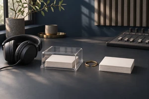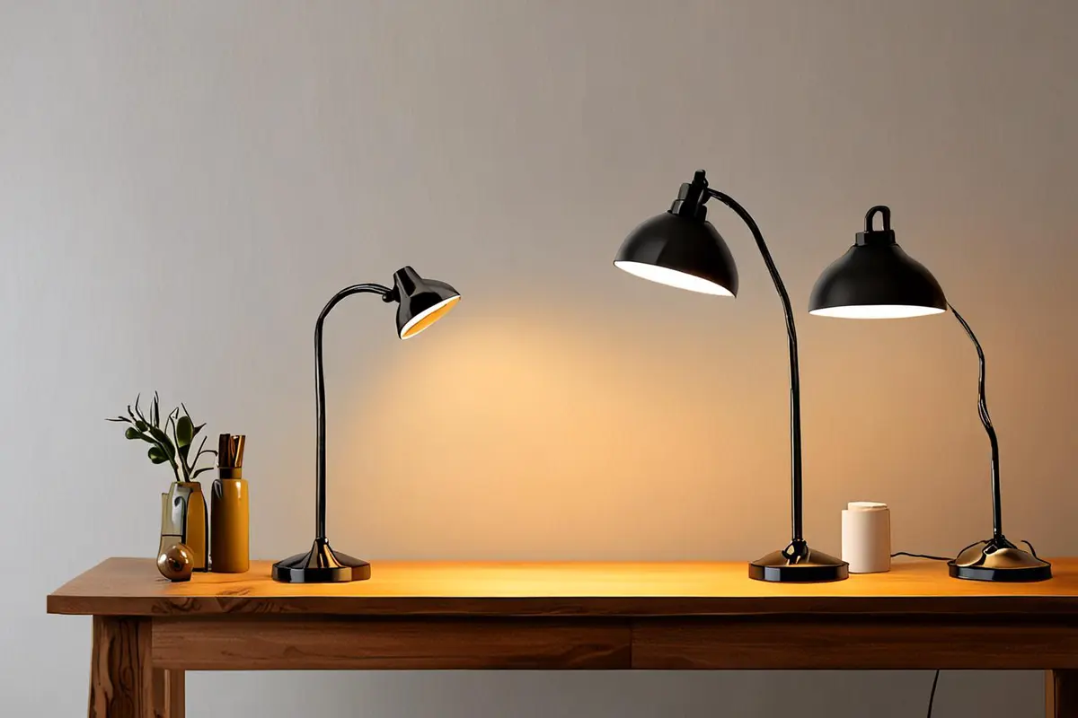
Three products appear together, each with a different color, background and camera angle. Every image looks attractive alone, yet together they seem to come from different brands. Another campaign uses exactly the same background, angle and light for all three. The family resemblance is clear, but the differences between models are not.
Product family advertising must answer two questions at once: why do these products belong to one brand, and what makes each one distinct? Consistency need not mean duplicating one image; distinction need not depend on adding more colors.
Give shared and distinct qualities different roles
Imagine a fictional range of three desk lamps: a compact model for a narrower desk, a standard model with an adjustable head and a larger model for a wider working area. These are assumptions for a creative exercise. An actual campaign must use the brand's confirmed features and conditions.
The lamps might share a compositional logic: the relationship between desk and person, product height, restrained backgrounds and consistent placement of the brand mark. Their actual structures, directions of light and use of space can carry the differences. A viewer can first recognize the family, then understand each model through its use.
Show differences where comparison matters
If the compact lamp saves desk space, a different background color cannot explain that. Place each model on a comparably sized workstation and keep the desk edge as a reference, then show the space each occupies. Actual dimensions and placement distances must be accurate; hand size is not a precise measurement.
The adjustable model calls for a complete action: a hand turns the head and the light moves to another working area. Each model need not have an entirely different story, but its distinguishing shot should help with a clear choice. Claims about illumination, coverage or other performance need verifiable product information in both imagery and copy.
Leave room for different materials
Different colors of one lamp may have different surfaces. A glossy finish needs control over reflections; a matte finish needs a visible light-to-dark transition. Identical lighting can erase the texture of one finish. Keeping a similar direction and overall character while adjusting reflectors for each material offers a more useful kind of consistency than forbidding any change in the setup.
For a group image, order also matters. An arrangement by size makes structure easy to read; grouping by use helps explain choice. The family image and the individual images need not do the same job. Give each product room in its own image and use the group to explain their relationship.
Extend a main film into shorter pieces
A family film might establish a shared working environment, then introduce each lamp in a different position. Individual cuts need not be mechanical extracts: the compact model might begin with space freed on a desk, while the adjustable version begins with the moving head. Both can return to a related closing product shot.
Brand recognition does not depend only on an end card. Related pacing, clear product orientation and a consistent written voice can connect pieces. These are creative choices, not guarantees of memory or sales. Explore ONCE video production insights for related approaches to visual systems.
Ask viewers to describe the difference
Show the family image and short films to people outside the project. Ask which products seem to belong to one brand and what difference stands out for each. If they can name only the colors, revisit the shots and copy instead of merely adjusting saturation. A few responses can uncover comprehension problems; they cannot represent the whole market.
If you are planning launch content for several product models, contact ONCE to discuss the visual family, product scenarios and production.