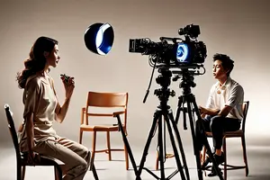
A button lights up and a status changes from “pending” to “assigned.” Someone who uses the software every day may understand immediately; a first-time viewer may not know whose work has changed. A software demo video needs to show the interface while helping viewers understand what is happening beyond the screen.
Enter the screen through a person's task
Imagine software used to assign equipment maintenance requests. A coordinator receives a pending task and needs to send it to the right colleague. This is a fictional narrative exercise, not a real product, client project or verified efficiency result. Begin with the coordinator reviewing the task, then enter the interface: the audience understands the person's aim before seeing the button.
“Make work more efficient” is a desired message, not a filmable action. Turn it into an observable question: who receives the task, where does the coordinator find its status, and what information reaches the next person? The answers should come from a workflow the brand has confirmed.
Let one action carry one change
Show a readable close view of selecting a task, assigning a person and updating the status, then return to the colleague reviewing the information. Every mouse movement need not appear in full, but an omitted step must not determine the outcome. If the real workflow also requires confirmation, permission or waiting, communicate the relevant conditions accurately.
Editing can compress waiting, but do not join unrelated times or accounts to suggest an instantaneous result. For complete instruction, create a tutorial people can pause; a short ad may focus on one essential action and direct viewers to detailed material for the rest.
Let the screen and workplace answer each other
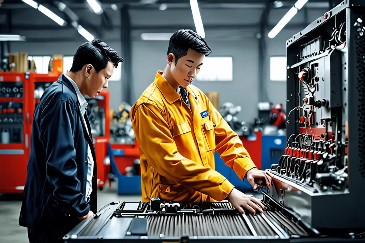
The interface shows a task being assigned. The next shot can show the colleague reviewing it and then checking the equipment. Both images answer the same question: who received the information, and what do they do next? If the work has not actually taken place, distinguish a staged scenario from a recording; do not present a reenactment as a client's workplace.
The sequence can also begin with someone noticing an issue at the equipment, then cut to the request being created. In either direction, viewers need enough clues to connect the two spaces: the same task name, clear relationships between people and a confirmed sequence of events.
Use graphics to guide attention, not add features
Enlarging a detail, reducing background emphasis or using simple animation can make a small interface easier to read. Preserve the actual information hierarchy and relationship between actions. When a concept interface or simplified flow is used for explanation, make its illustrative nature clear to the team; do not invent a button, automatic action or notification and present it as an existing feature.
The example must also remain consistent as a story. Tasks, people and states should match from one shot to the next. Fictional data can illustrate an operation but should not be presented as proof of business results. Explore ONCE video production insights for related approaches.
Check understanding separately from outcomes
Show a rough cut to someone unfamiliar with the software without explaining it first. Ask who needs to do what, which step the software helps with and who must act next. If the answer is unclear, revisit the missing link between the task, the interface and the workplace before adding more captions. A small viewing exercise can reveal comprehension problems; it cannot prove ad performance.
If a brand wants to claim time savings or increased output, it needs separate, verifiable evidence and the conditions under which the result applies. Clearly showing a workflow does not prove every team will obtain the same outcome. For a broader discussion of presenting services, visit ONCE solutions.
If you are planning a software or B2B service video, contact ONCE to discuss the demo story and production.