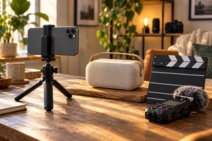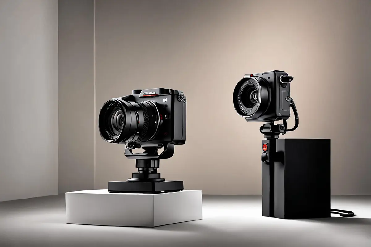
Choosing an overhead, eye-level, or low camera position is not mainly about selecting a preset mood such as “premium,” “friendly,” or “powerful.” It decides where the viewer is imagined to stand. Are they arranging the objects from above, meeting the product at the height of a user, or looking up at an object that has been promoted into the hero of the scene?
Once that relationship is clear, the product action, surface, performer, and background can support it. The same product does not need one permanent angle. A tutorial may need a view that makes hand-to-part relationships legible. A lifestyle scene may need the product to share a believable space with a person. A hero shot may temporarily raise its status. The useful question is not which height is best, but which one fits the viewing task of this shot.
Camera height decides where the viewer stands
Camera height, tilt, and shot size are often collapsed into one note. A camera can be low while remaining level. It can be above a product with only a slight downward tilt. Two close-ups can show very different spatial relationships when one is made with a wide lens nearby and the other with a longer lens farther away.
It helps to separate three decisions:
- Height places the viewer above, alongside, or below the product.
- Tilt changes how much of the top, front, or underside is visible and how parallel lines converge.
- Distance and focal length affect the field of view and the size relationships between foreground, product, and background.
Canon's current focal-length guide explains that focal length controls angle of view and that changing perspective requires physically moving the camera. For product work, that means a longer lens cannot replace a camera-position decision by itself. When you move back to preserve product size, the viewing position and relative scale of nearby and distant elements change; zooming from the same spot mainly changes framing.
Overhead views turn the product into a relationship map
An overhead view is useful not because it automatically feels casual, but because it can place several objects, steps, and hand movements into one readable plane. Unboxing, accessory layouts, ingredients, control surfaces, and tabletop processes benefit when the viewer can quickly see what belongs with what.
The tradeoff is volume. A true top-down view can flatten thickness, curvature, and the distance between a product and its surface. A device that depends on grip, side profile, or a suspended structure may begin to look like a catalog of parts rather than an object that can enter everyday life.
An overhead shot should therefore answer a specific question: are we reading an arrangement, a path, or a contact point? If a hand merely travels around the frame without revealing why one part is selected before another, the shot offers neatness but not action logic.
Eye level lets the product share the user's world
Eye level is not neutral. It places the product, the person, and the room under the same spatial rules. The viewer can more easily imagine sitting opposite the object, standing at the workbench, or approaching it.
This height works well for opening, placing, looking, and reaching. A charging case is pushed to the center of a table and picked up. A coffee machine completes an action below chest height. An operator's sightline connects with an industrial control area. The product is neither worshipped nor flattened into an instruction diagram; it participates in an event.
Eye level can still become visually indecisive. When the background, tabletop, and product face settle into parallel layers, the result may feel like an inventory record. A small action can break the stasis: a hand reaches past the product toward a rear connector, a drawer opens toward camera, or side light reveals depth. The value of eye level is not simply that it looks natural, but that something meaningful can happen after product and user enter the same space.
Low angles create status and magnify mistakes
A low camera position can lift a product away from tabletop clutter, set its silhouette against a cleaner background, and give a foreground button, wheel, base, or edge more presence. Cars, speakers, robots, and industrial equipment often use the relationship to create weight or hero status.
But low does not automatically mean powerful. If the camera is also very close and wide, the nearest component expands while the far end collapses. A precise, restrained product may look top-heavy. An underside with little design value may dominate the frame. Tilting upward can also hide the top surface, screen, or critical connector.
Turn off the music and lighting effects for a moment and inspect only silhouette and proportion. Is the part nearest the lens truly the feature this ad needs to emphasize? If not, step back, change focal length, or raise the camera before asking stronger light or faster movement to disguise the spatial problem.
Do not blame focal length for a height decision
Review comments such as “too exaggerated,” “too flat,” or “not like the real product” are often filed under angle. In practice, height and shooting distance need to be compared together.
Make a three-frame test with the same sample. Keep the product at roughly the same size in frame, then compare a nearby wide view, a normal working distance, and a farther long-lens view. At each distance, keep one overhead, one eye-level, and one low option. The grid makes it easier to see whether height changed the viewer relationship or distance changed front-to-back proportion.
The test does not need finished lighting. A simple background, the same surface, and similar exposure reveal which product plane disappears, whether a connector distorts, and where the hand will obstruct the view. Once the position is approved, solve reflections and surface finish. For glossy objects, our article on polarization in product advertising examines that next decision; light control can organize a surface, but it cannot repair the wrong viewpoint.
Preserve the relationship across horizontal, vertical, and AI versions
When a horizontal shot is cropped vertically, the product may survive while the references that made the height meaningful disappear. An overhead layout loses its step logic when side accessories are cut away. An eye-level scene loses the sense of shared space when the person vanishes. A low-angle hero can become even more distorted when the bottom is cropped tightly.
TikTok for Business's current creative guidance recommends 9:16 for vertical ads and keeping important content within the interface safe zone. That does not mean every brand should center the product. It means the vertical composition should be reviewed inside the actual interface. On set, keep a tighter alternative position for essential references, or design a separate vertical camera position instead of simply narrowing the horizontal hero shot.
Generative video needs the same separation of variables. Adobe Firefly's current documentation lists shot size, camera angle, and motion as distinct controls. It also notes that some camera controls become unavailable when first or last keyframes are added. Tool workflows therefore have conditions; “cinematic low angle” is not enough to preserve one spatial relationship across every version.
A safer method is to approve one relationship frame first: how far the product base sits from the lower edge, where the table line falls, which side the hand enters from, and which background reference must remain. Live action, CG, and AIGC may use different methods, but each can be compared with this relationship frame instead of being judged only by mood.
Let the shot task choose the height
Replace review notes such as “make it more premium” or “give it more power” with three questions: Where is the viewer standing? What action or surface must be readable? When the shot ends, how has the product's status within the scene changed?
If the viewer must understand how accessories combine, overhead may be the direct answer. If they should imagine using the product, eye level often creates a more accessible relationship. If the product needs to become the temporary hero of the environment, a low angle can raise its status, provided proportion, underside, and background receive extra scrutiny. A shot can also change height during movement, but the change needs a storytelling reason beyond showing off the rig.
ONCE approaches product video planning by asking whether the camera position makes product value visible as a relationship, not merely whether a shot list includes enough angles. If you are choosing a visual language for a launch film, vertical cutdowns, or a live-action and AIGC hybrid, share the product, target placements, and the action viewers must understand through our video production solutions. Those three inputs are a better starting point than a list of mood adjectives.
Source check: October 27, 2026. Technical references are limited to Canon's focal-length guide, Adobe Firefly's current video-generation controls, and TikTok for Business's current vertical-ad guidance. Interpretations about camera height and product roles are ONCE's creative analysis, not universal psychological laws.