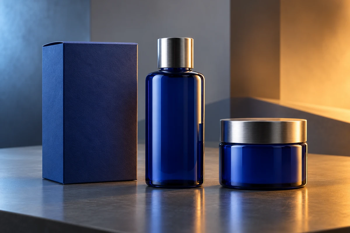
A package looks like the right brand blue in the meeting room, shifts toward cyan under studio lights, and turns flatter again after the vertical cut is uploaded. Teams often group all of these differences under “color cast” and keep grading until the package resembles a color chip pasted onto the frame. The deeper problem is that product color never exists as an isolated number. Material reflectance, the spectrum of the light, neighboring colors, camera white balance, the working color space, and the display all contribute to what the viewer finally sees.
The practical goal is not identical pixels in every shot. It is a recognizable relationship: the package should retain its hue family, tonal hierarchy, and material credibility as the scene changes. Brand color may live inside warm light, a night exterior, or a high-contrast composition. It should not stop looking like the same product.
The camera records a relationship between material and light
The same printed surface does not return identical signals under daylight, tungsten, and LEDs with different spectral distributions. Human vision adapts to the environment and often treats the object as approximately the same color. A camera still has to convert the arriving light through a chosen white balance, sensor response, and color pipeline. The CIE describes a chromatic adaptation transform as a way of predicting corresponding colors under different adaptation conditions. The important word is corresponding: appearance is being related across conditions, not assumed to be physically unchanged.
This is why white balance matters and why it cannot solve everything. ARRI's Color FAQ recommends balancing the camera to the scene so that a neutral grey target does not carry a cast, and checking the result on RGB waveforms or a vectorscope rather than relying only on the eye. But a single global white point cannot neutralize warm light on one side of a package and cool window light on the other. Fluorescent inks, pearlescent coatings, metallic foils, and glossy laminates can also react differently as the spectrum and angle change.
The first production question is therefore not “What is the RGB value of the brand color?” It is “Which light establishes the color reference in this scene?” The key can carry the body color, the environment can create atmosphere, and an edge light can separate the form. If every source tries to redefine the package at once, grading is forced to negotiate between conflicting evidence.
A background can change perceived color without changing the pixels
Color is always viewed in relation to its surroundings. A medium-saturation orange can feel warmer and more assertive against cool grey, then appear yellower or weaker next to a large red field. CIE research on simultaneous color contrast examines how a target's appearance shifts with the surrounding color. For commercial imagery, the implication is direct: a background is not merely a container for the package color. It participates in that color.
The relationship should be tested with the real sample, not approved only on a static mood board. Place the product into candidate sets and shoot brief tests at the intended focal length, exposure, and motion speed. When the background changes, ask more than whether the palette feels attractive. Does the package remain distinct from competing category colors? Do the logo and legal text retain their hierarchy? Do specular highlights fragment the body color?
The issue resembles wardrobe and product competing for the same chromatic attention. If the package is meant to be the dominant blue in the frame, surrounding blues may need to change in brightness, saturation, or area rather than simply matching the brand swatch. The more important the brand color is, the more room the composition must give it.
Color accuracy should not flatten the material
The body color of matte paper is carried largely by diffuse reflection. Metallic bottles, varnished cartons, and pearlescent inks also carry the color of the light source, the geometry of the highlight, and the viewing angle. If every shot is isolated and pushed toward one hue and saturation value, the product may look numerically closer to the guide while losing the behavior of metal, lacquer, or paper. It begins to resemble a texture map.
A better target separates three layers. Body color carries recognition. Highlights describe the surface. Shadows preserve volume. The body color can be anchored with the physical sample, approved references, and a neutral target. Highlights do not need to become the same pure color, but they should not clip into large white areas with no information. Shadows may absorb some of the scene's atmosphere as long as they do not turn the package into a different product color.
That is why product close-ups should solve light before depending on grading. ONCE's guide to texture and depth in TVC product close-ups explains the separate jobs of key, fill, rim, and background light. Color management can keep transformations consistent. It cannot recreate highlight detail or reflection structure that capture has already destroyed.
Grade relationships, not a single color value
A film can move through morning, interior, and night scenes, and the package may legitimately look a little different in each one. The difference needs a visible cause, and the product needs stability within the scene. A compact color baseline helps: photograph the real sample and a neutral reference under each major lighting state; preserve one minimally stylized product shot; record camera, white balance, light sources, and input color space; then build the creative grade on top of that evidence.
Review motion, not only still frames. When the edit cuts from a warm room to a cool exterior, does the viewer understand that the environment changed, or does the product appear to change color? When the package rotates, does the color shift travel naturally with reflection and angle, or does a correction window seem attached to the screen? Color credibility is temporal. A single screenshot cannot fully measure it.
For a tightly controlled brand system, define which relationships cannot drift: perhaps the main package hue, logo contrast, and the separation between two product variants. Let ambient reflection, shadow, and highlight vary within a designed range. That protects recognition without denying cinematography and production design the behavior of a real world.
Rec. 709, HDR, and a phone screen are not one canvas
ITU-R BT.709 specifies parameters for HDTV production and exchange. Apple's current Final Cut Pro documentation distinguishes a standard workflow based on Rec. 709 primaries from wide-gamut HDR workflows based on Rec. 2020, and warns that the working space can affect processing and final rendering. Adobe's current explanation of color management in Premiere likewise connects input tagging, working space, tone mapping, and output conversion in one pipeline.
So “the hero film is graded” does not mean every version is finished. If a campaign needs standard dynamic range, HDR, and mobile cutdowns, establish a monitored master and create controlled transforms for each intended output. HDR is not a blanket increase in saturation and highlight intensity. Rec. 709 is not a place to crush a wide-gamut image until it fits. The packaging test is whether body color, background, text, and surface highlights keep the intended hierarchy in every version.
No professional workflow can make every uncalibrated phone look identical. What production can control is the file's color definition, the transformation, and the reference display. Accepting that limit encourages more resilient brand cues: a clear hue family, sufficient luminance contrast, readable marks, and recognition that does not depend on extreme saturation alone.
Let AI change the world around the product, not repaint its identity
Generative tools are useful for exploring environments, atmosphere, and compositions. They are less reliable as the only source of truth for a real package. A hexadecimal color in a prompt does not lock printed layers, fine typography, foil response, or material reflection. Research such as GenColorBench exists precisely because fine-grained color control remains a measurable challenge for text-to-image systems.
For a color-critical product, a captured product plate can remain the factual layer while the generated background stays variable. If the lighting must change, controlled relighting, compositing, and human grading can make the layers meet. Repeatedly regenerating the package until it looks close is not the same as preserving it.
This is not an argument against AIGC. It is a division of labor. The model can propose a visual world. The physical sample anchors product identity. Color management carries that identity through deliverables. When each layer has a clear role, atmosphere no longer has to be purchased with inaccuracy.
On the next review, briefly disable the creative look and inspect whether the package survives under the recorded light. Then restore the full treatment and ask whether each color shift has a narrative cause. When a product can belong to the world without losing itself, brand color has become moving-image language rather than a static swatch.
If you are planning a launch film, product close-ups, or a hybrid live-action and AIGC campaign, ONCE can connect sample tests, lighting, production design, grading, and multi-format delivery through its brand film and commercial production service.