A white cyclorama creates a dangerous illusion: once the background is clean, the product will automatically look premium. The opposite often happens. The silhouette is readable and the logo is visible, yet plastic, metal, fabric and glass seem flattened by the same blanket of light. The result feels less like a commercial and more like a catalogue image that happens to move.
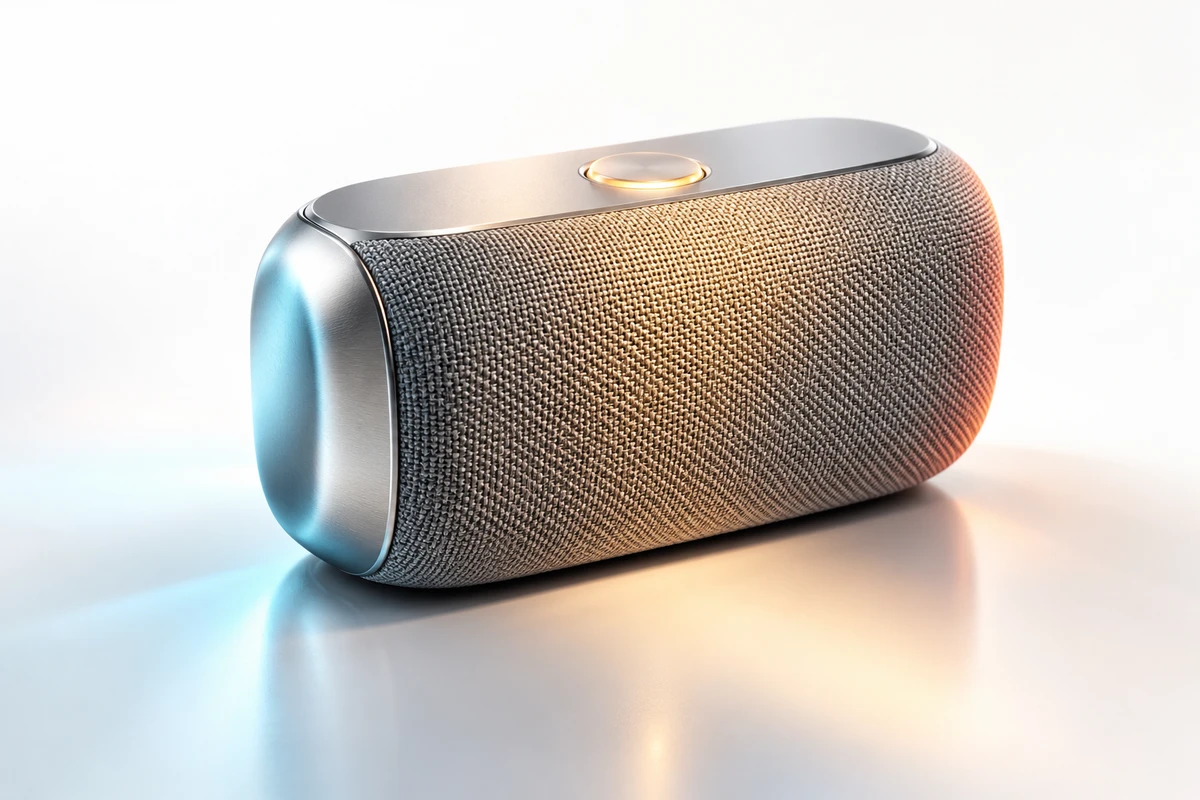
The first question should therefore not be “How many lights do we need?” It should be: what character should the audience remember? To make that decision concrete, this article uses a hypothetical portable Bluetooth speaker with an anodised aluminium frame, fine fabric grille, translucent buttons and silicone feet. It is intended for urban commuters in Europe and North America, with a launch film for the brand website. This is not an ONCE client project, and none of the directions below is presented as a completed performance test.
U-STUDIO Commercial Studio Production 02/10
A white background clears the frame; it does not create the brand
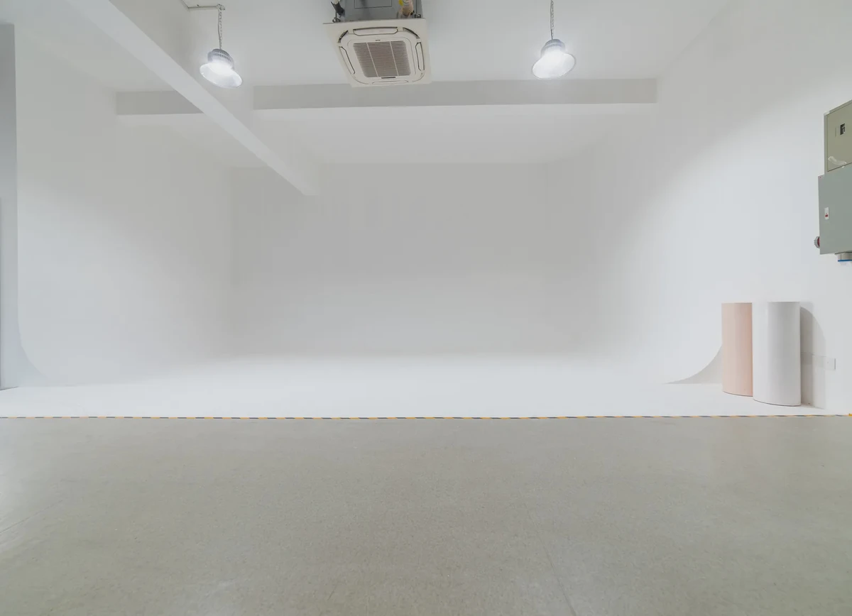
A cyclorama removes corners, window lines and fixed furnishings, allowing cinematography, art direction and post-production to rebuild the spatial relationship around the product. The official U-STUDIO page lists a 64 m² white cyclorama at ONCE's Shenzhen studio base. Dates, accessories, sound conditions and on-site support still need to be confirmed for each production.
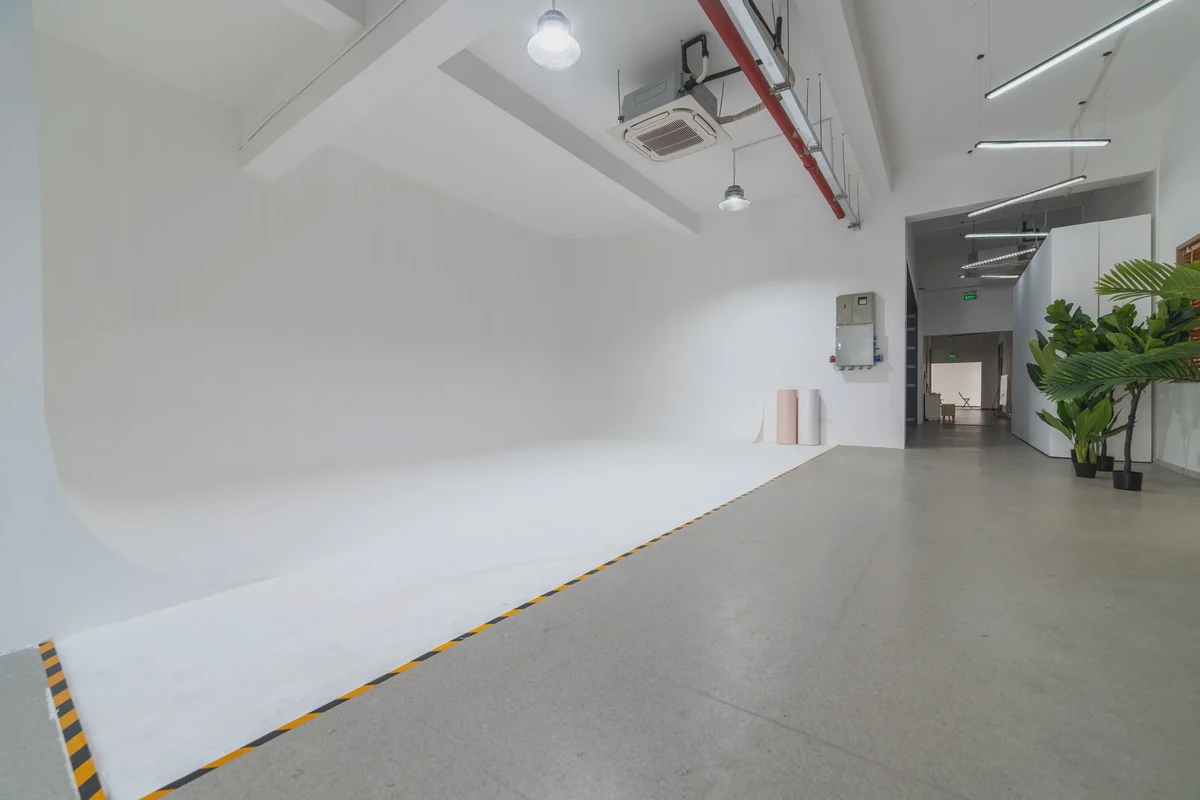
In a white space, viewers are not really reading “white”. They read four relationships: how a highlight travels across the surface, how shadow describes thickness, how the lens establishes scale, and how movement and sound give the object a tempo. The ARRI Lighting Handbook discusses specular highlights, diffuse values and transitions as basic ways to understand surface and light quality. That helps explain why the same metal can feel warm, sharp or industrial when the reflection changes width and speed. These variables must still serve the creative direction; equipment names are not a substitute for a brand decision.
One speaker, three distinct product characters
All three directions below can be produced in a white cyclorama, and all can show the product clearly. They are not three quality tiers. Each asks the viewer to believe something different.
Direction one: precise and restrained
The film opens on a narrow reflection along the aluminium frame. A cool-neutral strip travels slowly around the edge while the fabric stays low in contrast, revealing its weave only as the camera moves closer. The lens sits just below the product centreline and close to a frontal view, emphasising proportion. The speaker turns only about 30 degrees and stops where the buttons and port relationship remain legible.
The sound should avoid an oversized “technology rumble”. Use three short details instead: a clean power-on cue, the soft touch of a button, and a moment of compression before the low end begins. This direction fits a proposition built around structural discipline and controlled operation. Fast orbits, continuous particles and several competing colours would weaken the very order the audience is meant to remember.
The review question is not simply whether the metal is bright enough. Ask whether aluminium and fabric remain distinct in one shot, whether the reflection continuously describes the radius, and whether the product settles into a stable frontal relationship.
Direction two: light and approachable
The second direction warms the white background towards a pale grey and uses a larger source with softer reflection edges. The camera rises slightly to the height from which a hand might naturally approach the speaker. Rather than floating, the product can rest on translucent acrylic. As it lands, the brief compression and release of the silicone feet becomes a small but credible action.
Sound retains the faint friction of a finger across fabric, the muted contact with the surface and a lighter musical entrance. The objective is not to imitate a living room. It is to create tactility inside a controlled white space—to make the viewer want to pick up the object. This suits portability and everyday companionship, but it cannot prove waterproofing, impact resistance or acoustic output. Those claims need real, repeatable demonstration conditions.
Review it differently: can the audience feel weight from the movement? Is the scale of the hand credible? Has the warmer treatment shifted the product's real colour? Softness should not erase the boundary between frame and grille.
Direction three: energy and rhythm
The third direction does more than add coloured light. It links the change in light to the speaker's working rhythm. A tight shot begins on the grille texture; a saturated reflection expands with a low-frequency beat. The camera then pulls back quickly as the product makes one short turn and the base shadow tightens. The background remains uncluttered, but light and movement form a clear charge-release-lock sequence.
Sound moves from the real button response into music, rather than laying an unrelated effect over the picture. The lens can be lower, closer and wider, yet the logo and essential structure must survive motion blur. This direction can serve a launch beat or an energetic social opening. It cannot replace a functional passage when viewers need time to read ports, dimensions or connection steps.
Turn “premium” into a shot the team can review
Brand teams often respond to a style test with “make it more premium” or “give it more design”. Those phrases do not tell production what to change. A useful direction connects light, camera, movement and sound in one observable sequence:
0–2 seconds: an 85 mm close-up begins on the left highlight of the aluminium frame. 2–5 seconds: the product rotates 30 degrees clockwise; the highlight crosses the radius continuously without covering the logo. 5–7 seconds: the camera eases back until the fabric grille and translucent button share the focus range. Music starts after the button sound. Keep the background neutral white and do not shift the speaker's real grey towards blue.
This is still an example, not a universal recipe. Its value is operational: cinematography can test reflection continuity, art direction can judge whether the plinth competes with the object, direction can tune the movement, and sound knows where to enter. Once “premium” becomes a set of observable conditions, review stops being a collision of adjectives.
Hero imagery and functional explanation need different approval criteria
A hero shot must create brand memory while presenting the design honestly. A functional shot must make an operation, structure or state change easy to understand. They may share a sample, stage and part of the lighting setup, but clarity alone does not make them the same deliverable.
| Review area | Hero image | Functional explanation |
|---|---|---|
| First decision | Does the product establish a clear character immediately? | Are the action and result difficult to misread? |
| Material | Do reflection, texture and silhouette form one visual language? | Are the key surface, button and port truthfully legible? |
| Camera | Does the angle create the intended order, lightness or force? | Is the action continuously visible without obstruction? |
| Product movement | Is it memorable, well timed and clean at the final mark? | Does it follow real usage and remain repeatable? |
| Sound | Does it support brand emotion and match the action? | Does it clarify feedback without exaggerating capability? |
| Failure | Attractive, but belonging to another brand; effects swallow the material | Missing information, ambiguous order or an unconfirmed state change |
Adobe's current product photography guide distinguishes clean product imagery from lifestyle work and recommends establishing the required angles, label visibility and details before the shoot. The same principle applies to moving images: define the communication task first, then decide which shots build memory and which must explain facts.
Shoot three seven-second style tests before the full day
Instead of discovering after storyboard approval that everyone meant something different by “designed”, use the same sample and cyclorama position to shoot three tests of about seven seconds. Change only the variables that establish style:
- Keep the product angle and turn constant; compare a narrow hard reflection, a broad soft reflection and a coloured reflection with timed movement.
- Preserve one truthful material detail and one clean logo stop in every test so the team is not merely choosing an atmosphere.
- Avoid full finishing. Apply only enough treatment to judge exposure, colour, reflection continuity and movement rhythm.
- First choose which direction feels most like the brand; then list factual corrections. Do not average all three into a visually indecisive compromise.
This is a pre-production alignment test, not a performance promise or a media experiment. If the surface finish is not final, the colour differs from production units, or a key function is still changing, pause hero approval. A beautiful test cannot replace product confirmation.
A one-page white-cyclorama direction card
Before production, put the following on a single page for brand, direction, cinematography, art and post-production:
- Product and channel: model, target market, hero film/product page/social use and intended lifespan.
- One product character: precise restraint, approachable lightness or rhythmic energy—choose one lead direction first.
- Facts that must remain true: colour, material, ports, indicators, operating sequence and claims that cannot be overstated.
- Reflection design: which surface carries the key highlight, where it starts, how it moves and where it stops.
- Shot scale: which frame establishes proportion, which reveals texture and which proves operation.
- Product action: range, speed and final mark for rotation, landing, opening or pressing.
- Sound beat: real operation sounds, music entrance and moments that need visual silence.
- Approval split: brand memory for hero imagery; factual accuracy and repeatability for functional shots.
- Test decision: approved direction, corrections, elements that must not be mixed in and the final approver.
The U-STUDIO white cyclorama provides controlled space for light, camera and product movement. What makes the result belong to a brand is the team's ability to translate product character into shots that can be observed, compared and approved before the full shoot. For a product commercial, review ONCE's ecommerce and product video production, then contact ONCE with the product, target market, channels, sample status, visual references, timing and budget range. That is enough to decide whether the next step should be a short style test, a full production or further product preparation.
Sources accessed 9 October 2026. ARRI, Adobe, Google and U.S. Copyright Office materials were reviewed for general production, advertising and rights context; their inclusion does not imply endorsement of this article or ONCE services. For channel context, Google Ads' ABCD guidance recommends keeping the product central and using audio to reinforce the message. No platform performance outcome is claimed here.