The easiest wardrobe decision in a brand film can also be the most dangerous: the brand is blue, so every performer wears blue; the product is red, so everyone else is pushed into gray. The frame may look consistent, yet lose its viewing order. Character, background, and product compete on the same color channel, leaving the audience with a palette but no clear object of attention.
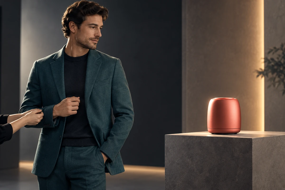
A better approach is to treat wardrobe as a route for attention. The setting establishes the world, clothing makes the character readable, and then clothing hands attention to the product. We call this a color relay. It is not a fixed palette formula. It is a decision about what should enter the eye first and what should remain a moment later.
Wardrobe is not a moving brand swatch
There is nothing inherently wrong with putting a character in a brand color. The question is what job that color performs. If the package, interface cue, and actor's jacket all use the same blue at the same scale and saturation, the frame creates several equally loud focal points. Brand recognition may appear stronger while the product becomes less distinctive.
Start by defining three layers before choosing a hue:
- The setting provides a base color field and locates the character in a world.
- Wardrobe establishes identity, energy, and distance from that world.
- The product keeps one legible difference, whether in color, brightness, silhouette, or motion.
This is why “put everyone in the brand color” is rarely a complete answer. A brand hue can live in an underlayer, a seam, or a small detail revealed by action, then find its full echo when the product enters. Color becomes setup rather than decoration.
Decide viewing order before deciding what looks good
An outfit that works on a rack may fail through a lens. Camera distance changes the area occupied by a garment. Editing changes its duration. Lighting rewrites its brightness and texture.
Four variables help establish a hierarchy.
Lightness determines whether the silhouette reads
A dark figure against a dark background can lose shoulders and movement, however expensive the fabric. A bright coat in a low-key scene can occupy so much visual area that it overwhelms a small product. Converting key frames to grayscale often exposes this problem faster than staring at swatches.
Saturation determines what behaves like a signal
Highly saturated color readily becomes a signal, but louder is not always better. If the product needs to be the final destination, keep wardrobe one step lower in saturation and save the clearest contrast for the moment the product enters. The aim is not maximum prominence; it is prominence at the right time.
Area determines how loudly a color speaks
The same red on a sock cuff and across a full-frame coat are not equivalent. Costume teams need to review actual shot sizes. A small sleeve detail may be enough in close-up; a wide shot may require a larger block.
Silhouette determines whether clothing obscures the product
Voluminous sleeves, scarves, and reflective jewelry can enter the product silhouette as soon as a character lifts or opens it. A wardrobe test should therefore include the scripted actions—lifting, turning, opening, and handing over—not only a standing reference photo.
Two public cases show two different wardrobe logics
In D&AD's record of Popeyes' That Look From Popeyes, the campaign turned existing employee uniforms into purchasable fashion objects and answered a pop-culture moment with a corresponding visual language. The important point is not that the actors were styled to “look on brand.” The uniform was already a recognizable brand asset. Wardrobe became an act of reinterpretation.
Burberry's 2026 The Trench, Portraits of an Icon takes another route. D&AD describes black-and-white portraits and a documentary film built around the trench's iconic silhouette, with different wearers animating the same object through character. Color is restrained so shape, texture, and personality can lead. Wardrobe extends an established symbol.
Neither case proves that uniforms will sell or that monochrome automatically feels premium. The transferable lesson is to identify the meaning clothing already holds for the brand, then decide whether to intensify it, reinterpret it, or let it recede behind the product. Copying the photography without the underlying cultural asset does not create the same force.
Let wardrobe complete one handoff of attention
A color relay can unfold across three beats.
First, setting and clothing establish the character. Imagine a person entering a space in cool, low-saturation workwear; the audience reads role and state. Second, an action changes the visual weight of the outfit: a sleeve is rolled, a coat comes off, or an apron opens to reveal a small detail nearer the product palette. Third, the product enters its clearest position. Wardrobe stops adding information and echoes a color already introduced.
Color is only one cue. An eye-tracking study of gaze cues in advertising found that a face looking toward a product region increased the likelihood that viewers looked there. A separate set of consumer-search experiments examined how product imagery and color contrast affected later visual search. These studies used conditions different from a cinematic brand film, so they do not promise campaign or sales performance. They do offer a practical creative reminder: wardrobe color, actor gaze, hand movement, and product position should point toward the same viewing goal.
That is also why styling cannot be separated from performance. For the product-action side of the problem, see Hand Performance in Product Advertising. If the visual hierarchy still feels unclear, revisit Shadow Design in Product Advertising and check contact, silhouette, and depth.
Fabric rewrites color in motion
A swatch is static; color on camera moves. Satin stretches a source into a long highlight. Glossy nylon can flare as a performer turns. Knit may absorb light and make the same dye appear heavier. RGB or Pantone values alone cannot predict these changes.
A useful test covers three states:
- Static key frames: check brightness hierarchy among character, product, and background.
- Movement tests: perform the actual turns, lifts, and product contacts in the script.
- Exposure boundaries: test slightly above and below the intended ratio to see whether brand color shifts, texture disappears, or reflections cover the product.
If the product is already glossy, wardrobe does not need to chase the same specular energy. Two moving highlights can make the frame restless. Matte clothing can become a quiet field for the product's reflection. If the product needs to communicate softness, wardrobe can provide a contrasting texture rather than imitate the same material.
AIGC can preview styling, but it cannot replace continuity review
Generative tools are useful for comparing silhouettes and large color blocks in development. They can help a team discuss how far a character should separate from the background. Once the work becomes a sequence, however, collar shape, print placement, button count, cuff length, and fabric response may drift.
A 2025 paper on mannequin-to-human video generation treats clothing consistency, identity preservation, and temporal coherence as problems requiring explicit technical attention. Its baseline comparisons report frame-to-frame changes in garment color and texture. That does not mean every commercial model will fail, but it does mean that a convincing single frame is not an adequate acceptance test for a finished film.
For a hybrid workflow, separate styling into three control layers:
- Identity layer that must not drift: silhouette, primary hue, print placement, and key accessories.
- Lighting layer that may change: highlights, shadows, and environmental reflections.
- Product-contact layer that must be shot or manually verified: sleeve occlusion, hand action, and real material contact.
Lock the identity layer with turnarounds and fabric close-ups, then use generative tools for environmental changes that do not alter recognition. When product interaction needs repeated revision, live action or controlled CG is often more reliable than regenerating the entire sequence.
End the wardrobe debate with a three-frame test
Do not wait for the shoot to discover that styling overwhelms the product. Put three storyboard frames side by side: the character's first appearance, first product contact, and the final product landing. Run three checks:
- Convert them to grayscale. Does the viewing order still hold?
- Reduce them to mobile-feed size. Can you still find the product silhouette?
- Remove the logo. Does the relationship between clothing and product still make sense, or is it only a color match?
If the loudest object in all three frames is the outfit, wardrobe may be playing the product's role. If the person disappears completely into the background, the story loses its emotional entry point. Strong wardrobe design in a brand film does not require every garment to be memorable. It lets the character be understood, the product be seen, and the brand color acquire meaning at the right moment.
If you are planning a film that combines performance and product demonstration, bring your storyboard, sample, and brand palette to ONCE's video production team. We can begin with the three-frame test and design the attention route among wardrobe, lighting, and product before moving into styling and production.