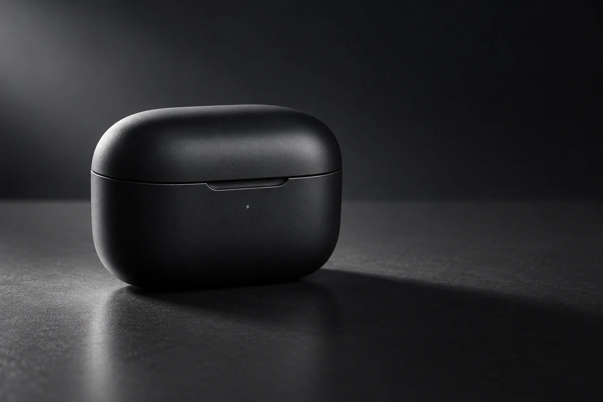
A matte-black earbud charging case sits on a black surface. A narrow light from behind throws a long shadow across the frame. The silhouette looks polished and the mood feels expensive. Then the shot holds: the hinge, lid seam, status light, and charging port have all disappeared into darkness. The image has a posture, but the product is difficult to understand.
Shadows do not make a product ad premium simply by becoming deeper. They become useful when they help viewers read three things faster: what shape the product has, where it sits in space, and which detail matters now. If the shadow only darkens the frame, it can darken the benefit with it.
Shadow is spatial information, not a mood filter
A flat image needs enough tonal change to make an object feel three-dimensional. When light moves across a rounded edge, the transition from highlight to shade helps the viewer read curvature. A deeper pocket of shade can signal a groove or structural turn. Research into shape from shading is built on the same basic fact: brightness variation in a two-dimensional image carries clues about surface orientation, illumination, and form. Advertising does not need to turn that into a formula, but it should respect the viewing mechanism.
A cast shadow on the surface performs a different job. It tells the viewer whether the product touches the table, how far it sits from the background, and where the light comes from. Without a tighter contact shadow, a cut-out product can appear to float. When a shadow direction contradicts the highlights, the scene may feel wrong even if the audience cannot immediately say why.
A third kind of shadow is mainly compositional. Blinds, plants, or props can cast shapes that divide the frame, suggest time of day, or steer attention toward the product. The right question is not whether that shadow looks attractive. It is whether it steals the product silhouette, crosses important copy, or becomes a stronger subject than the item being sold.
Hard and soft shadows are not fixed brand styles
ARRI's published lighting material describes hard light as a concentrated, single-source beam capable of producing a defined shadow. Its large-aperture soft-light systems create a more uniform field with clean, soft-edged shadow transitions. These are differences in source character, not a rule that hard light belongs to technology while soft light belongs to beauty.
Hard shadows establish direction
A crisp cast shadow makes the light's position easy to feel. It can extend the outline of a bottle, shoe sole, or tool across the set. It can evoke afternoon sun, a stage spotlight, or a graphic plane. When the product has a distinctive silhouette, the shadow can act as a second rendering of the object.
Hard light also magnifies small variations. Creases, dust, surface scratches, and uneven edges become more visible. If a cast shadow crosses a logo or control area, lifting it later in post often produces a muddy patch rather than restoring convincing material detail.
Soft shadows describe surfaces continuously
A gradual tonal transition lets the eye travel along a curved surface. Matte plastic, leather, fabric, and rounded shells often benefit from a wider boundary between light and shade, because it can preserve texture and volume at the same time. ARRI's soft-light description similarly emphasizes a large, uniform field and shadows without multiple edges or strange colors.
Soft does not mean flat. If frontal fill erases every dark area, a black product can lose its edge and a white product can merge with the background. The task is to decide how much information remains in the shade, not to eliminate shade.
Protect the benefit before deciding how dark the image can be
The image's job determines how far the shadow treatment can go. Henkel's public packshot guidelines call for the most meaningful product angle, visible primary details, and natural diffused lighting that renders color and shape realistically. Shopify's official product-photography guide recommends a white reflector card to lift an overly dark side, or black foam board to deepen edge separation.
Those sources serve different use cases, but they point to the same practical idea: shadow is not one undifferentiated block. A hinge needs structural definition. A status light needs a clear brightness relationship. Brand lettering needs an edge. Reflective material needs highlights that agree with the light direction. An uninformative background can become darker without pushing every functional area into black.
On set, temporarily put the word premium aside and build the frame in three passes. First, remove decorative light and keep only the source that explains form. Second, add the minimum fill needed to make important structure readable. Finally, restore the compositional shadow. The sequence matters. Starting with decoration and then trying to rescue the product often produces competing light directions.
A hypothetical earbud case, developed one pass at a time
Imagine a matte-black charging case with no real brand or specification. The short ad only needs to communicate compact volume, a legible opening action, and restrained finish. The lighting must not imply water resistance, impact resistance, or any other unverified performance claim.
The first version places the case on black acrylic and uses a small hard source from the rear left. The long cast shadow looks elegant, but the lid and base collapse into one shape, while the front status light disappears. The problem is not simply low exposure. The only tonal transition does not cross the feature that matters.
The second version keeps the rear-side key but raises its angle so that a narrow highlight traces the lid's rounded edge. A very weak white bounce in front lifts only the seam and the area around the status light. The contact zone stays dark, so the object still feels grounded, while the front information remains present rather than washed out.
Only in the third version does a cutter create a diagonal hard shadow on the background. It leaves from behind the case, avoids the front face, and does not split the product in half. When the lid opens, the graphic shadow can move slightly to suggest passing time. The lid highlight, seam, and contact shade still carry the structural explanation.
This is not a universal lighting diagram. Transparent shells, metal earbuds, fabric cases, and colored packaging all require different decisions about reflection, color, and detail. The value of the exercise is turning make it darker into specific jobs that can be discussed on the monitor.
CG and AIGC must still explain where the light comes from
CG offers precise control over source size, direction, materials, and shadow projection. Control does not make the default result coherent. When a rendered product is composited into a photographed environment, the highlights, contact shadow, cast-shadow length, and environmental reflections must appear to belong to one space. Otherwise, a highly polished object can look more detached rather than more convincing.
Generated backgrounds require product consistency to be reviewed separately from atmosphere. A 2025 AAAI paper on product-image background inpainting divided evaluation into background suitability and product consistency, using human feedback as well as comparisons between the original and generated product regions. A background can therefore feel on-brand while the product itself has changed.
A separate 2024 IEEE study assessed the consistency of cast shadows and reflections in AI-generated images. For commercial review, that means checking more than the presence of a shadow: does its direction agree with the highlight, does the contact area feel grounded, does the reflection acknowledge the same environment, and have the hinge, opening, or mark drifted during generation or repair?
When product accuracy carries sales and brand responsibility, a safer hybrid approach is often to preserve the photographed item or a dependable 3D asset, use generative tools for environment exploration and replaceable backgrounds, and then reconcile the final lighting around the real product.
A shadow needs a reason before it becomes the protagonist
Some ads can reveal a shadow before the product. A recognizable outline can create identification, a moving projection can imply time, and the shadows of a person and a product can establish a relationship. But when the benefit depends on button position, packaging copy, skin-relevant color, or a precise connection, that information should not remain absent merely for drama.
To judge whether a shadow deserves to stay, ask what the frame loses when it is removed. If the only loss is a vague sense of looking more expensive, the shadow may be decoration. If the frame loses volume, grounding, direction, or a meaningful reveal, then the shadow is participating in the communication.
The goal of product-ad shadow design is not to make darkness visible. It is to make the product easier to understand because darkness has been designed. If a new launch needs a lighting language that creates shape without sacrificing truthful product detail, bring the sample, material notes, and target formats to ONCE's product video production team and develop the concept into a shootable test.
Source note: This article draws on ARRI's lighting handbook and published hard- and soft-light material, Henkel's product-content guidelines, Shopify's product-photography guidance, the 2025 AAAI product-background evaluation paper, and the 2024 IEEE study of shadow and reflection consistency in AI-generated images. The earbud case is an original hypothetical exercise, not a client project, product specification, or shoot test.