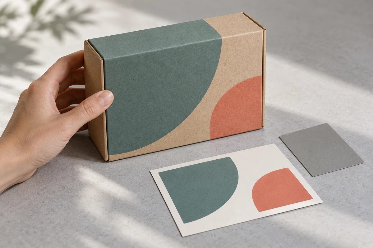
Imagine an overseas brand reviewer asking for the carton in a China-based product shoot to match the bright end-card artwork. The studio has faithfully photographed the supplied sample, but the packaging team has not yet approved it. More grading will not resolve the missing decision.
ONCE recommends approving the printed object before judging its representation in video. Keep the digital brand artwork available for graphic elements, but do not assume a lit, textured package should look like a flat screen swatch everywhere in the frame.
Printing is already a production stage
In its October 5, 2026 Kärcher case study, Mondi describes using white underprint with multicolor digital printing on brown paper, including reproduction of Kärcher’s signature yellow.
That establishes what the supplier reports about this packaging solution. It is not our independent color measurement, nor does brown paper by itself establish an environmental benefit. For a video commission, the important implication is that a digital color has already passed through a material and printing process before the camera arrives.
Adobe’s workspace guidance for color printing, updated October 10, 2026, explains that displays emit light while prints reflect it, and that paper finish and viewing conditions affect appearance. This is print-workflow guidance, not a video acceptance specification. It helps explain why the artwork alone is an incomplete reference for the filmed object.
Consider a fictional personal-care brand whose teal carton looks less vivid than its web graphics. If the sample is unapproved, the packaging decision comes first. If it is approved, the web graphic’s greater vividness does not by itself establish that the camera or grade is wrong. No client work or measured color difference is implied by this example.
ONCE’s One Box, Two References review
The method separates the objects being approved. It is a proposed coordination tool, not colorimetric certification.
Keep one approved physical carton. Identify its packaging revision, approval owner and status: representative production sample, print trial or temporary prop. A prop may be useful creatively, but it should not silently stand in for the final package a customer will receive.
The first reference is the official digital artwork for logos, end cards and other graphic applications. Its color values belong with the relevant file and intended use. Sampling a new value from a chat screenshot does not recreate that context.
The second is a baseline image of the approved carton, made through a known, correctly interpreted imaging path and reviewed under agreed conditions before a strong creative look is added. It is neither an untreated Log screenshot nor a phone photograph of a monitor. Retain the lighting, image processing, output and viewing context so later decisions have a traceable starting point.
That baseline remains an image, not a physical color standard. If print acceptance requires measured tolerances, the relevant specialists must define the method and limits separately. The review does not replace that work.
Route the disagreement to the right decision
Before sending a grading note, identify which relationship has broken down. These are review branches, not automatic diagnoses from a screenshot.
| What the review establishes | First action | Avoid |
|---|---|---|
| The carton is unapproved or not the intended sales version | Resolve the physical packaging decision with its owner | Grading it into an apparently approved package |
| The carton is approved but the baseline is not a credible representation | Check lighting, capture, interpretation and reference monitoring; adjust the shoot if needed | Raising saturation while ignoring texture, shadows and reflections |
| The baseline passed, but the creative look changes the product unacceptably | Review the affected shot and local treatment | Rebuilding the entire grade without locating the change |
| Only a particular playback or device looks anomalous | Check the actual file, player, settings and environment | Changing the master to fit an unexplained viewing state |
More than one issue may be present. A changed print sample and strongly colored scene lighting can coexist. Restore a usable comparison, then investigate each rather than declaring the printer or colorist responsible prematurely.
A stylized campaign can legitimately use night lighting or an expressive grade. Agree whether a shot is creating atmosphere or helping a buyer recognize the product. For ecommerce use, a separate clear product view may serve the second task better than forcing one shot to do both.
Make remote feedback identify the reference
For a team reviewing a shoot across borders, “match our website” leaves too much unresolved. A more actionable note would be: “The carton in this version differs in hue from the approved baseline. Please check whether that change enters with the creative grade.” It identifies both the object and the comparison without claiming the cause is already proven.
If the intended change is actually to the packaging, say so: “This sample has not reached the new design target; pause its use as the final sales package.” That is a packaging approval decision, not an ordinary request to make a video more vibrant.
Keep the approved sample identity, baseline, digital artwork and final output linked in the production record under the agreed retention terms. A future reshoot then has more than a remembered look or an old preset to work from. For ONCE, such context could support continuing content production; it does not prove lower costs, eliminate all revisions or establish a margin gain.
When discussing a project through ONCE’s product video production solutions, send the intended sales package and official graphic files, and identify who can approve the printed object. Decide what the film is representing before deciding how to beautify it.
Sources checked October 16, 2026. Alongside Mondi and Adobe, we reviewed Lenso’s product photography quality-control framework, marked reviewed August 20, 2026. It is not a universal video standard. The review method and teal-carton scenario are ONCE’s original proposals, not completed shoots or tests. The original cover is conceptual, not a color-validation image.