Advertising Aesthetics Research 02/10 | Light and Materials
In one of Apple's official iPhone 15 Pro product images, the titanium band is not flooded with brightness. A broad, restrained highlight crosses the brushed surface and reveals its directional grain. The rounded edge catches the light, while the black glass and camera rings remain dark. Calling the image simply “premium,” “low-key,” or “cinematic” would miss the useful part. The light is not adding an expensive filter. It is allowing metal, glass, coatings, and curves to make different claims.
That is a more dependable source of perceived value in product advertising. Light cannot manufacture a material from nothing. It selects which material facts become visible and which remain concealed. Brighter does not automatically look more valuable. Useful light should help a viewer infer, even before seeing a logo, whether a surface is hard or soft, cool or warm, fine or coarse, and how it may respond to a hand or an environment.
This is the second essay in our series, following Advertising Aesthetics Research 01/10: Negative Space and Attention. The previous article asked how a frame directs looking. This one asks what light should make visible once attention reaches the product.
A Highlight Must Say Something About the Material
Studio crews often classify fixtures as key, fill, rim, or background lights. For a creative decision, however, three kinds of information are more useful than the job title of a lamp.
The first is diffuse value: the approximate lightness or darkness of the surface itself. The second is the specular highlight. That bright shape is not the product's color; it is the image of a light source reflected by the surface. Its width, edge, and movement reveal gloss and curvature. The third is shadow, which describes volume, distance, and contact. ARRI's current Lighting Handbook page uses this vocabulary to distinguish diffuse value, specular highlight, and shadow. Together, they keep form and texture from collapsing into one uniform level of brightness.
Different materials turn that framework into different questions:
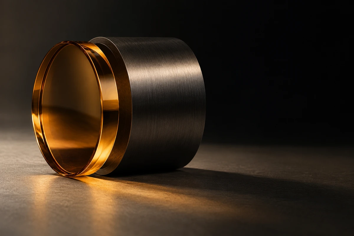
- Metal needs a highlight that travels across its geometry, but it also needs darkness to retain weight. If every plane is bright, brushed metal can start to resemble silver-painted plastic.
- Glass is not always recognized through transparency. Often it is read through edges, refraction, and reflections of the environment. A white background without edge separation can make a clear container disappear.
- Fabric benefits from raking light that reveals relief, but excessively hard light can make softness look coarse and can distort the perceived color.
- Liquids, chocolate, and skincare creams have viscosity, flow, and temperature as well as color. Their material is not a static texture map. Fixture heat, frame rate, and action timing can alter what is physically in front of the lens.
“Premium” is therefore not one lighting formula. It is a more precise material proposition: what should the viewer believe this object is, and why should it feel worth approaching?
Apple Did Not Light Titanium Like Silver Plastic
On September 12, 2023, Apple announced the iPhone 15 Pro and Pro Max. The official release identifies the titanium band, refined brush texture, and contoured edges as central design features. Two public still images on the official Apple Newsroom page provide a useful observational sample.
In the close view of the camera system, the brushed grain is not merely “sharpened into existence.” A horizontal reflection organizes it. The highlight rolls away around the rounded edge on the left, making the curvature legible. A narrow antenna break interrupts the texture, preventing the metal from becoming an abstract gray block. At the same time, the camera glass and back remain deep black, with reflections appearing only where an edge needs definition. The materials do not compete for the same brightness; each receives different visual evidence.
The second image compresses the phone into a thin side profile. A large field of black negative space gives a narrow vertical highlight enough contrast to define the side button and the continuity of the band. What reads as valuable is not higher brightness. It is the absence of a visual lie: the metal still has direction, the glass still absorbs most of the light, and the contour still requires a transition.
This is our editorial observation of publicly available still images. It is not a claim about undocumented photographer intent, and it cannot establish sales or conversion effects. Its narrower conclusion is more useful: when material and finish are part of the product proposition, the light should prove those differences before it decorates them.
Materials Also Decide How They Can Be Lit
Light does more than make a material visible; it can intervene in the material itself. In a tabletop commercial case published on February 15, 2024, ARRI describes a reshoot involving a yogurt product and a chocolate-based material moving in a pan. The team used a Phantom Flex4K at more than 200 fps, with some shots above 900 fps. Three SkyPanel X23 units formed a large soft source, while a harder M8 provided product accents.
The official ARRI case study is not evidence that soft light is always premium and hard light is cheap. The soft surface provided a continuous, controllable base; the harder source separated edges, particles, or splashes from that base. More importantly, the chocolate-based material could not tolerate heat, so cool output was a physical condition for continuity. In the published behind-the-scenes photograph, a tabletop pan, a close camera position, a large white diffusion surface, an LED panel, and black flags are visible. It is a production record, not the finished advertising image. We can use it to understand constraints without pretending to have reviewed unreleased final frames.
The case exposes an overlooked trade-off: the prettiest source may damage the most important property of the product. Ice cream melts, chocolate loses viscosity, leather becomes unnaturally reflective when overtreated, and anti-fog treatment can change the refraction of transparent packaging. A creative and production team should write “how the material changes” into the test plan before the shoot rather than leaving it to color correction.
Product Listings, Brand Films, and Generated Scenes Need Different Truths
Material expression also depends on the channel. Google's current Merchant Center image guidance emphasizes accurate product representation and asks the main image to minimize staging, usually against a white, gray, or light-colored background. Its first responsibility is identification: what is the product, is the color accurate, and does the image match the variant?
A brand film or campaign hero can be more interpretive. Dramatic reflections, motion, and spatial atmosphere may amplify one material property. The two tasks are compatible, but they cannot impersonate one another. A commerce image fails if champagne-colored metal is graded into gold. A campaign image may fail if perfectly even illumination removes desire and imagination. A useful system keeps a neutral product reference and develops a separate, explicit material argument for advertising.
Generative AI adds another layer. Adobe's current Firefly Object Composites overview says the feature can place a product image in generated scenes and complement its tones, colors, lighting, shadows, and textures. That makes it useful for exploring environmental directions, but it is not proof that the product material will remain exact. The generated setting can supply atmosphere; an approved product image should remain the anchor. In an AIGC visual workflow, the important lock is not a “premium” prompt. It is the set of edges, colors, reflections, and surface textures that must not be rewritten.
Replace “Make It More Premium” With a Material Sentence
During a creative review, replace “make it more premium” with a sentence that can be tested. For example:
This is finely brushed, cool-toned metal with a softly chamfered edge. It is neither a mirror nor silver-painted plastic.
Then make only three shots or test frames:
- Identification frame: Under neutral light, are the color, proportions, and primary structure accurate?
- Material-reveal frame: Which highlight, shadow, or movement best proves the material? If the logo is hidden, can a viewer still say what it is?
- Change frame: When a hand, liquid, wind, heat, or camera movement enters, how does the material respond? Does that change support the proposition or expose a problem?
The review can then ask four questions: Where does the light appear to come from? What shape does it leave on the surface? Which material property does that shape prove? If the reading is wrong, what is the object most likely to be mistaken for? Those questions are closer to a decision that can be approved, produced, and checked than an argument about whether the frame feels “premium enough.”
More credible material does not automatically make an advertisement more effective. Brand position, screen size, copy, and media objective still require testing. But at the image level, we can stop using brightness as a substitute for value. Perceived value begins when light selects and organizes material facts.
If you are building launch visuals, motion assets, or an AI-hybrid content system for a new product, contact ONCE with the product sample, material specification, and intended channels. We can first translate “premium” into a testable material proposition, then discuss the appropriate production and generation route.
Source Scope
This essay reviewed Apple's September 12, 2023 iPhone 15 Pro announcement and public still images; ARRI's February 15, 2024 high-speed tabletop case and public behind-the-scenes photograph; the current ARRI Lighting Handbook page; current Google Merchant Center product-image guidance; and the current Adobe Firefly Object Composites documentation. Image analysis is editorial interpretation. We have not presented unseen final footage, creator intent, or commercial outcomes as known facts.