Advertising Aesthetics Research 01/10 · ONCE Editorial
A small Volkswagen Beetle sits in a broad field of pale gray. It does not fill the image or occupy its center. Below it, the headline offers two words: Think small.
It is tempting to take a convenient lesson from this advertisement: fewer things make an image feel more premium. That misses its more interesting achievement. The small image and the small car explain one another. The space around the product participates in the argument. Replace the Beetle with an indistinct object and keep the layout, and the idea may no longer work.
When reviewing negative space, a brand team should begin with a question: What does the space help the viewer see more clearly? A product characteristic, a relationship between a person and an object, or a way of living they might want to enter? If the answer stops at “it looks premium,” the creative idea needs further development.
Why the small Beetle holds its place
Volkswagen's retrospective, dated April 5, 2019, dates the campaign to 1959. The static version examined for this article places the car toward the upper left, above a headline, three columns of copy and a brand mark. Information remains; the layout gives it an order.
Our reading is that the car's scale and the headline make the same proposition. Enlarging the car might improve its visibility while weakening the visual argument for smallness. For a new proposal, ask what making the product smaller adds: portability, lightness, or a meaningful sense of distance? If it adds little beyond resemblance to a minimalist reference, the smaller product may simply become harder to understand. An unfamiliar brand also needs recognizable cues; a borrowed layout cannot supply those automatically.
The viewing order and interpretation of scale above are our analysis of the published image, not a claim about the creators' undocumented intentions or campaign results.
Where a horizon takes the viewer
The 2003 horizon advertisement in MUJI's official Kenya Hara archive offers a different use of space. Sky meets a broad pale surface, with a small figure and the MUJI mark toward the right. There is no product close-up. Hara's accompanying explanation connects the campaign to emptiness and the viewer's freedom to imagine the brand.
Our interpretation is that the open space invites meaning rather than clarifying a product function. It suggests an option for brand teams: leave some of the emotional interpretation to the audience. Yet that freedom still needs an anchor. Identity, product design and later encounters with the brand must give people a way to attach the feeling to the same company. Applied to an unfamiliar product, removing both use and identity cues could leave viewers remembering only a landscape. That is a condition to investigate, not an effect we can infer from the classic campaign.
This discussion uses the static image and official explanation, accessed October 3, 2026. The archive page does not state a publication date; no video viewing is claimed.
Three jobs for negative space
Calling every sparse image “clean” makes different creative choices difficult to discuss. We find it more useful to distinguish what the space is doing. The following is ONCE Editorial's review framework, not an empirically validated psychological classification.
| Job | What the space communicates | What the proposal must preserve |
|---|---|---|
| Direct attention | Reduce competing elements so an object or action stands out | A recognizable subject and enough detail to support the intended characteristic |
| Establish a relationship | Make distance, scale or direction part of the meaning | A legible connection between people, products and their surroundings |
| Invite interpretation | Leave room for viewers to complete an emotion or idea | Cues that let people attribute the feeling to the brand |
These jobs can overlap. The purpose is to explain a deletion, rather than assign a label to an advertisement.
Negative space need not mean a white background. Imagine a headphone advertisement with few props but the corner of a desk and a laptop being closed. That small action could connect quietness to the end of work. Remove it all and leave a person wearing headphones against a seamless backdrop: the image may become tidier while losing the meaning of the original situation. This is a hypothetical creative example, not an ONCE client case or performance test.
For this proposal, “make it even simpler” gives the team little to work with. “Keep the laptop-closing action and remove the furnishings competing with it” explains both the change and its reason.
Put the quiet image back into its viewing context
Moving a spacious print layout into mobile video introduces different questions. Can viewers still recognize the product? Does something meaningful happen in the open space? Do they already know whose advertisement this is? Minimalism alone does not answer them.
The university-hosted abstract of Wals and colleagues' 2026 study reports 2,520 viewing experiences across 42 public service announcements. Simpler, shorter scenes had higher attentional synchrony: viewers' gaze converged more closely. That is not evidence that negative space increases purchases, nor a universal prescription for empty area. Reducing visual complexity and slowing the edit are separate choices. This account is limited to the public abstract and publication record.
Google Ads' official ABCDs guidance, checked October 3, 2026, recommends avoiding competing elements while introducing the brand early. Its Shorts guidance also favors tight framing for ease of viewing. These are platform creative recommendations, rather than universal aesthetic laws. They nevertheless show how simplicity can coexist with a clear subject and brand presence.
Imagine a newly launched small appliance reduced to a distant dot in a vertical frame, with an opening that lingers on an empty room. Viewers may lack the cues needed to understand it. The setting can remain uncluttered while the product moves closer and a real use action appears earlier. A functional film needs people to understand what happens; a brand film can allow more room to establish a feeling. Their use of space should follow their respective tasks. ONCE's TVC and campaign production page likewise starts with the campaign's communication needs.
Review the idea with a deletion test
For a composition or storyboard, first cover the element you intend to remove, then cover the subject you intend to keep. Compare the changes. Does the first removal focus the idea or strip an action of its reason? Does the second remove the brand's central meaning, or leave a background any company could use? This is a way to discuss a creative idea, not a substitute for audience research.
Before production, make two inexpensive composition sketches: one with the necessary context intact and another with further elements removed. Reduce them to the actual mobile viewing size. Give target readers the same brief exposure and ask what product they saw, what happened and which brand they remember. Starting with “which looks more premium?” could steer the conversation toward a preference for form before comprehension has been examined.
If the difference is aesthetic preference, the brand's intended expression can guide the choice. If simplification makes the product category or action harder to understand, revisit subject size, distance or identity cues. To assess sales impact, compare versions under conditions close to actual distribution, keeping audience, copy, offer and media settings as consistent as possible. A small preference exercise cannot establish a conversion lift.
Negative space earns its place when it sharpens a meaningful idea: smallness, distance, anticipation, or a way of living that has not been fully explained. A brand can leave a frame open while still knowing why that space is there.
Reviewing a brand advertisement?Send ONCE your product, communication task and two composition references. Begin with what viewers should notice first and what they should remember afterward.
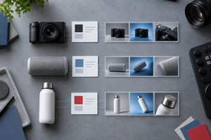
The cover is an original generated commercial still-life concept illustrating the relationship between a subject and negative space. It does not depict a client campaign.