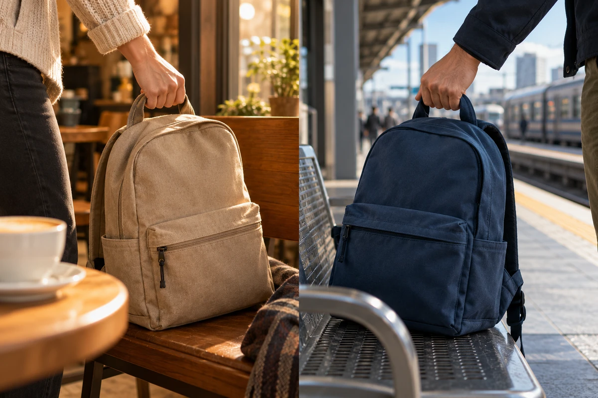
Two movements meet perfectly at the center of the frame. Why can the result still feel like two unrelated ads? The easiest thing to admire about split screen is the precision of the match. What a brand usually needs is the next thought: why do these two things belong together?
Not every split-screen ad needs a grand statement. Two everyday habits, different circumstances around a product, or even conflicting feelings can justify the pairing. The question is whether that reason becomes clear while the images coexist, without an end line having to explain it afterward.
The join needs to carry an idea, too
Nike’s You Can’t Stop Us offers a useful starting point. Its The One Club entry describes split screen as a visual metaphor connecting different people. The format itself carries the idea of connection, rather than merely allocating one sport to each side.
In Working Not Working’s September 1, 2020 interview with the creative team, the editors discuss matching emotion and concept as well as movement. How long a pair could remain synchronized also shaped the film’s pacing. Consider those ideas together: a neat join happens in an instant, but understanding the relationship takes time.
What follows is creative analysis, not a shot-by-shot account of that film. Split screen can suggest similarity, contrast, a relay, or a shared challenge. When the outlines match but the meanings remain unrelated, the technique can become an attraction in its own right. That may be enjoyable without doing much for the brand’s intended idea.
Before searching for footage, try writing a sentence without any framing terminology. What do these people share? What do these circumstances help us understand differently? “A hand rises on each side” describes action. “People with different lives are preparing to leave familiar territory” proposes an idea. The second sentence does not guarantee a good concept, but it gives the team a reason to keep some matches and reject others.
Similarity can leave room for difference
If the connection is a shared experience, the settings can remain distinct. Making the clothes, surroundings, and gestures almost identical may produce a clean join while removing the discovery that these lives were different in the first place.
This is a different task from comparing product features. Two products demonstrated under the same conditions invite a performance comparison. Two life situations joined through an action may suggest a relationship or an attitude. A concept can use that meaning, but the format should not imply an unsubstantiated equivalence in performance. Nor should independent actions in documentary material be presented as evidence that the people actually responded to each other.
Synchronization is a span of time, not a single point
Once a matching frame has been found, the editing question begins: how long should these images stay together? Cutting away immediately may leave time to notice only the trick. Maintaining perfect alignment throughout can make the subsequent changes predictable.
Look at the preparation, the action, and what remains afterward. Are both situations understandable before the movement starts? Does the join clarify a shared direction during it? Afterward, should the correspondence continue, or might one side come to rest first? This is not a compulsory three-beat formula. It is a reminder that the relationship between panels can be established, sustained, and changed.
Letting the sides fall out of step can be a valuable choice. One person waits while another sets out; a gap appears. The second catches up; closeness becomes possible. Conversely, a concept about incompatible circumstances may not benefit from speed changes that force the actions into the same rhythm. Alignment should serve the idea, not make every life look identical.
At the proposal stage, a rough sequence of a few candidate actions can be more useful than numerous polished stills. Include the moments before and after the match. This is a suggested discussion method, not a completed shoot or audience test. It lets the team distinguish a momentary coincidence from a relationship that remains interesting as playback continues. The latter deserves further decisions about camera position, performance, and art direction.
Sound does not have to fill both sides
Seeing both images at once does not require giving both soundtracks equal prominence. One option is to establish a setting through its ambience, then hand attention to a specific action on the other side. Another is to use shared music while retaining selected sounds from each environment.
The important distinction is between a connection for the viewer and a cause within the story. A collision on the right, timed to a person turning on the left, may suggest that the person heard it. If they are in separate places, that choice does more than create a rhythmic accent: it invents a relationship. A fictional commercial can deliberately build such a device. Documentary or archive material requires care about the real event the edit appears to describe.
Put the product inside the shared idea
A split-screen product ad does not need to hold the same object against the center line throughout. A shared action may express the product’s role better than a shared silhouette. For a bag’s lifestyle concept, for example, a team might propose two independent situations: one person lifting a bag for a commute, another setting out for a weekend trip. These are creative possibilities, not a description of an existing brand project.
Simply aligning the two lifts would still be a thin idea. Does the ad care about setting out every day, or about preparing for different schedules? The former might call for echoes between different departures. The latter might need the different ways people pack and retrieve their belongings. Those choices should change the emphasis of the action and the time spent on it, not just the background.
Some material is better told sequentially. A product that needs a complete operating demonstration may become harder to understand when each process occupies half a frame. A comparison that depends on a clearly visible difference may not need an elaborate movement match. Split screen asks viewers to divide their attention continuously. Returning to a single image is not a creative retreat when simultaneity adds no new understanding.
The editor’s brief can therefore be concise: what happens independently on each side, what idea they share, and what change allows the pairing to end. It need not dictate the alignment of every frame. It should explain why these images deserve to occupy the same stretch of time. A beautiful join should lead the audience toward that meaning.
For a brand film or product visual project, explore ONCE’s solutions and discuss whether split screen fits the idea, and what actions would need to be filmed for it.
Source note: The case discussion draws on The One Club’s project entry and the Working Not Working interview linked above, accessed October 19, 2026. It is based on public written material; the embedded film was not viewed. No shot-by-shot analysis or campaign-performance claim is made. The remaining judgments are creative analysis.