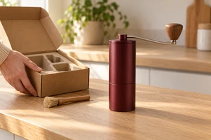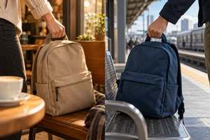
A window shadow can matter more to a product image than a window that actually appears in it. It divides the background and makes a small tabletop seem to belong to a room. A passing leaf shadow suggests a tree beyond it. The product has not moved, but the photograph no longer feels like an empty shooting surface.
Designing shadows for product advertising does not end with selecting an attractive pattern. Where does it come from? Where does it land? Does it cross the product or obscure something important during an action? The objects cropped out of the picture are participating in the set, too.
Separate the different kinds of darkness
The shadow that places a product on a tabletop and a pattern suggesting a window in the background do not necessarily have the same job. One contributes to the relationship between object and surface. The other can describe an environment or simply establish a graphic rhythm. Treat both as one shadow layer, and a pursuit of stronger style may alter the object's grounding along with the decoration.
Then there are shadows that have no intention of faithfully describing the scene. A small box casts a mountain; a shoe's shadow becomes a running animal. These are deliberate visual metaphors. They can carry an advertisement, but they should be designed as transformations, not also offered as proof of the product's actual shape, size or function.
When discussing a reference, identify the relationship worth borrowing: grounding the object, suggesting a place, or expressing another meaning through its shadow. Not every dark area needs a plot. A restrained window pattern can earn its place simply by creating the right composition around a product.
A crisp window pattern does not require hard light on the product
In pursuit of a clear window shadow, a team might replace the entire product-lighting approach with hard direct light. The background gains character, but the surface loses the subtlety the image was meant to preserve. The problem is not that hard light is bad. Two different tasks have been forced into the same treatment.
Rosco's official Diffusion Material In Film & Video Applications explains that diffusion disperses a beam and increases its apparent size, changing its shadow-casting properties. Softening light is therefore not simply darkening an otherwise identical image. This article uses that basic relationship, not performance claims about particular materials or fixture settings.
When the product needs broad tonal transitions and the background needs a recognisable pattern, the two can be developed separately and then considered together. One possibility is to retain soft product illumination and use a controlled light path to form a window pattern behind it. Whether they can be separated in practice depends on the object, surface and space. If the lighting treatments interfere, their masking, positions or composition need adjustment. Another fixture will not automatically resolve that relationship.
Nor does every shot require two systems. One source may already satisfy both tasks, or a subtler shadow may better suit the brand. Decide what needs protecting before deciding whether separating the tasks is worthwhile.
The pattern's source shapes how much of the scene you retain
Placing actual foliage, a window frame or another object in the light path is one approach. A designed projection pattern is another. Rosco's official Gobos page lists windows, clouds and breakup patterns among its options. Environmental cues can be deliberately organised without bringing an entire location into the frame.
The distinction is more than convenience. Trying physical objects can reveal unexpected overlaps and gaps as they are arranged. An existing or custom pattern lets the intended graphic be selected from the outset. Either way, leaves do not automatically mean the tropics, and window bars do not automatically identify a city. A specific location or cultural meaning needs other reliable cues.
For an image that suggests no more than a quiet afternoon, generality can be useful. Every leaf need not acquire a geographic backstory. If the advertisement identifies a particular living environment, however, the shadows should make sense alongside its architecture, art direction and use of space. Decoration need not pretend to be documentary; documentary intent cannot be fulfilled by decoration alone.
Installation and safety belong with people who understand the equipment and follow the actual requirements of the fixtures and materials. This article does not provide instructions for placing ordinary paper, plants or homemade attachments close to hot lighting equipment.
When a shadow crosses the product, composition becomes a process
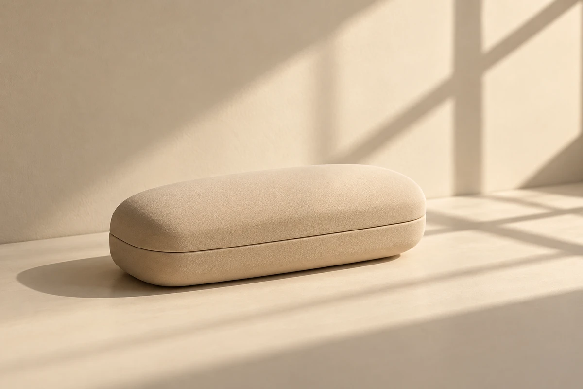
Imagine a pale glasses case on a tabletop with the shadow of an offscreen window passing beside it. This is a hypothetical discussion for a trial shoot, not an actual model, ONCE client project or completed production.
If the pattern remains on the empty surface, its main task is to organise the background. If a dark band crosses the lid, reassess whether it hides the opening, surface detail or a previously clear shape. The same pattern has a different viewing task in a different position. Its beauty alone cannot approve the entire sequence.
One approach worth trying is to retain a product-only version, add a stationary pattern, then introduce movement. Each step answers a different question. Is the product still clear? Where does the pattern contribute most? Does movement create a sense of passing time, or merely sweep light across the image without purpose? This is a proposed trial sequence. No test was carried out for this article.
Every branch does not have to move
A small local change may be enough to suggest the looseness of a breeze. Continually rotating the entire pattern may instead make the image feel like a stage effect. That can work, but it is no longer pretending to be sunlight incidentally entering a room. Theatrical and everyday treatments are both valid choices; consistency matters more than choosing one by default.
When the product moves, discuss the complete action. A lid opening, a hand approaching or an object being lifted may change the usefulness of the original pattern. A shadow can briefly conceal a detail or remain in an empty space after the product leaves. What to keep depends on what the shot is expressing. An attractive position in a still frame is not an automatic answer for a moving sequence.
Compositing changes the method, not the decisions
Live action, projection, CG and generated imagery can all be explored for this composition. But a shadow added as a graphic still needs an identity. Does it belong to the background, cross the object, or become a metaphor no longer governed by the natural scene? Changing the production method does not remove these choices.
Avoid preserving the reading of a product in a natural room while arbitrarily arranging every shadow within it. There can be multiple light sources and bold art direction; every dark area need not point in one direction. But if the differences are merely unplanned remnants of production, the relationship between product and space may become unclear. The creative needs a decision, not another adjective requesting realism.
A useful reference for this kind of product ad includes more than the finished image. Describe what is imagined outside the frame, which dark areas belong to the object, where the pattern should stop and what its movement should change. Bring those choices and a real sample to a discussion with ONCE about product imagery and commercial production. Resolve the offscreen set so the shadows in the picture do not have to carry the composition through decoration alone.
Sources consulted on 19 October 2026. This article uses two public Rosco texts; the remaining discussion is creative analysis. No shoot, optical measurement or audience test was conducted. The original AI-generated cover and glasses-case scenario are fictional illustrations, not actual products or client work.