A tone-on-tone product advertisement does not need to turn the product and its background into one uniform patch of color. It can establish a shared atmosphere while preserving the curve of a tumbler, the joint between its lid and rim, and a convincing connection to the surface beneath it. What becomes consistent is the image's tone. The differences worth keeping depend on what the advertisement asks people to notice.
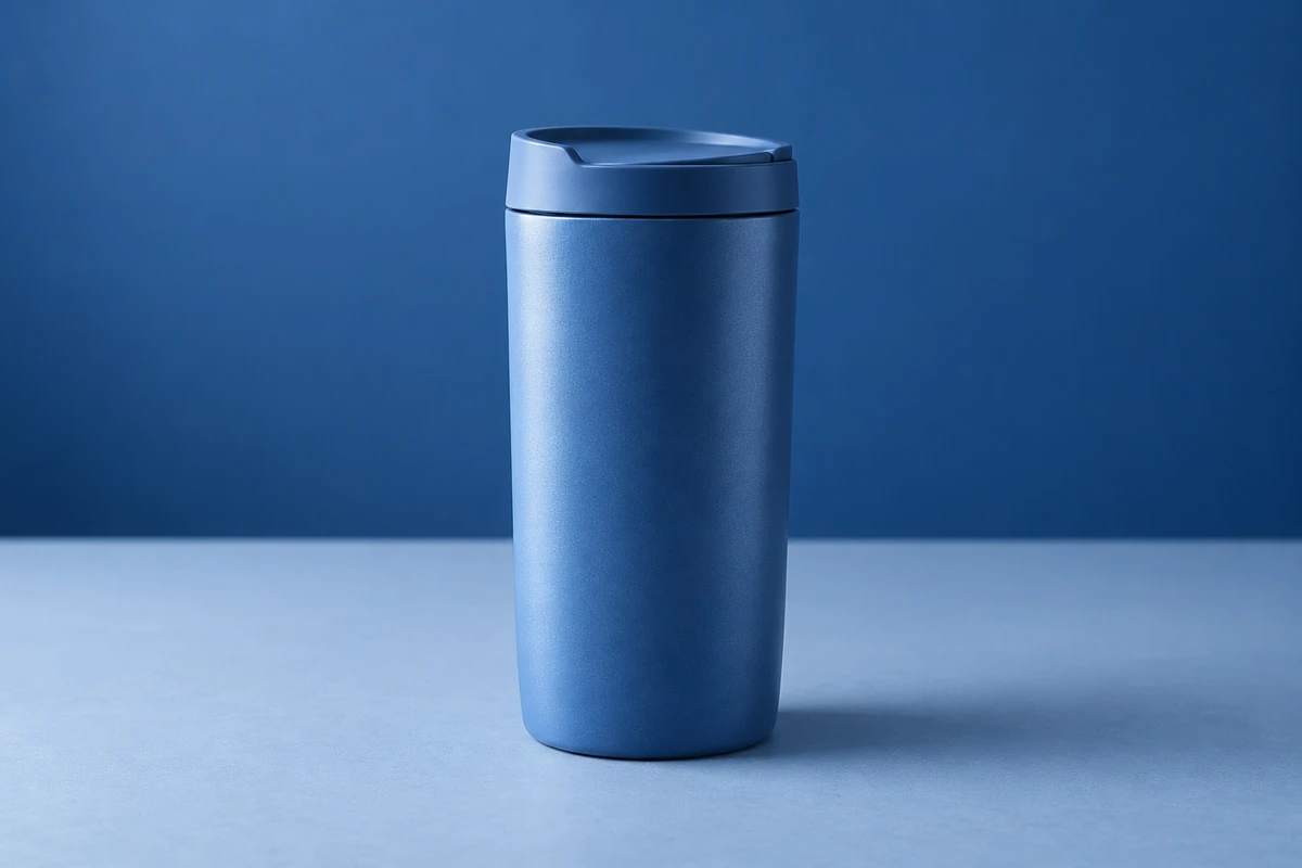
Imagine a blue travel tumbler on a blue surface against a blue backdrop. This explicitly fictional concept could become a quiet product portrait, or an entrance in which the object gradually emerges from its surroundings. Both can use blue. They should not inherit the same indiscriminate instruction to make everything match.
Which differences does the palette set aside?
Adobe Photoshop Elements' Understanding color distinguishes hue, saturation and brightness in the HSB model: the color family, its strength, and its relative lightness or darkness. The page was updated on January 12, 2022. These distinctions help articulate an art direction; they are not a photographic exposure chart or a standard for measuring a physical product's color.
The fictional tumbler might have a fairly saturated mid-blue body, a paler, grayer surface beneath it, and a somewhat deeper backdrop. The elements can share a color direction without identical values. With the background giving way, an orange prop may not be necessary to make the product stand out.
Conversely, keeping the surrounding values close could push the picture toward a flat graphic. A disappearing contour can itself be a design choice. Neither treatment is inherently more sophisticated. Showing the whole shape and allowing just one curve to surface from a field of color invite different kinds of looking.
A useful opening question for the art direction is therefore specific: should viewers first recognize the whole tumbler, or first discover a curve? That gives photography and post-production more to work with than a request for greater consistency.
Read the small area behind the contour
The backdrop is not a beautiful color swatch that exists independently of the product. What matters also includes the particular light or dark area immediately beside its edge.
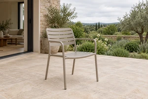
Adobe's black background photography article, headed Discover how black background photography can help you capture mood and emotion, uses a white chair against white as an example of edges, curves and dimensions becoming harder to see. A different background can reveal more information. This illustrates a legibility problem; it is not a ban on photographing white products against white. The page does not display a confirmed publication date.
For the tumbler, try changing that relationship before adding another color. Its darker side could sit against a slightly lighter part of the backdrop. Alternatively, a darker area could fall behind a brighter portion of the rim. The adjustment concerns where two regions meet, rather than simply increasing contrast across the entire image.
Nor does every edge need equally strong separation. An evenly glowing outline could turn a restrained picture into an emphatically outlined icon. If the curved body is the intended first discovery, keep the distinction there; let the contact area help connect the base to its surface. Recognizing the whole object does not require emphasizing every contour.
These remain creative proposals to try, not reproduced lighting results. The real coating, curvature and camera position will affect whether they work. If separation requires lighting the product so that it looks markedly unlike itself, changing the backdrop's tonal structure may be preferable to asking post-production to recover every detail.
After color is unified, materials still need a voice
The body, lid and supporting surface need not share the same surface character. If the imagined tumbler has a fine satin coating, one could preserve a graduated bright area across it. A more subdued lid could appear through quieter tonal changes. This example does not prescribe the materials of a real product, and it is not a reason to retouch plastic into metal.
Props belong in this discussion too. A same-color soft fabric and a same-color hard surface propose different relationships. The former could organize the composition around wrapping, contact and touch; the latter around support and a crisp shape. Choose the relationship that suits the intended setting, rather than bringing every matching object onto the set.
One temptation is to preserve the swatch while retouching away all local differences: suppress the highlights, raise the dark areas, and make every surface equally smooth. The result may look orderly while becoming less clear about what the tumbler is made from. Consistency should not automatically mean making different materials resemble one another.
Generated backgrounds can explore atmosphere, not settle material questions
Adobe's September 17, 2026 tutorial, Guide product shoot concepts with reference images in Firefly, demonstrates exploring backgrounds, compositing a perfume image with one of them, and using Harmonize to relate lighting, color and atmosphere. This account draws on the official tutorial's text and transcript, not a model test performed for this article.
For the blue tumbler, concept images of this kind could help a team discuss a pale-blue surface versus a deep-blue backdrop. But a cohesive composite and a faithful product remain separate questions. If a lid joint, coating texture or actual color changes too, return to the sample and original product image. A more harmonious overall picture is not sufficient reason to accept that change. This article makes no claim that a particular tool will preserve a product unchanged.
Emergence can become an action
A relationship shown at once in a still can unfold over time in video. Continue with the fictional tumbler: begin with part of its body close in value to the background, leaving a section of the lid visible. Then a deliberately arranged camera or product movement could create clearer separation, ending where the complete shape becomes recognizable.
The idea is not simply a tonal palette plus a turntable. It is a progression in what viewers discover. A shape might emerge before a joint becomes apparent, or a fragment might gradually reveal itself as part of a complete tumbler. If every moment is equally bright and complete, movement primarily supplies a presentation rhythm. If the object remains unreadable throughout, the reveal may exist only in its creator's mind.
When action enters, reconsider the contact areas too. If a hand grips the tumbler, viewers should have an opportunity to read where that happens. When it returns to the surface, its landing position should be clear. A stylized disappearance can belong to an entrance without continuing through every usage explanation. Not every shot needs to pursue the same degree of blending in.
If the main task is comparing available product colors or explaining how the lid opens, the tonal atmosphere can give way. A direct explanatory shot does not invalidate the advertisement's visual direction. It allows the atmospheric shot to stop carrying every information task.
The interesting question in product ad color is not necessarily how many colors appear, but which differences are deliberately preserved. For a product film like this, bring the physical sample, the surface details worth retaining, and a tonal reference to a conversation through ONCE's product and commercial video production solutions. Should this particular difference be visible, or is it worth letting it disappear for a moment?
Sources checked October 17, 2026. This is original creative analysis, without a shoot, color measurement, audience study or advertising-effectiveness test. The tumbler and original AI-generated cover are independent fictional concepts. Overseas sources have not been tested on a mainland Chinese network; the Chinese version retains their names, titles and confirmed dates without unverified outbound links.