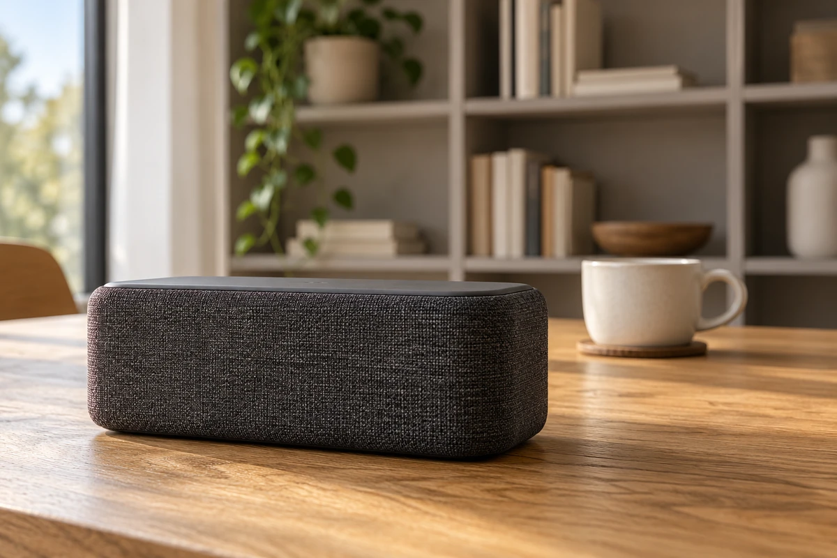
Imagine a desk-speaker commercial: the speaker in front, a cup behind it and a bookcase farther back. The director wants the speaker to have more presence. One version simply crops the original image tighter; another moves the camera closer and reframes. The speaker may end up occupying a similar height in each frame, while the cup and bookcase tell different spatial stories.
That fictional scene raises a useful question about product-ad perspective. Are we changing how much of the frame the product occupies, or its apparent size and distance relative to its surroundings? Framing and cropping can adjust the first. The second calls for choosing the viewpoint. Confuse them, and “a little closer” becomes an ambiguous direction.
The same product size can describe a different space
The perspective section of Sony’s official guide, Focal length, angle of view and perspective, explains apparent telephoto compression through shooting distance rather than a lens flattening space by itself. Filling the frame with a longer lens usually entails standing farther away; a wide lens often entails moving closer. Camera position and framing need to be considered together, not turned into aesthetic labels for focal lengths.
Leave the speaker and cup where they are. If the viewpoint stays fixed and the middle of the same image is enlarged, the cup’s size relative to the speaker does not change. Both grow together as the surrounding room is removed. The near-to-far proportions have not been photographed anew. Keep that distinction in mind when changing focal length and comparing a common image area at equal size.
This is an account of conventional rectilinear perspective geometry, setting aside lens distortion, small viewpoint shifts and differences in lens rendering. A fixed-position crop does not make all lenses identical in sharpness, blur or detail. It simply cannot substitute for moving the viewpoint.
Consider an explicitly hypothetical calculation. Let the speaker and cup each be ten centimetres tall, upright with their bases at the same height. Keep the camera level and ignore lens distortion. With the camera half a metre from the speaker and the cup one metre behind it, the cup’s projected height is about one-third of the speaker’s. Move back along the same direction until the speaker is two metres away and the cup three metres away. Reframe the speaker to the same image height, and the cup is now about two-thirds as tall as it.
Those ratios follow from ideal perspective, in which projected height varies inversely with distance. They are not measurements from a shoot. The cup has not grown, and the objects have not moved toward each other. The viewing position has changed. Real product shapes, camera heights and lens conditions are more complicated; this example is not an on-set measuring rule.
The readable Figure 5 caption for Banks, Cooper and Piazza’s 2014 paper, Camera Focal Length and the Perception of Pictures, separately describes changing focal length at a fixed camera position and changing distance at a fixed focal length. That comparison is useful here. This article does not extrapolate unread experimental results into claims about advertising effectiveness.
Move closer for foreground emphasis, farther back for company
Return to the imagined commercial. If its opening should introduce the speaker before revealing the life behind it, a close viewpoint can give the foreground greater weight. The desk extends away, the cup and bookcase appear comparatively smaller, and the speaker becomes an entrance into the room rather than merely a larger object. That establishes a viewing sequence; it does not inherently make the product more expensive or its sound more powerful.
The trade-off also affects the product itself. At very close range, the distance difference between its front and rear edges becomes more significant, potentially making the front feel heavier than the back. That may suit an expressive view of a finely textured front grille. It may be less suitable for understanding the overall form. Strong near-to-far exaggeration cannot also preserve every surface as it would appear in a more distant view.
Moving back and reframing can give the cup and speaker a more companionable visual relationship. The product may feel like part of desk life rather than an enormous arrival. But background objects also appear comparatively larger. A cup handle, bookcase division or window frame may crowd the product’s outline. Reconsider overlap and silhouette rather than assuming more light will solve it.
Neither approach needs to win a contest for the most authentic image. Everyday companionship may call for one relationship; a striking product entrance may call for another. Explain why it belongs at this moment instead of treating a focal length as a universal recipe for premium branding.
Background sharpness is related but different. How large the bookcase appears relative to the speaker is not the same question as whether it is in focus. Blurring it cannot undo the captured size relationship. Our discussion of depth of field in product ads develops that separate choice. Perspective organizes spatial relationships; depth of field helps determine which distances remain legible. Design them together without treating one as a substitute for the other.
Give changing proportions a reason across the edit
Perspective carries into editing. A close opening view of the speaker followed by a distant view of a hand reaching for the cup can change the apparent proportions of the cup and room, even if the speaker remains similarly sized. Whether that matters depends on action, the cut and the story. It is not automatically an error, but it deserves normal-speed viewing rather than appreciation as separate compositions.
If the change transfers attention, make that purpose clear: one shot introduces the object, another establishes a person’s desk life. If they should form one continuous action, check whether the background jump distracts from it. Camera position, object placement or the division of work between shots can be reconsidered. Post-production need not be asked to force different viewpoints into one image.
For a study, first keep the product and props fixed. Compare a crop from the original viewpoint with a reframed image from a new position. Keep the product’s frame height similar and examine the cup, the product’s front and rear edges, and the bookcase in relation to it. Then address aperture, focus and lighting, rather than changing everything together and crediting focal length for every difference. This comparison has not been photographed for the article; it is a proposed creative exercise.
Leave room for product information that does not depend on exaggerated perspective. An assertive close shot can attract attention, while a complete view and a use shot support understanding. Cups vary in size and screens vary in display scale. Looking smaller than a cup cannot by itself establish portability; foreground dominance cannot establish sound pressure or performance.
For a product commercial, bring the sample, the environmental relationship you want to preserve and visual references to ONCE VISUAL. Discuss where the camera should stand, not only which focal length to use. How much of the frame the speaker occupies is one compositional choice. Its relationship with everyday space is what the viewpoint ultimately writes into the shot.
Sources checked on 16 October 2026. A complete publication date was not confirmed for the Sony guide. The paper is from 2014; only the readable figure caption’s comparison setup is used. Other discussion is creative analysis and idealized geometry. The speaker scene and original AI cover are fictional concepts, not photographed tests.