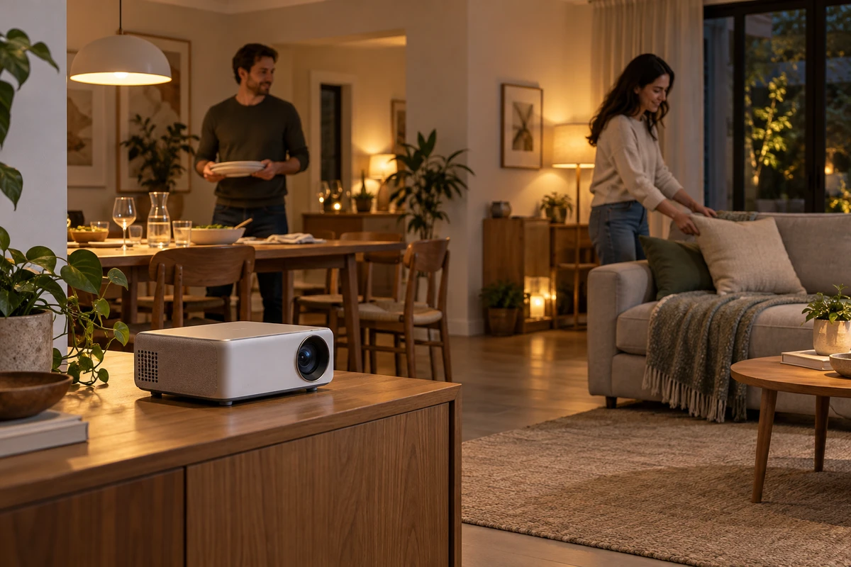
Some products become harder to understand when separated from their surroundings. A portable projector may look beautifully defined against soft circles of light, yet tell us little about how it fits into an ordinary evening. Depth of field in product ads determines not only how strongly an object stands out, but how much its surrounding life can contribute.
Shallow focus can concentrate attention; greater depth of field can preserve relationships. Neither is inherently better. The useful question is whether this moment asks us to admire an object or understand its connection to a room, a person and an action.
When the background becomes part of the message
Imagine a fictional commercial for a portable projector. Dinner has just been cleared away. One person places the device on a sideboard while another moves a sofa cushion and prepares to sit down. This is neither an ONCE client project nor a demonstration of product performance.
Keeping only the device sharp could produce a clean image. But if the table, people and sofa dissolve into indistinct shapes, the idea that a room is changing purpose after dinner may disappear with them. The setting was explaining how the product enters everyday life, not simply filling the frame.
Some background legibility gives the product another route to being understood. We do not need every wood grain or cushion seam. We need enough to recognize a cleared table, people changing positions and a room preparing for a different activity. That requires sufficient information, not identical sharpness from the nearest surface to the farthest wall.
Conversely, a shot exploring the feel of a control dial can let everyday life recede. A clear background is not morally superior, and blur is not necessarily a shortcut. Each assigns speaking time within the scene. A film can establish use through its setting, then move closer to appreciate design, without asking every shot to explain everything.
Nikon’s official Understanding Maximum Aperture defines depth of field as the zone of acceptable sharpness around the focused subject. With other conditions unchanged, a larger aperture and lower f-number reduce that zone; a smaller aperture increases it. This optical relationship does not establish that heavier blur looks more premium.
A legible setting can still have a clear lead
Retaining the background often shifts more work to set design and lighting. A bright window, reflective picture frame and busy cushion pattern may each feel plausible, while collectively relegating the product to a supporting role. Opening the aperture softens their detail, but does not decide which objects belong in the story.
In the fictional projector scene, retain the table and the act of sitting down while removing unrelated decoration. Separate the device from its surroundings through tone or color. Avoid clothing that merges with its outline, and watch whether a moving person obscures it. A background can participate without every object competing for attention.
This is where depth of field and composition need a shared discussion. Placing the device very close to the camera and an important action far behind it may make the required sharpness difficult to achieve together. Before asking the cinematographer for more depth, try reducing their separation along the viewing axis or changing the camera direction to create a more readable arrangement. The room, lens and blocking determine what works; a universal f-number cannot decide it.
Canon’s Depth of field describes aperture, focus position and shooting distance among the relevant conditions, including shallower depth at closer subject distances. If a comparison changes aperture while also moving the camera closer, the result cannot be attributed entirely to aperture. Hold other conditions as steady as practical before judging whether the change helps the story.
Depth of field is also not identical to the amount of background blur. One concerns the range of distances accepted as sharp; the other concerns how a particular background appears in this composition. Its distance from the focused subject matters. There is little value in pushing a person farther away merely to reproduce a reference image’s blur when their relationship with the product needs to remain visible.
Lighting can establish a reading order within a relatively sharp frame. The product and its surroundings need not share the same brightness or contrast. But darkening a person until their action becomes unreadable defeats the reason for keeping the setting. Our hard-light analysis explores related distinctions between shape and tonal contrast. The aim is not to light everything equally; it is to preserve the relationships that matter.
Movement turns sharpness into a question of time
A sharp still does not ensure a sharp action. Suppose someone walks from behind the sofa to the sideboard, adjusts the device and returns to their seat. Checking only the final seated position misses whether their body hides the product or the focus remains at the old position during the adjustment.
Rehearsing the full action at its intended speed is more useful than perfecting one isolated frame first. If a hand moves the important interaction outside the selected sharp range, possible responses include changing the blocking, keeping the action nearer the chosen position, adjusting depth of field or dividing the action into shots. These are creative options, not settings tested for this article.
A focus pull offers a different arrangement in time: notice the device first, then the person sitting down. It can connect the object to everyday life, but does not show both sharply at once. That suits a sequence of discoveries. If the purpose is to observe whether an operation and a reaction happen together, alternating sharpness should not replace a readable shared relationship.
Greater depth of field does not require simultaneous attention to everything either. One action can begin before another person responds. The product’s outline can stay stable while a background figure makes one necessary movement. Timing, negative space and tonal separation all establish hierarchy; blur is one option among them.
Finally, play a test at the intended viewing size and normal speed, rather than inspecting sharpness only at magnification. Without explanation, can someone understand what is happening in the room and why the product is there? If the setting supplies that understanding, let it remain legible. If it contributes only repeated decoration, allowing it to recede may lose nothing.
Giving a product an independent beauty and showing how it enters everyday life can be complementary tasks within one film. Bring the sample, the usage context you want to retain and your visual references to ONCE, and discuss which shots should isolate the product and which should keep life near the plane of focus.
Sources checked October 15, 2026. Optical explanations draw on the Nikon and Canon tutorials above; neither page displayed a confirmed full publication date. Other recommendations are creative analysis. The projector scenario and AI-generated cover are concepts, not tests or representations of actual brightness, image quality or throw distance.