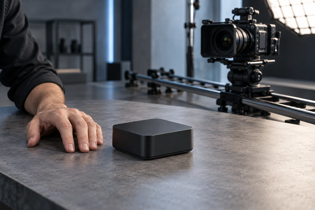
A palm-sized charging case can look like a desktop appliance when it is filmed from very close and low. A substantial machine can look unexpectedly slim when a longer lens compresses the scene. Both images may be polished. Neither necessarily gives a buyer a reliable sense of size.
Brands do not need to give up cinematic hero shots. They do need to separate two jobs that are often forced into one image: attraction and calibration. Attraction can use light, motion and dramatic composition. Calibration must help a viewer understand physical size, fit, capacity, compatibility and the exact SKU on screen. For products that must be worn, installed, stored or connected, that distinction belongs in the production brief and the acceptance criteria.
Why the product grows inside the frame
It is too simple to say that a wide-angle lens automatically makes a product look large. Perspective is governed primarily by camera-to-subject distance. When a camera moves close, the part nearest the lens becomes large relative to the far side. A spout, handle, front edge or package face can dominate even when the product occupies an attractive amount of the frame.
Focal length still matters because it controls angle of view and magnification, and therefore influences the working distance chosen to keep a similar composition. Nikon's guide to focal length explains that longer focal lengths produce a narrower view and greater magnification; Nikon's lens literature separately notes that perspective is determined by camera-to-subject distance. Canon's perspective explainer demonstrates the strong spatial separation commonly associated with wide-angle setups and the compression associated with telephoto setups.
The production lesson is practical: record focal length and camera position together. If a comparison of two sizes, generations or accessories changes camera distance, height and background placement for every shot, the apparent difference may come partly from perspective rather than the product. A dimension label cannot completely undo the visual first impression.
Scale bias is not only a wide-lens problem
Depth of field and the number of visible surfaces also influence size perception.
A 2022 Psychology & Marketing study used one eye-tracking study, three behavioral experiments and a field study. Under those study conditions, a sharply focused product against a blurred background increased perceived product size compared with a deep-depth-of-field presentation. The effect weakened when product familiarity was high. The authors therefore frame depth of field as a choice that should depend on whether the retailer wants to attract attention or provide accurate information—not as a universal conversion tactic.
A 2024 Journal of Consumer Behaviour study examined front-facing, two-dimensional presentations against views that exposed depth. Across three studies, participants tended to perceive the three-dimensional presentation as larger; the research also found effects on perceived weight in some tests. Here, “3D” is a depth cue in the presentation. It does not mean that every 3D model, spin or three-quarter view will produce the same response.
These findings do not prove that making a product look bigger will sell more units. They do show why scale-critical products should not depend on one atmospheric hero film as their only evidence.
Define the scale decision before the shot list
“How big is it?” is actually four different buyer questions:
- Absolute scale: approximate length, width, height, thickness or weight.
- Fit scale: whether it fits a cabinet, bag, worktop, port or existing device.
- Use scale: how the product relates to a hand, body or room during use.
- Variant identity: which capacity, size, color or configuration is actually shown.
The risk is not equal for every category. A decorative object or fragrance can tolerate more visual abstraction. Luggage, built-in appliances, wearables, organizers and replacement parts need stronger calibration evidence.
Google Merchant Center's current image guidance recommends a recognizable view of the complete silhouette plus supplementary angles, lifestyle context and detail images. Its product video specification says videos should feature the specific product and can show it from different angles or in use. Those rules do not design a scale system for the brand, but they reinforce a useful principle: one hero image cannot carry every product decision.
The ONCE SCALE delivery card
Instead of telling a crew to “avoid distortion,” put five checkable requirements into the brief.
S — Specification baseline
Lock approved dimensions, weight, capacity, accessories and variant names before production. The source should be an engineering-approved product truth sheet, not an old marketplace description. Flag any prototype difference that changes the exterior.
C — Camera-distance record
For comparison, fit and scale-proof shots, record focal length, camera-to-product distance, camera height, pitch and product rotation. These details do not belong in the final edit. They belong in the production record so a reshoot or a new SKU can reproduce the same spatial relationship.
A — Anchor reference
Give the viewer a familiar, honest reference: a real hand interaction, a standard worktop, an approved accessory, a known device interface or a dimension graphic. A hand is not a measuring instrument, so compatibility decisions still need exact millimetres or inches. The anchor creates intuition; it does not replace specifications.
L — Lens and angle continuity
When comparing models, lock the camera position, focal length, background and product centre. Shoot the dramatic hero separately. A three-quarter view helps explain depth, but it can also increase apparent size, so pair it with a neutral front or side view.
E — Evidence sequence
Build a short sequence for each scale-critical SKU: a neutral complete silhouette, a three-quarter form view, an in-use or installation view and, when needed, an exact dimension card. Not every six-second ad needs every element, but the master asset set should contain them for product pages, ads, support and channel versions.
Turn the framework into an acceptance test
A scale sequence can be brief. Start with a neutral view that preserves the complete silhouette. Add a three-quarter angle to explain thickness and construction. Then introduce the hand, furniture or companion device that proves use context. Finish with dimensions or compatibility details when the decision demands precision.
For multiple variants, keep the camera locked and exchange the product. Do not “find the best angle” again for every SKU if the result is meant to be compared.
At review, ask five questions:
- Without captions, can a viewer estimate the product's relationship to a person or environment?
- Do the color, configuration and accessories belong to the SKU being sold?
- Do comparison shots share the same camera and reference conditions?
- Is an exaggerated close-up or shallow-focus shot corrected by a neutral scale view?
- After 16:9, 1:1 and 9:16 adaptation, does the reference remain visible?
The fifth question is easy to miss. A hand and worktop may be clear in the landscape master, then disappear when the same shot is cropped vertically. Scale truth must be reviewed per placement, not inherited automatically from the master.
Where visual exaggeration is useful—and where it becomes risky
A hero shot may move close, sit low, blur the background and let the product fill the screen. That is reasonable when it is performing the attraction job and another shot performs calibration. The risk begins when the dramatic view becomes the only product evidence, especially for installation space, wearability, capacity or compatibility.
A useful boundary is simple: if looking larger changes only the product's character, the risk is usually low. If it can change the buyer's answer to “Will it fit, connect, hold this much, or match the variant I selected?”, add scale evidence.
The same rule applies to generative scenes and digital twins. AI can multiply environments and camera angles, but geometry, environmental proportion and SKU differences must trace back to an approved specification baseline. Adobe's enterprise Substance 3D materials position scalable product imagery around accurate digital twins and SKU-level variations. That vendor claim is not proof that every generated asset is accurate; it does clarify what the production input has to preserve.
Compare production costs with the right denominator
Cost per finished video rewards the fastest export. It does not reveal how many products, contexts and placements actually pass a scale-truth review. A more useful planning denominator is:
Fully loaded cost per valid scale-decision unit = (product-truth preparation + lens tests + controlled capture + anchors or dimension graphics + format adaptation + scale review) ÷ accepted SKU × use-context × placement combinations
“Accepted” means a viewer can understand approximate physical size, the relevant fit relationship and the shown variant without contradictions between shots.
A single decorative product may need only the light version of SCALE. A multi-size product with accessories or high fit sensitivity benefits from recorded camera positions and a complete evidence sequence. Accurate scale does not make creative work less cinematic. It gives the film a boundary: the hero shot may dramatize the product, but the evidence sequence must return it to the space it really occupies.
For the adjacent question of how product assets should support visual discovery and variant recognition, see ONCE's guide to building a visual-search asset system.