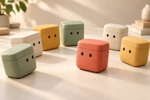
A floating card lands inside a software interface. That does not necessarily complete the transition from brand expression to product explanation. What did the card represent in the previous shot, and what is it now? If shape is the only connection, the viewer may have seen a transformation rather than the continuation of an idea.
B2B product animation can open with abstraction. But when the film begins answering “How would this software help me work?”, recognizable product objects and actions need to take over. The aim is not identical rendering styles. It is a meaningful connection between two clearly distinguishable kinds of image.
Two kinds of image, two narrative jobs
Motion By Emily’s BOX AI project account offers a useful reference. The creator describes opening with stylized spaces before moving into the product interface, with core UI supplied by the client. This discussion draws on that written account, not a shot-by-shot viewing or a statement of current functionality. Consulted October 16, 2026.
The useful creative possibility is to give each treatment a different job. Abstract space can emphasize relationships such as dispersal, gathering, obstruction or connection. An interface needs to identify objects, actions and changes. One introduces a feeling or problem; the other supplies a product-specific answer. That is our creative interpretation, not an explanation of the project’s commercial results.
For example, cards crossing one another’s paths might evoke competing tasks. That image alone cannot establish automatic scheduling. A ring enclosing every card cannot establish access protection. Metaphor can suggest an association; accurate product demonstration still has to explain the capability.
Hand the same object to the next shot
Imagine an original, fictional advertisement for scheduling software. This is not an existing product, an ONCE client project or a test. Several translucent cards compete for room in a narrow space. One has a distinctive clipped corner. The camera follows it as the space flattens and the card settles into a task row in an interface.
The important thing to preserve is identity, not necessarily transparency. The clipped corner might become a small marker in the corresponding position, helping identify the same task. Color can assist, but should not carry the connection alone: outline, relative position and a text label can also take over. If the actual interface has no such marker, use a feature it really has. A transition is not a reason to invent a button or status.
The action should connect, too. A card yields to the right in abstract space, then abruptly moves left to complete an interface action. The sequence may be lively, but its meaning has changed. It could instead continue in the original direction into the corresponding row, then hand attention to the actual interaction. Or use a clean cut: hold on the card, then clearly identify it through the interface’s selected state. Continuous transformation is only one option.
After arrival, make room for the interaction
The abstract section can move quickly without imposing that speed on the interface. Let the object settle so viewers can locate it. Show a click, drag or selection that genuinely exists, then hold the resulting state. Test the duration against the information in the shot and its viewing context; there is no universal number of seconds.
With constant rotation and flying windows, an operation can appear on screen without ever becoming the narrative focus. Flatten the perspective and settle the camera as the interface arrives, allowing the meaningful change to happen in the object itself. Restraint here gives the product its turn to perform.
A visual resolution is not a functional solution
Continue the fictional idea. All the crowded cards pass through a glowing entrance and emerge as a perfectly organized schedule. That ending can imply that the software automatically resolves every conflict. If the actual feature only flags conflicts and helps someone choose, the film has overstated it.
A treatment suited to that hypothetical feature would keep the conflict visible inside the interface. Two tasks are identified, the user makes a choice, and the revised schedule appears after the adjustment. The abstract section makes crowding tangible; the product section distinguishes the person’s contribution from the software’s. Order should follow the operation shown, not an editing trick that performs magic on the product’s behalf.
Likewise, when a waiting period is omitted, make the passage of time clear. Label an illustrative interface if it differs from the real product. Commercial storytelling can simplify detail without turning human approval into automation or treating visually limitless expansion as a capacity promise.
Not every film needs an abstract opening
For someone new to a category, an abstract image may offer an approachable problem. For someone who already knows the product and is comparing a specific feature, starting with a concrete difficulty inside the interface may be the more useful option to try. Show two conflicting tasks, then the way they are handled. The viewing task determines the sequence; it is not a ranking of creative ambition.
If every sphere, tunnel and light beam needs lengthy narration to explain it, consider removing the abstraction. Conversely, a brand atmosphere film need not carry a complete tutorial. Abstract expression can remain open-ended provided imagination is not presented as product fact.
Return to the card landing in the interface. The question is not just whether the transition is smooth. Does a clear, accurate action, connected to the previous shot, follow its arrival? That is where brand expression and product explanation can become one narrative.
Planning a software or B2B product film? Bring one confirmed real interaction and the central problem you want to communicate, and discuss the production approach with ONCE. Together, we can consider what should be imagined and what the product needs to show for itself.