Props earn their place in a product commercial when they help the viewer understand the relationship between a product and the person using it. Coffee beans establish what goes into a grinder. A hand provides scale. A cup gives an action a destination. Yet the same objects can turn the product into background dressing if their size, position or timing is wrong. Decide what each object adds to the viewer's understanding before deciding how prominent it should be.
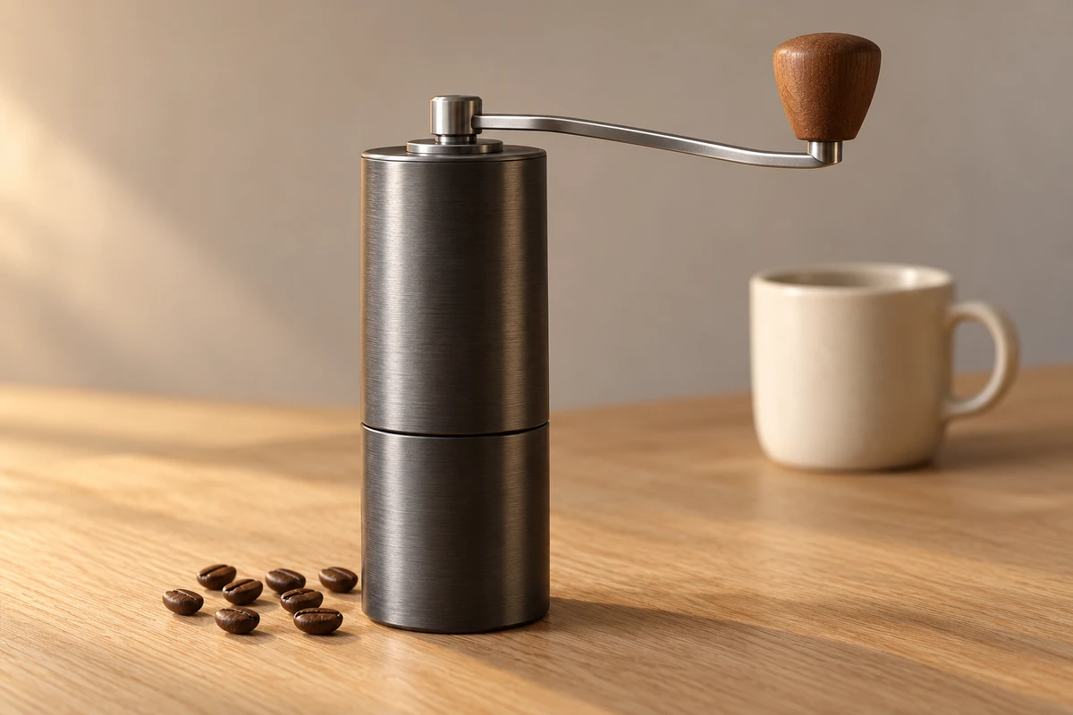
Consider a hypothetical portable manual coffee grinder for urban home-coffee enthusiasts in the UK: a dark grey metal cylinder, a detachable handle and a grounds cup beneath it. The brand is preparing a launch film for its website and shorter social videos around the idea of making a little time each day for a considered cup of coffee. This is a creative example, not an ONCE client project. Dimensions, grinding performance and operating steps would need confirmation against the final sample and instructions.
Give each prop a specific job
Start with what the script is missing rather than a shopping list of premium-looking objects. If viewers cannot judge size, the missing ingredient is a scale relationship. If they cannot understand operation, it is an object that makes the action readable. Colour, dressing and lifestyle cues become the next question when the product is already clear but the visual character feels generic.
Adobe's Product photography props guidance recommends using props to accentuate product features and functions while keeping the product the focal point. Video adds another variable: time. An understated object can command attention as soon as someone lifts it, it catches a reflection or it makes a sound. Background objects therefore belong in the shot plan, not just the art-direction reference.
For this grinder, a simple role table gives each object a reason to stay and a condition for removing it. It does not prescribe a universally minimal set.
| Candidate prop | What it explains, and when to remove it |
|---|---|
| A small quantity of beans | Establishes the input. If decorative scatter makes loading difficult to read, put the beans back in a container. |
| Hands and the grounds cup | Shows grip, scale and where the grounds go. Keep hands clear of key structure; use the actual product cup or identify a separate demonstration vessel. |
| One unbranded coffee cup | Gives the daily ritual a purpose. Reposition it if the composition makes it look like part of a bundle, and clarify included items where needed. |
| A small coloured surface or geometric plinth | Adds a brand colour and spatial order. Replace it if it distorts scale, resembles an accessory or hides the base. |
| Flowers, books and a coffee machine | May explain a character's life, but this example does not need all of them. Remove objects without a narrative task before deciding that atmosphere is missing. |
Three prop relationships tell three different stories
Everyday ritual: let objects arrive with the action
The first treatment uses a pale wooden surface, a few beans and one plain cup. It opens with a hand placing the grinder down, rather than an already styled coffee tableau. Beans enter from a small container and the other hand takes the handle. The cup stays behind the action until grinding is complete.
Soft light and a camera near seated eye level create an approachable viewpoint. Direction concentrates on finding a comfortable grip, turning and stopping, rather than presenting every step to the lens. The sound moves from beans falling to the actual manual grinding sound; music opens up slightly only after the action is complete. Objects enter through preparation, operation and completion, with the product connecting all three.
This can establish an everyday relationship, but a short lifestyle sequence cannot prove grinding speed or consistency. Product-page footage should give the loading opening, handle fitting and grounds cup enough observation time. Lifestyle imagery can explain why someone uses a product without answering every question about how to use it.
Design order: let props support the product's own movement
The second treatment reduces the everyday objects to a grounds cup. A neutral grey background carries one small area of a brand-specified colour. The grinder stands on a low plinth; the extended handle creates a readable horizontal line. A slightly angled close-up reveals the relationship between cylinder, shaft and handle.
The coloured surface need not fill a wall. A small edge accent can connect with the closing frame. Light forms a continuous reflection along the metal outline, while the sound of fitting the handle sets an editing beat. Props provide order around the product and support a restrained design attitude.
Looking precise is not proof of precision. Rulers, laboratory vessels or decorative data-like elements should not imply measurements that have not been made. Nor does an internally chosen colour automatically become a recognisable brand asset. The Ehrenberg-Bass Institute's Brands of Distinction identifies uniqueness and fame as key characteristics. This example uses a specified brand colour; it does not claim established consumer recognition.
A richer lifestyle set: when dressing takes over
The third treatment adds flowers, old books, a large coffee machine, two colourful cups and a tablecloth. It is not inherently wrong. Books and crockery may have a role in a story about someone preparing a weekend breakfast. But this brief has very little time to introduce a grinder. Viewers might notice the flowers first, assume the coffee machine is the advertised product next, and understand what is for sale only at the end.
Other misunderstandings are less obvious. An oversized cup can make the grinder appear smaller. Another brand's equipment can compete for visual ownership. Showing beans, grounds and finished coffee at once can obscure which object performs each step. Restore a hierarchy rather than automatically clearing the whole table: remove the brightest, largest or most active object first, then keep one readable relationship around the key action.
Use a removal test instead of scoring prettiness
Before the shoot, record a few short tabletop trials with the final sample and candidate props. Keep product position, camera, light and action consistent, then remove objects one at a time. The comparison should isolate a prop's contribution, not make the simpler version deliberately less attractive.
Pause at the first product frame and ask what the product is, where it is and what is happening. Play the sequence and ask whether input, operation and result become easier to understand. Then listen separately: do cup impacts, surface friction or decorative sound effects overwhelm useful feedback? If removing the vase improves product clarity without losing the intended mood, it need not return. If removing the grounds cup makes the destination of the grounds unclear, it has a specific job.
This is a proposed production method, not a completed audience experiment or a sales forecast. If the team still disagrees, a small group of people from the target market can describe what they see in their own words, allowing the team to record misunderstandings. That exploratory feedback cannot represent the whole market either.
Put props into a twelve-second shot sequence
The following example chooses the everyday-ritual treatment. Twelve seconds is a creative allocation, not a platform rule. Grinding includes a visible time omission, so the edit does not imply that two seconds produces enough grounds for a cup.
| Timing and shot | Roles for objects, action and sound |
|---|---|
| 0–2 seconds: tabletop close-up | A hand places the grinder in the foreground; the plain cup stays behind it. Keep the placement sound and establish the subject first. |
| 2–5 seconds: operating close-up | Load beans from a small container and fit the handle. Both serve the real action and stay clear of key structure. |
| 5–7 seconds: grinding excerpt | One hand holds the cylinder while the other turns. The cut clearly omits time; actual operating sound connects shots without implying a complete duration. |
| 7–10 seconds: result close-up | Remove the grounds cup as the real product allows and make the grounds visible. An attractive patch of grounds does not substantiate consistency or a performance specification. |
| 10–12 seconds: product hold | Keep the handle-to-cylinder relationship clear and the cup secondary. Add the closing brand information in post; props introduce no new question. |
There is no brewing step here, so coffee in the drinking cup cannot be edited as the grinder's direct output. If the film needs to move from beans to a finished drink, add the actual brewing steps and appropriate equipment, then reconsider the running time instead of bridging the gap with a pouring sound.
Make the props work across takes and versions
Prop states change during filming: beans diminish, the grounds cup becomes dirty, the handle turns and a cup moves a few centimetres. Any of these can prevent two camera angles from cutting together. Reference photographs should record each shot's starting positions, bean quantity, product state and the hand being used. Reset against the action as well as the composition.
StudioBinder's props-breakdown guide distinguishes objects handled by characters from set dressing that is not handled. A project can use that distinction to assign preparation and reset responsibilities; no particular software is required.
Check action relationships separately in landscape and portrait. Cropping out the loading vessel makes beans appear from nowhere; cropping out the grounds cup removes the result. TikTok's current Creative Guidance recommends reducing clutter and allowing for interface safe zones. For a TikTok ad version, use the project's current preview to check product, hands, captions and interface elements. There is no universal pixel prescription in this article.
AI reference images can help discuss colour and dressing. They cannot establish whether a cup physically fits, a handle can turn or the grinder structure is correct. Test the actual props with the real sample. The project owner should confirm conditions for using third-party patterns, trademarks, music and generated assets. A conveniently attractive detail in a reference must not become an untested promise for the shoot.
When the product should stand alone
Shots for identifying appearance, checking included accessories, explaining connections or showing colour variants often benefit from removing atmospheric dressing. If the sample is unfinished or a key operation cannot be demonstrated, lifestyle props should not conceal that problem. Establish what can be filmed, then add a lifestyle relationship where it helps.
ONCE's current U-STUDIO page lists home interiors and a white cyclorama, with product-specific changes to props, colour and local dressing. Choose between them through the relationships the shots need: an interior helps establish a living space, while a cyclorama allows the background and dressing to be rebuilt more freely. Alterations, sound, equipment, support and availability require project-specific confirmation.
For a product commercial, send ONCE the product, target market, website or paid-media channels, confirmed functions, sample status, visual references, timing and budget range through the project enquiry page. Include the action you most need viewers to understand. This gives the team a useful starting point for discussing full production, a prop trial or a studio visit with the sample.
Sources accessed on 10 October 2026: Adobe, Product photography props; Ehrenberg-Bass Institute, Brands of Distinction; StudioBinder, Props Breakdown — How to Make a List of All Props in a Script, published 20 March 2022; and TikTok, Creative Guidance. They inform the relevant creative and production principles and do not endorse this treatment or ONCE. The cover is an original generated concept image, not a client work or a photograph of the studio.