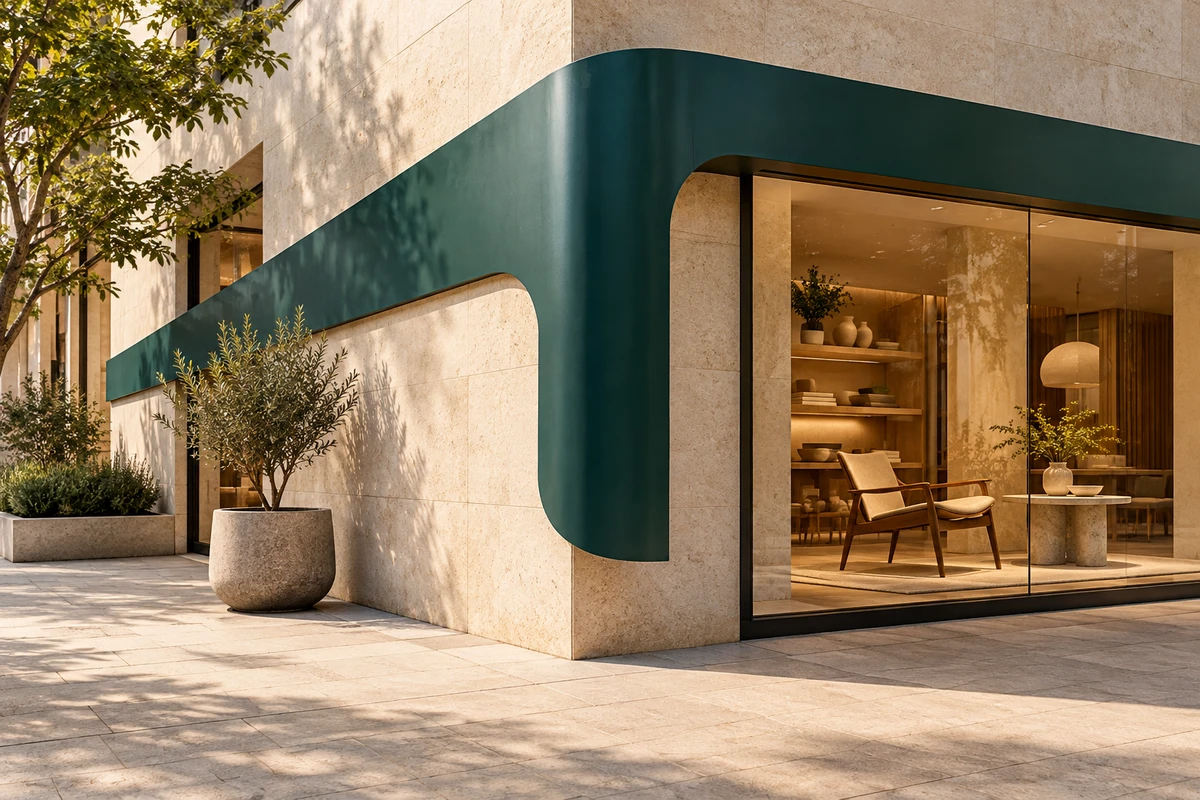
On a presentation slide, left and right may look like compositional choices. At a street corner, they can send people to different places. When brand out-of-home advertising takes on a directional role, the image acquires another job: it must explain not only who is speaking, but why this message matters here.
That opens creative possibilities. A logo need not always sit in a corner, and a key visual need not be a larger product photograph. A brand’s existing shapes may be able to do useful communicative work. But looking directional and helping someone find the right place are different outcomes.
Follow the Arches: one graphic, two questions
In its February 13, 2018 announcement, Cossette described McDonald’s Canada’s Follow the Arches: portions of the Golden Arches became directional graphics accompanied by brief instructions. The One Club’s 2018 project archive records the same design approach. This is a historical campaign, not a recent launch.
The interesting move is not simply enlarging a logo. It gives an identifying contour something to do. The brand does not merely sign a directional message; the message takes on the brand’s own form. That is our interpretation of the published design account, not a measurement of navigation performance.
Two questions come together: whose advertisement is this, and what does it want me to do next? Identification alone could leave an elegant but unhelpful image. A generic arrow might communicate direction without making much use of the brand’s own expressive resources.
Intent is not proof of effectiveness. We have not visited the placements or watched the complete case film, and make no claim about incremental visits, sales or memory. What is useful here is the graphic’s role, not an assumption that an admired format is a universal growth formula.
The same left turn changes meaning when its location changes
A brand shape can continue across locations. Its directional relationship has to be established again. Is the ad ahead of the viewer, beside them or behind them? Has the destination already been passed? Does the graphic indicate another entrance or an object within the image? An isolated artwork cannot settle these relationships.
Mirroring a directional graphic for compositional balance is therefore not an innocent adjustment. Flipping decoration may change only its appearance. Flipping an instruction may change the sentence. Moving the work to the other side of a street also requires more than preserving its color and dimensions.
This connects with our discussion of visual brand assets in advertising. A consistent cue may help establish who a message belongs to; it does not establish where someone should go this time. An unfamiliar brand should not omit its name, location or necessary explanation simply because its own designers recognize the shape. Restraint can be a style. Missing information is not sophistication.
This article concerns advertising creative, not road signage, architectural wayfinding or accessible passage. Actual installations and guidance require assessment in their setting by the appropriate professionals. Brand graphics cannot replace necessary formal signs.
A line that turns, for a fictional homeware store
The following is an original fictional proposal, not an ONCE client project or an audience-tested installation. Imagine a homeware store exploring a theme of making everyday living feel less cramped. Its candidate graphic is a dark teal, ribbon-like line that bends. It is not yet an established brand asset.
In an ad before a corner, the line could turn through the composition alongside a clear store name and location information checked against the actual site. Its job would be to make the store’s presence relevant to the viewer’s position. If it seems to point toward the neighboring entrance, its elegance is no reason to keep it.
At the store entrance, the task changes. People need to confirm arrival, not receive another instruction to turn. The same line might settle around an object in the window, drawing attention to furniture and a living scene, while arrival information remains clear. The visual language can continue without perpetuating the previous action request.
Moving into social video means leaving the local left behind
Someone watching a social video may be nowhere near the store. The left side of their phone is not a real-world direction to it. A line sliding left beside “just over here” can become motion without a reference point.
Another narrative is possible. The line travels past a cramped dining table, then accompanies a camera move into a space where people can sit together, before returning to the store and its theme. Here, the turn expresses a change in everyday life, not an actual route. If the content genuinely supports a visit, it still needs separately verified location information and context. Animating the line does not, by itself, adapt outdoor creative for a phone.
These three images do not require one format to dominate every medium. They show how related shapes can serve different viewing tasks: a choice before the corner, confirmation at the entrance, and an imagined possibility on a phone.
Motion can explain a shape without hiding the essential message
Motion graphics can show a line bending or forming a relationship with a product contour. A proposal might let the fictional ribbon pass around a chair back and connect parts of a room. That is a creative exploration, not a claim that the movement will cause a purchase.
Where location-related information matters, consider what someone sees if they arrive halfway through the sequence. If the name and essential explanation appear only at the end, the preceding drift may not communicate independently. Necessary information could remain visible while movement supplies an additional idea, instead of asking every passerby to wait through a miniature film.
This is not a universal duration rule. Playback, viewing conditions and whether motion is permitted need checking with the specific medium. We prescribe no timings, brightness values or placement specifications. Decide what the image must accomplish before deciding whether movement improves understanding.
AI-generated images may help explore fictional settings and shape relationships. A convincing street mockup does not establish that an entrance exists or replace observation. Keep concept imagery separate from actual location material. If a graphic’s turn changes across versions, return to its meaning rather than selecting only the most attractive image.
The creative achievement is useful form, not mere reduction
The challenge is not deleting as much copy as possible. It is making a clear relationship between brand identity, location information and someone’s next step. Simplicity should serve that relationship, not become the assignment itself.
Sometimes one graphic can carry several meanings. Sometimes another explanatory sentence is better. An unfamiliar brand cannot borrow an established brand’s recognition conditions, and a social video cannot inherit an outdoor placement’s physical context. What can carry over is the question: why must this shape appear here, and what does it help someone understand?
If you are extending a brand key visual into a film or motion graphics, bring the existing elements, intended settings and the next step you want people to understand to ONCE. Establish each image’s viewing task before deciding which transformation deserves animation. Outdoor media execution and on-site guidance should be confirmed by the relevant specialists.
Sources read October 16, 2026. Cossette created the campaign; The One Club’s project description is not independent effectiveness research. This article analyzes published text. The homeware store, social-video proposal and AI-generated cover are fictional concepts, not real commissions. No McDonald’s identity assets or case images are used.