ONCE Advertising Cinematography Research · Advertising Cinematography Research 05/10
Research article / work analysis · ONCE Editorial
A freshly painted wall may look like the correct brand red to the eye. The moment the camera turns on, it can become three different reds: brighter near the source, textured where light skims across the roller marks, and reflected onto the performer standing in front of it. Putting a color chart in frame proves that a chart was present. It does not automatically make the set, skin, wardrobe, and product belong to the same world.
That is the production-design problem advertising often underestimates. The art department does not merely fill a background, and the cinematography team does not arrive after the build to make it look good. Before the camera rolls, the size of the set has already limited how far the camera can move and how many steps a performer can take. Surface finishes have already determined whether light will be absorbed, scattered, or returned to the lens. The proportion of wardrobe color against the set has already affected figure-ground separation. Props and practical sources have already proposed a logic for where brightness comes from.
This article advances a specific thesis: production design is not a background layer inside cinematography; it is a physical precondition for cinematography. Design first allocates spatial paths, reflective relationships, figure-ground separation, and brand motifs. Cinematography then organizes those conditions into viewpoint, light, and time. Postproduction can clean seams, extend a location, and adjust local color. It cannot restore, without cost, occlusion, reflection, spill, contact shadow, and performance relationships that never occurred on set.
To make the thesis useful, we propose four agreements for a “shootable world”: scale and pathways; surfaces and light; color proportion and figure-ground separation; motifs and cross-format continuity. These are not a departmental checklist. They are four sets of questions that directing, cinematography, production design, wardrobe, product, and post must answer together before shooting.
Material and method: only verifiable production relationships
This analysis reads three sets of public project materials. The first is Tigrelab’s project page and eight official stills for a CIBC television commercial. The second is ARRI’s cinematography interview, credits, and frame examples for Pepsi’s Discover. The third is Griffith Media’s production case study for a World’s Finest Chocolate brand refresh. We also consulted the Production Designers Collective article “How do you design for commercials?”, published on July 13, 2024, for practitioner accounts of short schedules, budgets, and client collaboration.
The available evidence differs by case. The CIBC page discloses projection across four walls and a table, in-camera effects, and full credits; we also inspected the stills available on that page. The ARRI page discloses a built market street, a custom luminous prop, wet ground, lighting choices, and selected camera parameters, with corresponding images. The World’s Finest Chocolate page documents preproduction, LED-wall backgrounds, wardrobe, and floor organization, but we did not perform a frame-by-frame viewing of every finished film.
The article therefore separates four kinds of statement. Direct observation is limited to what was actually visible in the supplied stills. Documented production fact is limited to what the sources disclose. ONCE interpretation is identified as our reading of those materials. Proposed experiment is clearly marked as unperformed and has no invented results. We do not infer undisclosed lamp positions, lenses, exposure values, material recipes, or authorial intentions from finished frames.
Agreement one: scale and pathways are not problems to solve after the set is built
Both the camera and the performer need paths. A three-meter-wide room does not acquire six meters of depth because a wider lens is mounted; the lens merely projects the existing distances differently. If the director wants a performer to move from a narrow entrance into an open main space while the camera crosses laterally and reveals a product at a second action point, the set must contain room for performance, camera movement, focus, flags, sources, crew safety, and what must remain out of frame.
A plan should therefore show more than doors, windows, and furniture. It should include three types of invisible footprint: where the camera begins and ends, where the performance changes, and how lighting and control surfaces can enter at usable angles without appearing. If production design optimizes only the front view, a lateral move can expose wall backs, rigging, projection boundaries, and floor seams. If cinematography asks for “more width” only after the technical scout, it can damage the scale relationship that the design was built to express.
The shared deliverable is not a beautiful concept frame. It is a shootable spatial agreement: key viewpoints, action routes, eyeline height, likely aspect ratios, and negative space that must survive. The set can be vast or deliberately constricted. The point is not luxury. The point is to make physical limits consistent with the creative proposition.
CIBC: four walls and a table become both space and light
Tigrelab’s CIBC project page says Aggressive TV wanted to combine cinematography and projection mapping, using light to create different spaces inside a 30-second commercial. The team centered the sequence on experimental in-camera visual effects, researched design and footage, built some scenes as full-CG images with trompe-l’oeil depth and others as two-dimensional motion graphics, then projected across four walls and the table. The published credits name directors Alex Topaller and Daniel Shapiro, cinematographer Adam Marsden, production designer Jesson Moen, and projectionist and technical director Brandon Epperson.
The official stills make the disclosure observable. In one image, a performer sits behind a table while hard-edged fields of color cross both wall and tabletop. Another compresses the room into an almost monochrome purple field, making the table, walls, and light difficult to treat as separate layers. A third uses a horizontal division and two color zones to organize a standing figure. What we can see is that fields of color and brightness continue across several physical surfaces. We cannot identify the projector model, exact output, or exposure strategy from those stills.
ONCE’s interpretation is that this is not a neutral room receiving a replaceable background. The set surfaces themselves carry illumination, composition, and spatial deformation. The projected image is both picture content and light falling onto the performer and table. When the performer moves, occlusion and projection placement change. When the camera moves, the trompe-l’oeil perspective must still resolve. Production design, graphic content, cinematography, and performance share one coordinate system.
The benefit is not simply “less post.” It moves creative feedback onto the set. The team can see whether a graphic boundary cuts across a face, whether a table reflection consumes a hand gesture, or whether a color field destroys wardrobe separation. The cost is equally concrete: projection level, surface color, performer occlusion, and camera viewpoint constrain one another. None can be replaced independently at the last minute.
Agreement two: a surface is not a color sample; it is a behavior of light
“The wall is blue,” “the floor is black,” and “the table is metal” are insufficient descriptions. Cinematography needs to know whether the blue wall is matte emulsion, eggshell paint, or translucent material; whether the black floor is absorbent cloth, wet asphalt, or polished acrylic; and whether the metal tabletop is mirror-finished, brushed stainless steel, or coated imitation metal. The names can remain constant while the reflective behavior changes completely.
Surfaces change three things. The first is luminance range: a dark glossy object can combine a nearly black base with extremely bright reflections, making it harder to hold than a pale matte wall. The second is source shape: practical fixtures, signs, and large walls return their own geometry into products, floors, eyes, and skin. The third is color contamination: a large saturated surface sends colored bounce toward performers and products, particularly affecting white packaging, skin tones, and metals.
That is why a finish sample should be tested under the proposed light and viewpoint, not only compared with a Pantone chip in a meeting room. In the Production Designers Collective interview, Latisha Duarte describes scanning supplied Pantone chips, mixing paint samples in several finishes, and applying four coats before the scenic color was satisfactory. The lesson is not that more coats are automatically better. It is that a color code, a paint system, surface gloss, and photographed appearance are separate variables.
Pepsi Discover: a prop is not just illuminated, it can be an illumination structure
ARRI’s May 4, 2021 production feature on Pepsi’s Discover records a detailed collaboration. Director Blake Farber and cinematographer Corrado Serri initially imagined a music-driven journey through several iconic locations. Travel restrictions moved the production to two studio days and two location days in Dubai, with large-format capture and set extension. Production designer Gaspare De Pascali built custom signage and a market street nearly 100 meters long according to an agreed palette. The page also credits wardrobe to Micaela Cigala and identifies the VFX and color teams.
The source explains that, near the end of a long moving shot, the performers stand beneath a translucent machine custom-built by production design. Serri placed three LED tubes inside it and had two electricians carry tubes just outside the frame for additional side kick. In another scene, a white piano supplied enough bounce for the player, while wet ground intensified reflections from shop signs. The official stills show three figures under a large luminous object, a white piano catching blue-green ambient color, and a market street whose dense signs and floor reflections create a continuous brightness rhythm.
The important point is not the brand of lamp. It is how art objects become optical structures. The translucent machine is simultaneously a prop, a top source, a performance destination, and a compositional center. The white piano is both a narrative object and a bounce surface. The wet street is not an atmosphere preset; it duplicates vertical signs across the ground and gives the performers’ route a second directional layer.
The documented facts are the custom machine, internal tubes, white-piano bounce, wet-ground reflection, and street built to a selected palette. Our interpretation is that these decisions convert art-department resources directly into photographable light. If the machine existed only as a late composite, the wrap on heads, eyes, skin, wardrobe, and nearby objects would need to be rebuilt separately. If the decision to wet the ground were made only on the shooting day, camera movement, shoe safety, reflection density, and exposure would all change together.
This does not mean everything must be practical. ARRI’s account explicitly notes composites and set extensions, and some shots preserved cleaner imagery for CGI. The more useful decision is to specify which relationships must happen on set and which can be completed later. Interactions involving touch, occlusion, reflection, or performance are often expensive and valuable to capture physically. Distant extension, sign cleanup, and local continuity are more natural postproduction responsibilities.
Agreement three: color proportion comes before naming a hero color
Bringing a brand color into a commercial does not mean making the set, wardrobe, props, and product the same hue. Color needs proportion and position. A red wall occupying two-thirds of the frame affects skin, product edge, and viewing order differently from a red strip confined to the edge, even when both use the same nominal color.
A color design can be examined through four questions. Which color occupies the greatest area? Which color sits near faces and product? Which appears only in highlights or props? Which neutral gives the others room to breathe? Wardrobe cannot be treated as a variable inserted after the set is finished. Fabric color, gloss, and texture determine whether it absorbs or returns environmental color, and whether the performer holds an edge against different backgrounds.
If a product package is already highly saturated and the background fills the frame with the same hue, the product may be reduced to contour. If wardrobe approaches both skin and background, the performer can collapse into an unstable middle layer. The solution is not always to change hue. It may be to change surface gloss, area, luminance hierarchy, or distance from the background. The common task of color design and cinematography is not to maximize the amount of brand color, but to decide where that color becomes most legible.
World’s Finest Chocolate: a style guide becomes a world only when it reaches wardrobe, background, and product
The World’s Finest Chocolate virtual-production case study documents one of the first moving-image applications of a refreshed brand system: new colors, illustration, and packaging existed, while the previous video generation was no longer suitable. According to the producer, scripts, casting, and shot-by-shot storyboards were completed before photography. The design team spent two weeks building a set of animated backgrounds and more than 30 still backgrounds from the new style guide. Performers wore solid pastels corresponding to the brand and chocolate-bar flavors. The LED wall moved rapidly among a forest, gym, school, hallway, secret-agent headquarters, and urban interior, and the project page states that the wall itself lit the performers.
We did not view every finished film in full and therefore do not evaluate their editing or every wardrobe pairing. The documented production relationship is enough for a narrower analysis: backgrounds, wardrobe, graphics, product, and on-set light were designed within one brand system before shooting. The LED wall did not only replace locations; it participated in performer lighting. Props and wardrobe were staged with backups and extra sizes, while takes were checked at video village.
ONCE’s interpretation is that this case shows why recognition cannot be added later as a LUT or corner mark. If pastel wardrobe and background content carry the same saturation and luminance, performers disappear. If the LED environment only supplies attractive places without leaving luminance and hue separation for the package, the brand can be consumed by its own world. Consistency does not mean every element is identical. It means they obey the same rules for proportion, contrast, and repetition.
The case also exposes a real constraint. Front-loaded design can shorten the shooting day, but it moves decision pressure into preproduction. If boards, background assets, wardrobe, props, and performance timing are not resolved, rapid switching simply reveals inconsistency faster. Efficiency comes from decisions already made, not from an LED wall creating efficiency by itself.
Agreement four: a motif must survive formats, not only one hero frame
Advertising usually requires horizontal, vertical, square, and multiple-duration versions. If a design motif exists only at the far edges of a widescreen frame, the vertical crop removes it. If recognition relies only on broad spatial proportion, a mobile close-up can lose the world. If a prop acquires meaning only through a long lateral move, a six-second edit may never establish it.
Motifs therefore need scale. Large motifs live in architecture, dominant color blocks, or spatial geometry. Mid-scale motifs live in wardrobe, furniture, repeated props, and local materials. Small motifs live in products, hand actions, and readable details. Every version does not need every scale, but each should preserve at least one relationship that identifies the same world.
Cinematography and design can test this early by placing 16:9, 9:16, and 1:1 guides over key viewpoints and checking how performer, product, luminous prop, and color fields redistribute. The goal is not to crop horizontal material mechanically. It is to know which walls need extension, which props need a secondary position, and which actions must occur near the center axis.
Why postproduction is not permission to postpone production design
Postproduction can absolutely change a world. It can extend walls, replace skies, remove rigging, unify color across shots, add distant depth, or rebuild an entire digital environment. The issue is not whether it can. The issue is whether the recorded material contains the relationships required for reconstruction.
When a performer truly stands under a luminous object, skin, eyes, hair, wardrobe, floor, and nearby props all receive it differently. Add the object later and each surface requires separate attention, with movement and occlusion maintained. If production preserved no separation around a product, increasing saturation may move noise, skin, and reflections together. If a prop never gave the performer real weight and position, post can draw the object but does not automatically restore hand pressure, eyeline, or body balance.
This is a cost judgment, not a moral argument for practical photography. A deliberately flat, graphic, or highly virtual commercial can simplify physical interaction by design. A campaign requiring many versions, territories, or product updates may benefit from a stable CGI system. The condition is that the team defines in advance which elements are replaceable assets, which are optical interactions that must co-occur, and which are performance interactions that must co-occur.
A useful boundary is this: postproduction is strong at rebuilding describable assets; it is rarely cheap at restoring interactions that were never recorded. A background plate can be replaced. Refraction through transparent packaging, scatter along the edge of textured hair, moving reflections on a watch, and a pinpoint highlight in an actor’s eye can turn “replace the background” into layered tracking, keying, relighting, and compositing.
Counterexample: emptiness can be complete production design
Treating design as a physical precondition does not require every commercial to construct an elaborate world. A white cyc, black volume, monochrome sweep, or empty location can be rigorous design choices. If the idea isolates the product as a test object, introduces performers as graphic symbols, or removes narrative location from an action, less information can be more exact.
Yet “nothing there” still needs design. Does the cyc curve appear in a reflective product? Does the floor produce a horizon line? How does white wardrobe separate from a white wall? Does a black room consume dark packaging? Is the contact shadow sufficient to give weight? Emptiness is not the absence of production design; it concentrates design into edge, surface, and proportion.
An unperformed minimum joint test
The following is a proposed experiment. It has not been run, and it has no results.
Use one performer, one actual wardrobe look, and one real product. Build two replaceable flats and one tabletop. Fix the camera, lens, viewpoint, action, white balance, and exposure reference. Change only three groups of variables:
- Surface: use matte, semi-gloss, and gloss finishes in the same background hue.
- Proportion: hold the nominal hues of background, wardrobe, and product while changing their area and luminance relationships.
- Practical source: build the same prop as a working source, a non-emitting object, and an element intended for post-only insertion.
Record the same ten-second action for every condition and inspect both horizontal and vertical frames. The observations should not be scored as “more premium.” Record instead whether face-background separation remains stable; whether the product edge survives the whole action; whether color spill contaminates packaging and skin; whether prop light appears in eyes, wardrobe, floor, and product reflections; and whether the vertical version retains at least one brand motif.
The test can fail. Construction differences between finish samples can contaminate the variables. Fabric folds and performer position can change the reflection. If midtone brightness is not matched, exposure can be mistaken for material behavior. A “post version” without a real time and cost allowance does not represent a deliverable plan. Even with those limits, this small test is closer to a production decision than three moodboards because it puts set, wardrobe, product, action, and camera inside the same problem.
Turn the treatment into a set-camera agreement
For a real production, the discussion can be compressed into a single agreement page rather than another stack of references:
- Space: key viewpoints, performance routes, product position, and machine footprint;
- Surfaces: color, finish, reflectivity, and approved construction sample for every major area;
- Figure-ground: area, luminance, and hue relationships among performer, product, wardrobe, and background in key shots;
- Practical sources: which props emit real light, whom they illuminate, and whether dimming and flicker tests are required;
- Versions: motifs and action points that must survive horizontal, vertical, and short edits;
- Responsibility: interactions that must occur in camera, assets that can be replaced in post, and the handoff test between the two.
This agreement does not remove flexibility from directing, cinematography, or design. It frees genuine improvisation from technical rescue work. Performers can change rhythm, the camera can find a better distance, and the art department can refine details because everyone knows which relationships must not be broken by accident.
The previous study on product material and reflected environments explains why a surface carries the world into a product. This article expands the question to the whole world: set, wardrobe, props, and people illuminate, occlude, and define one another. They are not decoration added after cinematography. They are conditions under which cinematography occurs.
If you are developing a commercial that must coordinate locations, LED walls, projection, CGI, or several aspect ratios, prepare the script, physical product or finish samples, brand colors, key actions, and delivery formats first. Then send those materials to ONCE to discuss a joint set-camera test. The useful first question is not “What style should the background be?” It is “How will this world allow product, performer, and light to remain true at the same time?”
Sources and research note
Sources were checked on October 4, 2026.
- Tigrelab, CIBC TV Commercial Campaign. This article uses the disclosure of projection across four walls and a table, experimental in-camera effects, workflow, credits, and official stills. No publication date was visible.
- ARRI, Rear diopters create a vintage canvas for ARRI Signature Prime lenses on Pepsi commercial, May 4, 2021. We use the built market street, custom luminous machine, wet ground, white piano, palette, practical-post split, and credits. Lens texture is not the subject of this episode.
- Griffith Media, World’s Finest Chocolate Case Study: Virtual Production on the LED Wall. We use the brand refresh, boards, animated and still backgrounds, pastel wardrobe, LED-wall lighting, props, and floor organization described by the producer. The page was accessed October 4, 2026; no clear publication date was visible.
- Production Designers Collective, Latisha Duarte, Dylan Kahn, Chelsea Oliver, and Pablo Tregebov-Poza, How do you design for commercials?, July 13, 2024. We use the discussion of commercial time pressure, location versus build decisions, and finish-sample work.
- D&AD, Welcome Home, 2018. As a supplementary comparison, the project page describes the Apple HomePod film as using detailed art direction and visual effects to stretch a small room as music changes the space. The D&AD video requires login; we did not treat the text page as full viewing or conduct a shot-by-shot analysis from it.
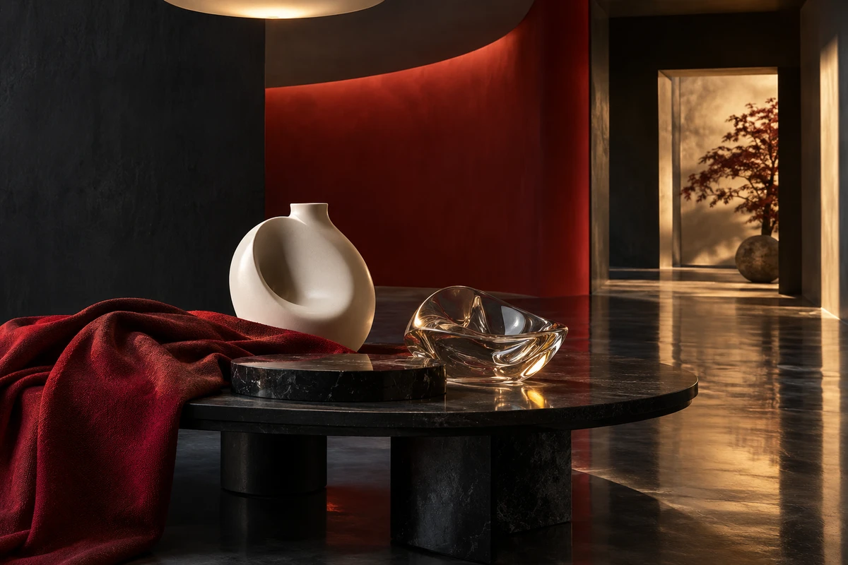
This is an original ONCE research article and work analysis, not a peer-reviewed academic paper. The cover is an original commercial concept image, not a frame from any cited advertisement, an ONCE client project, a real set, or an experiment record. No third-party advertising stills are republished in the article, and no third-party asset authorization is claimed.