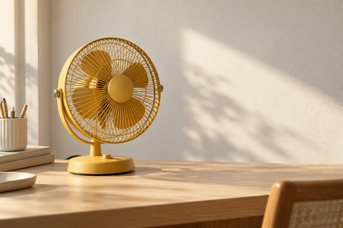
Imagine an existing photograph of a desktop fan: its warm yellow body sits to one side, against a table, a pale wall and a diagonal patch of light. It now needs to fit a wider banner. After both sides are filled, the fan may remain the same size and in the same place within the source image, yet no longer be the centre of the composition.
That is the creative problem in AI image expansion. An apparently undistorted object does not mean the original visual relationship has survived. New space can give a product room to breathe, or introduce a brighter window, a larger plant or another activity that turns a quiet product image into a busy interior.
The fan scene below is hypothetical, not client work. No expansion workflow or viewer test was carried out. It explores what should occupy the new space, not what any particular model will necessarily generate.
An expanded canvas needs a new composition
Adobe’s Photoshop documentation, Explore beyond the canvas with Generative Expand, updated on 23 February 2026, describes extending the canvas with the Crop tool and generating content. This differs from stretching the whole image: previously absent areas receive generated imagery, rather than simply widening existing objects to reach the target dimensions.
Runway’s Expand Image help page likewise separates the input image, target aspect ratio and optional directions for the new content. Being able to supply a direction does not mean the tool has decided the visual hierarchy for the creator. (No confirmed publication date is shown; consulted on 17 October 2026.)
Consider an easily missed change. Even if the fan is not reduced within the file, it occupies a smaller proportion of the wider banner. A dial and grille that were immediately legible may become little more than a yellow shape within a larger setting. If the complete banner is then displayed at a smaller size, inspect whether its details remain readable at that actual size.
Preserving as much of the original image as possible need not be the only objective. Sometimes a small extension is enough. Sometimes cropping and subject placement need consideration together, or another photograph may better suit the format. Expansion supplies a way to alter the image; composition remains a choice.
The same fan can enter different stories
One direction simply continues the pale wall and tabletop, retaining a little of their existing variation. It adds space without immediately adding an event. If the banner needs to hold one product message, that restrained continuation may be more useful than filling it with props.
A second direction introduces a bright window. The space may become more distinctive, but the window can also become a new centre of interest. Should we notice the fan first, or the sunlit room? A convincing join between window and wall does not establish that it belongs in this advertisement.
A third direction adds another table where people are occupied. The original fan now belongs to a fuller lifestyle scene. What the new people do, their distance from the product and their relationship to it all contribute to the reading. This is a scene rewrite, not merely more background.
No direction is always right. If the intention is simple, quiet desk use, extra people may redirect the subject. If a shared-workspace story is already being developed, they might supply necessary information. The decision follows the intended expression, not the assumption that more generated detail offers better value.
Likewise, a pool, mountains or an outdoor rain scene changes the context around the fan. Such settings could belong to an explicitly imagined creative world, but attractive imagery alone does not establish that the product is suitable for use there. Scene associations and actual operating conditions deserve consideration together, before copy fixes an unsuitable interpretation in place.
Negative space is not whatever remains
The added region may be called space for copy, but an empty wall still has direction, light and rhythm. Where the table edge ends, where the diagonal light stops and whether pointed leaves lead towards the text all affect the organisation of the image.
Try reducing the new composition in size and ignoring details, comparing the product, bright areas and large colour shapes. This is not eye-tracking research or a prediction of advertising performance; it is a way to compare compositions. If locating the fan becomes a search, reconsider whether the background carries too much visual weight.
Temporarily cover the original image and look only at the extension. Has it begun telling another story? A doorway into the distance or a group in conversation can create a new expectation. If the work will not address that expectation, removing it is not wasting a generation. It is bringing the story back.
Include the intended copy early. Place the actual proposed headline and inspect its relationship to the subject. If it can only sit over the brightest window, with a heavy panel hiding the background, typography may not be the central problem. The new space may never have been arranged for that message.
Negative space need not be a uniform gradient. It can have material, light and traces of life. Those elements simply need not all compete to lead. For a product advertisement, omitting one prop may sometimes get closer to the intended image than generating ten elaborate backgrounds.
A convincing still does not establish a convincing video
Adobe’s tutorial Tip: Expand a video with Generative Expand, published on 13 April 2026, demonstrates generating content on the sides of a video in Photoshop. It expressly starts with tripod-shot footage without moving elements at the edges. This account uses the written transcript, not a workflow tested for this article.
That condition matters. Joining one background image convincingly and sustaining that join through movement are different tasks. If someone leaves the original fan shot through its edge, the extension may need to continue their body and action. If the camera moves, the relationship between the existing and added table edges must remain coherent over time. This particular tutorial does not establish suitability for every source clip, nor does it show that other video tools cannot handle such material.
When planning motion, ask whether the new region needs movement at all. If a fixed product shot simply needs an environment that accommodates copy, curtains, passers-by and camera motion need not all be added. If fuller activity is essential, design it as a moving scene rather than treating an expanded still as an already-completed video plan.
Return to the fan photograph. The most useful extension may not be the largest or most detailed. It is the one whose added space helps the product belong to this particular expression. The canvas can grow without the image losing its point.
For product visuals or AIGC hybrid content, bring the source image, actual intended format and one message to a conversation through ONCE’s commercial imagery and AIGC production solutions: how much space should we add to express the same idea more clearly?
Sources were consulted on 17 October 2026. Tool functions follow the official material identified above; no generated result, pixel-exact product preservation or marketing return is promised. The fan example and original AI-generated cover are concepts, not software before-and-after comparisons or real client work.