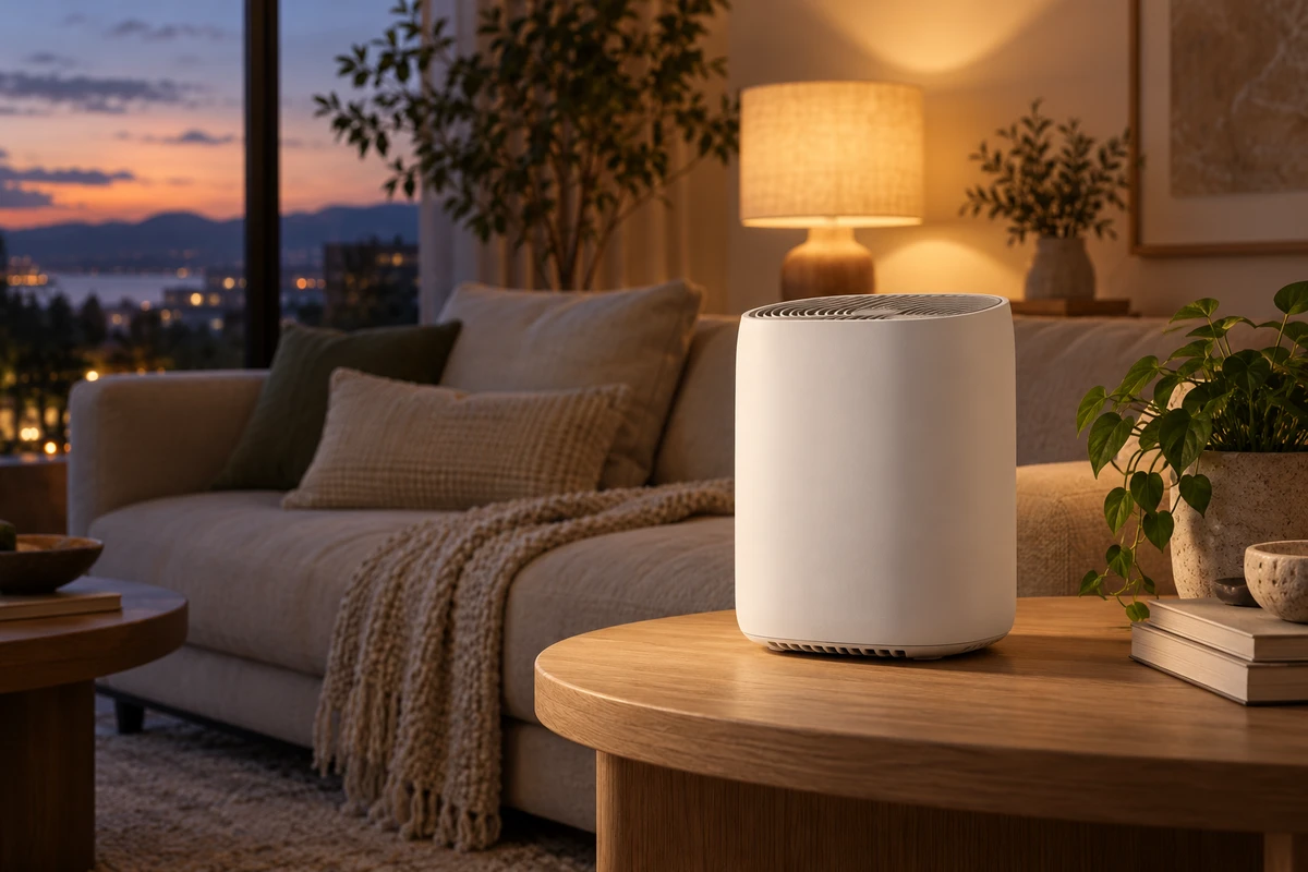
Imagine a home-appliance lifestyle film that has not yet been shot. A white air purifier sits on a living-room side table at dusk, with a table lamp switched on. The brand wants a warm, lived-in room, but the product should not appear to have acquired a cream-colored casing. Cooling the whole image brings it closer to white while taking away the atmosphere. In this hypothetical scene, the question is not simply which color-temperature number to enter. It is which light should describe the product, and which should describe the room.
Product video white balance does not have to make every white surface completely colorless. A more useful ambition is to keep the product's original color recognizable while making its lighting understandable. A warm interior and a white product can coexist when they are given different lighting jobs.
White balance sets a reference, not the color of every light
Sony's official White Balance introduction explains the function as compensating for the color of the lighting environment. It also treats automatic white balance as a possible starting point in uncertain conditions, rather than requiring manual settings everywhere. The guidance was checked on October 19, 2026; the page's copyright year is not treated as its publication date.
If one side of a product looks yellow and the other blue, look beyond the camera setting. Are different lights reaching different surfaces? Adobe's Understand white balance in filmmaking explains that mixed sources complicate white balance, and that neutral gray or white-balance cards provide a reference. A reference helps establish a correction; it does not move the light on set.
For our fictional purifier, suppose window light mainly reaches the front while a nearby warm lamp reaches the side. A single global adjustment is not enough reason to assume both surfaces are now accurate. Repeatedly moving the temperature slider may simply transfer the problem from one side to another. Moving the lamp or the product may be more useful than searching for a universal Kelvin setting.
Give the product and the room different lighting jobs
One possible arrangement is to have a controllable main light establish the product's recognizable base appearance, while the warm practical lamp describes the wall, furniture and atmosphere behind it. This is an approach to a particular conflict, not a universal lighting diagram.
Hold the composition, product position and camera settings steady. Compare the casing with the warm lamp off and on. If the whole front noticeably warms up, the practical is doing more than decorating the background: it is lighting the product. Try increasing its separation from the product, changing its direction, or safely flagging unwanted spill. Then check whether the intended background warmth remains. Change one factor at a time so you can understand what made a difference.
A narrow warm edge with a body that still reads as white is not necessarily a mistake to remove. It can establish that the object belongs in this room. The distinction is between a white surface receiving warm light and a product being mistaken for a different color. Removing every environmental influence can leave an image that feels pasted together.
A lamp in the frame need not light the whole product
The story may require someone to switch on the lamp, or the lamp may be central to the composition. Keep its reason for being visible while reconsidering its influence on the casing. If the location cannot separate those roles and the brand needs an especially direct view of the product color, consider a more controlled close-up. The lifestyle shot can establish the setting; the close-up can explain the appearance. Dividing responsibilities across shots can be more honest than asking one image to accomplish everything.
A neutral reference should sample the product's light
The following is a proposed on-set exercise, not a test we have conducted. Put an appropriate neutral reference at the product's position, receiving the light intended for the product, rather than casually holding it beside the camera. Pay attention to its orientation as well as its position. Turn it toward another source and it may be answering a different question.
Remove it and examine the actual object. Is the casing still recognizable? Has a warm reflection obscured the face the brand wants to show? A neutral card is a basis for correction, not proof that every material, color and moment in the video is accurate. Projects with stricter color requirements need their own measurement, monitoring and color-management approach. This hypothetical exercise is not a substitute.
Automatic white balance is not inherently wrong. For a controlled product shot, compare it with a custom setting and choose the approach that reliably preserves the intended appearance. Do not treat one automatic result as a promise for the whole shoot. Equally, do not carry a manual setting unquestioned into a scene where the lighting has changed.
Watch the entire action before deciding how much warmth to keep
A successful static close-up does not settle what happens when someone picks up the product. In our fictional room, moving it from the window toward the lamp changes the lighting zone it occupies. Rehearse the actual movement and review the important product surfaces throughout, not just in the first frame.
If that transition belongs to the story—someone moves the appliance beside their evening reading spot—the changing relationship to the room may be welcome. If the shot's job is to explain the white casing clearly, reconsider the blocking, main-light coverage or shot division. The decision should follow the shot's purpose, not an automatic rule that color must never change.
Post-production also needs to know which warmth was intentional. Adobe distinguishes color correction for accurate tones from grading as a creative choice. Applied here, establish whether the product's base appearance makes sense before deciding on the overall mood. Avoid correcting away the practical's warmth only to tint the product again with a global warm grade. References and creative notes supply context, not an automatically correct recipe.
The room can still feel warm. The casing does not need to be the coldest or brightest object, nor pure white on every face. It needs to read as a white product in a warm room. That is a more useful advertising goal than finding one setting for every light.
Planning a home-appliance or homewares film? Start a conversation through ONCE's video production solutions, bringing the real product color, intended atmosphere and key action so we can discuss how the shots and lighting should work together.